HOME | DD
 hyperionwitch — The Angel of Music

Published: 2004-05-02 04:07:35 +0000 UTC; Views: 1156; Favourites: 18; Downloads: 132
Redirect to original
Description
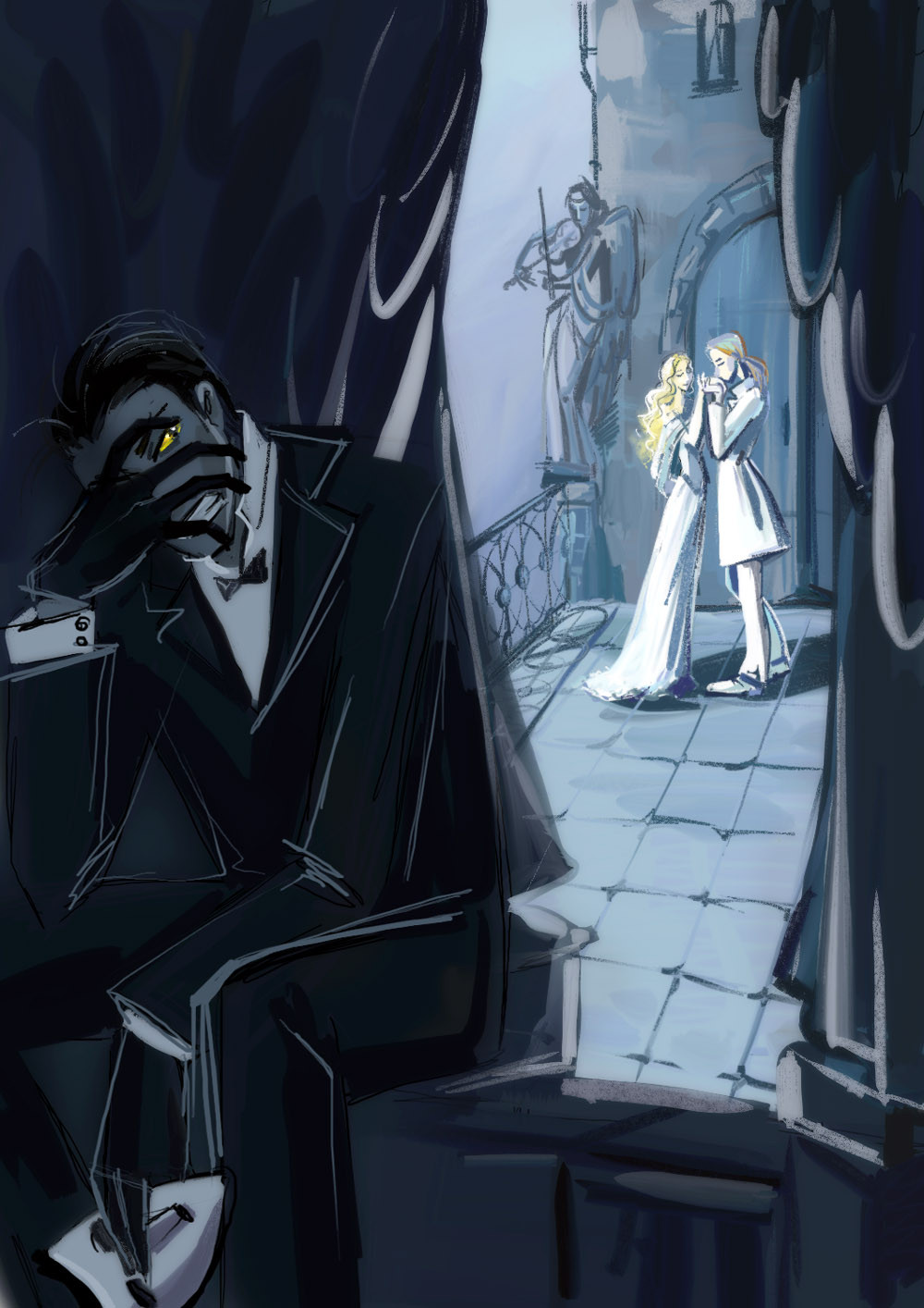
...I just recently got back from Chicago, where I saw the Andrew Lloyd Webber version of the Phantom of the Opera.OMG.
No, seriously. It was really, really magnificent. My mom says it's darker than the other version she's seen (the one we previously had the soundtrack to), but, then again, I like darker things, I suppose. Anyway, I loved it. It really gave me goosebumps at the beginning when the chandelier was lifted. The overture during that was splendidly...loud. Yes. Loud. And lovely.
We bought the soundtrack. X3
And, while listening to the overture, I sketched this. In a bumpy car (grr). Then, when we got home and began watching Meet the Parents (both my mom and I had seen it--my step-dad had not), I inked the Phantom, colored him, then did the rest. Which I did not ink.
I am SO PROUD OF THIS. This was the first time I've used paint to do the highlights--even if I did use the primer from our kitchen ceiling. The rest is my traditional media; Prismacolor Markers, Micron Pens, the usual. Unfortunately, the scanner killed it, and it took much fiddling in Photoshop to get the background to be as black as it's supposed to. In real life, it actually looks kind of...bad. I'm going to have to go over the background a few times. But I think I fixed the colors to a point that they don't look horrid. The curtains look wonky, but I suppose it'll have to suffice.
You know, I'm quite suprised that this fit on my scanner. It took the whole piece of paper and my scanner is weird and...isn't...big enough...or something. It has a huge place to set what you wish to be scanned, but it only scans about 5/8 of that. *hits scanner* At least it cooperated this time.
Well, I really hope you like this as much as I do. It took me a good several hours and...you get the point. You probably haven't even gotten this far.
By the way, the shiny things in the blackness near the bottom of the picture are shards of a mirror. I'll leave you to figure it out. Also, the darker half of his face had a different expression. It was smiling. Just that half. But the blackness kind of...made that invisible. Just so you know. And the chandelier is blue, not yellow, because it is not on, or what have you.
The Phantom of the Opera isn't mine--obviously--figure out who it belongs to on your own, I'm FAR too lazy.
Related content


Comments: 25


")

I LOVE the blue tones in this.. often I see Phantoms highlights for all the black he wears in red because people want to associate him with hsi character as Red Death during the Masquerade... but I think that's rather contrarty to what Leroux wanted for his book.. He usually skulked around in dark colors matching the dark operahouse.. so blacks, greys, and deep blues would deff. be more fitting like you've done here.. His Read Death was his way of suddenly standing out and giving a stark wake up call to the rest of the opera company and Christine to beware that they had arisen anger in him and he could and would be as fowl as the fever, never seeing him, but him crawling about your skin.. so I like this alot.. caue it's the way he normally is.. romantic, alone, embracing the night.. the way poor lonely Erik is before he feels betrayed.. nicely done.
👍: 0 ⏩: 1

Wow, thanks! That's a very deep thing to go into, it seems...and I am honored you would post it as a comment on my picture. 
👍: 0 ⏩: 1


*and blinks* Marker.
*grinning* I love it when people use marker. All these beautiful cool tones, with so much of the detail obscured but at the same time that makes it more interesting. The yellow works a lovley contrast to the blues, but at the same time you kept it in cool tones so it doesn't pop out and take over. There's a lineless quality here that makes it feel more chill...
👍: 0 ⏩: 1
Wow! Thank you very much, I'm glad the picture portrays such things to you.
👍: 0 ⏩: 0

Lovely what was the other version you have? Ken Hill? Yeston Kopit? just curious.
👍: 0 ⏩: 1
Yeston Kopit. The story was entirely changed!
Thank you!
")
👍: 0 ⏩: 1
I take it you don't like Kopit and Yeston then? It's on of my favorite versions next to Gaston Leroux of course I like all version. They made a movie of it. The movie is a little better then the musical if your interested it's Phantom of the Opera 1990 staring Charles Dance. It stands as one of the best POTO movies. It's also the only one that was ever shot in the Paris opera house.
👍: 0 ⏩: 1
I dunno, it just doesn't make sense that the story would be completely different. *shrug* Anyway, thanks for the recommendation. Perhaps I will check that out. ^^
👍: 0 ⏩: 1
lol It also does not make since to me why ALW would make a musical of something that should have been an opera. And pretty much put his name all over it and cut out Gaston Leroux's name almost completely making all new Phans think he wrote it, but you know. At least Yeston and Kopit changed it enough that it could be considered his own, but that's just my opinion.  (Smile)")
👍: 0 ⏩: 2
Well, the cutting out seems inappropriate. It was more opera-like than most musicals I've seen, though. Lots more singing than talking. Whatever. To each his own, I guess. ^^
👍: 0 ⏩: 0

Gorgeous clothing folds! Such an.. ethereal feel to this, Fantastic mood!
👍: 0 ⏩: 0

wow, nice job! I love the background and the great colouring. For some reason I think of Christopher Lee when I look at your phantom.
👍: 0 ⏩: 1
Wow, isn't Christopher Lee Saruman? Because if so, then this comment REALLY makes me happy. ^^ I mean...it makes me happy anyway. But moreso now.
Thank you!
👍: 0 ⏩: 1
yeah the same Christopher Lee
👍: 0 ⏩: 0

very nice. thanks for telling us about this!
👍: 0 ⏩: 0

Absoloutely beautiful and haunting! Wonderful job!
👍: 0 ⏩: 0

I love your painting! And you're right, The Phantom of the Opera by Andrew Lloyd Webber is magnificent. You should really read the book. It is SOOOOOOOOO awesome! btw, the rest of your gallery is cool, too! D D
👍: 0 ⏩: 1
Wee, thank you (oops, I've been replying to too many comments again...I had promised I wasn't going to anymore...)!! Perhaps I will read the book. I always end up in one of those situations where I need a book to read and don't have one, so...yeah. Thanks! And, just by the way, the only painting on it is the white, the rest is marker...but call it a painting anyway. It maketh me feel special (paint doesn't like me, that's why). X3
Thanks again!!

👍: 0 ⏩: 1
Oooh....marker, paint.....SAME DIFFERENCE! ")
- me...I think..
👍: 0 ⏩: 0

WOw nice style!! Very hidden, and very european looking... guess that's cuz it's inspired by the opera you watched, right? Sounds cool.
👍: 0 ⏩: 1
Thanks!! I'm glad it looks hidden, that was my goal. My mom says it's opera-like, but I think, technically, it's a musical. *shrug* Who can say?
Thanks again!
👍: 0 ⏩: 0