HOME | DD
 ibas — undefined

Published: 2005-12-15 12:51:52 +0000 UTC; Views: 852; Favourites: 21; Downloads: 125
Redirect to original
Description
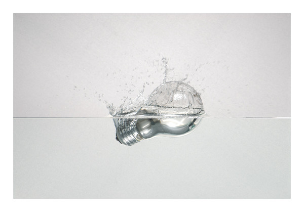
new experimentation ..")

Related content


Comments: 30

Je ne pourrais pas trop expliquer pourquoi, mais j'adore cette photo :]
Les couleurs sont très belles et l'idée plutôt intéressante.
Bravo !
👍: 0 ⏩: 1

merci beaucuop  (Smile)")
👍: 0 ⏩: 0

This intriques me, in a good way.
I love the composition.

👍: 0 ⏩: 1
thank you very much, happy to see this picture is inspiring for people, because it's an important picture for me
👍: 0 ⏩: 0

thank you, i like too these green tones in photographies...
👍: 0 ⏩: 0

ca change ! y'a un petit coté chris cunnigham je trouve nan ??
👍: 0 ⏩: 1
çà c'est toi qui voit, ouais pourquoi pas, mais peut etre pas assez sombre pour coller à l'univers de cc
👍: 0 ⏩: 1
ui evidemment opinion personnel en tou cas jaime le syle broken
 (Wink)")
👍: 0 ⏩: 1
de rien mais bibi heu non koi pas devant tou le monde
👍: 0 ⏩: 1
mais quelle chochotte celui là ")
👍: 0 ⏩: 0

j'aime bien cette photo
👍: 0 ⏩: 1
coté non arrondi voulu
merki pour le commenaire
👍: 0 ⏩: 0

is it prize for my patience?
I love these colours!
nice flower
👍: 0 ⏩: 2

yeahhh your prize
thank you for your attention
👍: 0 ⏩: 0


un peu comme la glace à la vanille ...
(je cours me cacher, les rimes du matin sont pas les meilleures
👍: 0 ⏩: 1

exactly what i wanted to make believe, thank you
👍: 0 ⏩: 0

very nice
👍: 0 ⏩: 1
retro is beautiful
👍: 0 ⏩: 0


j'aime bcp , the close up is really really nice 
great job !~
👍: 0 ⏩: 1
ce sont bien des feuilles derrière, c'est une fleur électrique
merci
👍: 0 ⏩: 0