HOME | DD
 Illys — Calligraphy and by-hand inking
Published: 2006-12-09 21:57:50 +0000 UTC; Views: 4472; Favourites: 24; Downloads: 58
Redirect to original
Description
Inking with nibs is best when you take it slow and learn to use india ink from a slightly wide-mouthed bottle, dipping the nib itself in only up to the rounding of the joint where the top, or gold part of the nib is lifting away from the bottom part of the nib itself.Practice this before all else, and make gentle flat strokes on the paper itself to learn now best to control the ink flow.
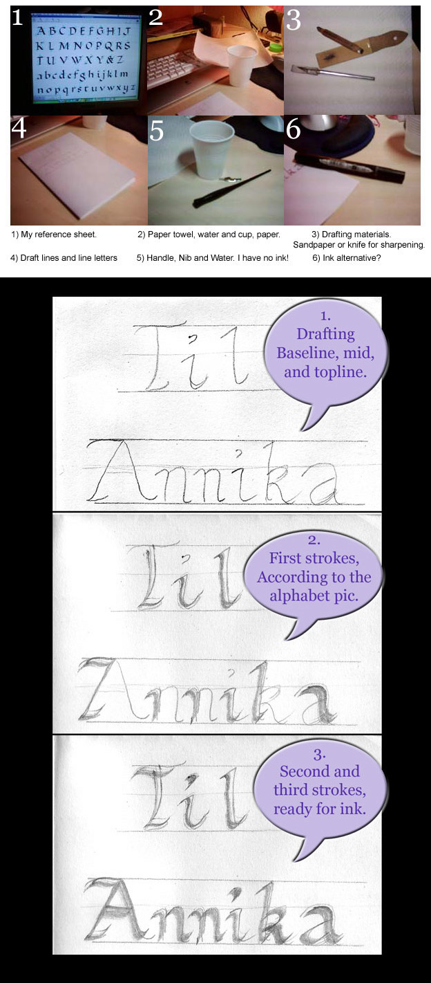
Use very, very smooth paper, and before you apply the nib to the paper, tap it gently one or two times on the side of the ink bottle to remove extra drops of ink, which result in blots and heavy, slow-drying strokes. Keep paper towel beside your bottle at all times to help drain off any extra ink when the nib is too full, and if you plan on using a broad nib in calligraphy, take time to practice simple, gentle strokes after a classic alphabet. ( [link] ) all of these are of either sideways or diagonal strokes, and you can look at them to learn just how a scribe or monk would learn to draw straight lines down, make smooth strokes left or right/up/down, and the angle of the nib and the angle of your arm and hand control the ease of the letter strokes. Begin with the simplest letters and strokes, and using a ( [link] ) flat calligraphy pencil instead of nibs smooth out the difficulties of learning good calligraphy strokes. I recommend simple calligraphy alphabets and classic, non-serif roman letter text (Arial, Helvetica) to practice in both large and small on either newsprint or semi-transparent large-block paper, with lines measured out and written with a T-bar. This page ( [link] ) provides perfect instructional sheets on a number of alphabets, including arrows to understand the directions of the strokes.
for nibs in artwork, I recommend a very simple, fine nip. It's just a small round tube, with two rather sharp points at the end of the nib for the fines sketching lines. It cannot fit in the classic long and curved calligraphy pen/stick, but the kit comes with a shorter, more maneuverable and round holder. again, this is for very fine lines and strokes, which for example can be the lines of an eye, eyelashes, the wisps of fur at the end of a cat's tail or her whiskers, or the fine lines in the creases of your own hand. Assuming you know how to draw and sketch very well, begin your project with a very simple sketch - a hand, an animal, a plant, a cartoon figure.. and draw in only lightly upon the smooth paper. Then, after you have practiced strokes with the fine nib and have learned not to scratch the paper or bear down too hard (fine control counts), begin inking in the directions of the lines you want to flow.
Begin by practicing this alphabet ( [link] ) on a large piece of newsprint (recycled grey paper, large block), or on normal paper, but in large size first. Use three lines to define large and small letters. Say, for instance, you create a two inch margin between lines drawn with a ruler or T-bar, and inbetween these, at the halfway point or slightly higher, you define the center of the letters. The bottom line is the bottom of the letters, the top line is the top of the capital letters, and the middle line is the top of the lower-case letters and center-strokes in capitals, like E and B.
I really do recommend practicing the alphabet with the flattened pencil first on large paper before moving to speedball flat nibs on your artwork or on letters and artworks. Practice the sheet between five or ten times, analyze your weak letters and strokes, and practice your weak letters. In two days you should be ready to try on a smaller scale with a speedball nib. Again, don't use the speedball on rough paper, but on very smooth, fine paper, heavy weight if possible. You need your lines to be practiced and the ink laid smoothly to create ideal letters.
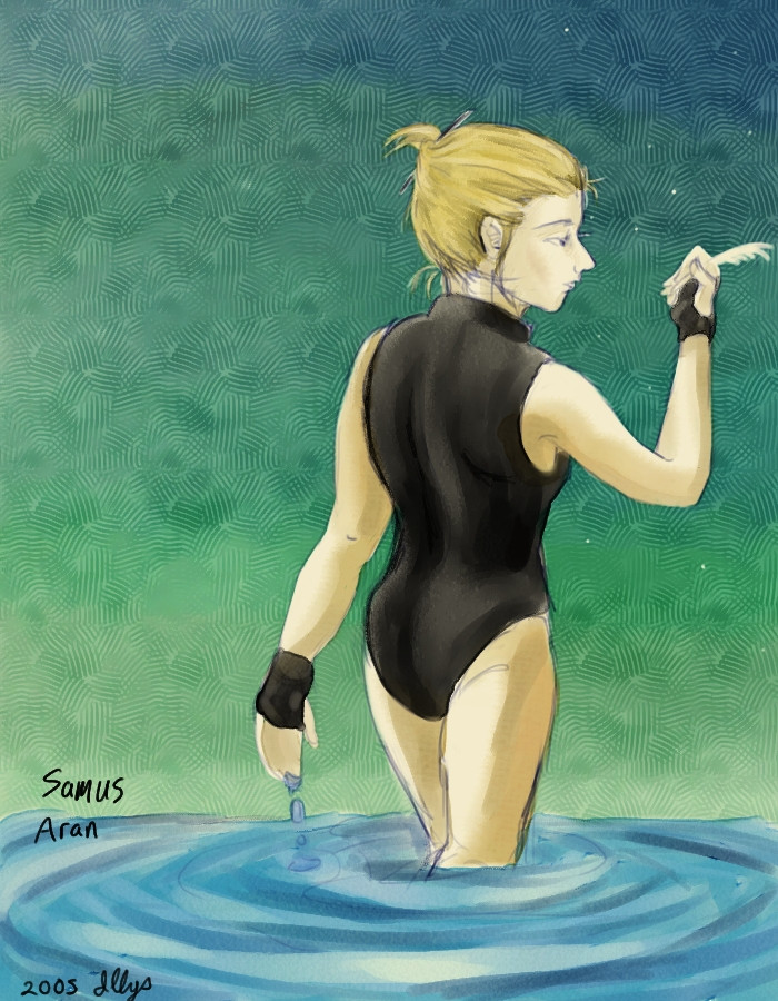
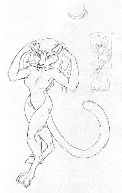
Hogarth's 'Dynamic Light and Shade' ( [link] ) gives clear ideas on dramatic inking and contrast, and I recommend slowly increasing your skills on simple line drawings instead of crosshatching to put shade on your drawing/work. My image 'Chalcara - Moonlight' began as a sketch ( [link] ) and was finished in pencil linework, but would have been ideal for inking with nibs. I did this image ( [link] ) a very long time ago, while I was still settling into inking with nibs and materials, and so the lines do not display lighting source or clothing flow, but you can see how the beginning was as I developed. I started a little later with contrasts of dark and light lines in my lineart, and that gave me a better sense of what I wanted to do with ink.
This here ( [link] ) is simple inkwash over an inked image, when I had finally begun to get control over my nibs and heavy drawing hand. The style is in part inspired by the ink work of Satoshi Shiki in his comic 'Riot' ( [link] )
This tutorial on imitating comic-book dramatic inking in Corel Painter ( [link] ) is done specifically for deviantartists looking for digital inking help, but his technique will help you get the basics of dramatic shade-inking and skills in your mind.
Be patient with yourself and relieve yourself of outside or emotional stresses before trying to ink. Play calming music, and reject anyone who tries to interrupt you at the door. A soft hand on the art requires also a calm heart and a restful psyche, and I find Enya and Mike Oldfield to be best when I try to get in the mood of sketching.
No great artist is born in a day or aspires to astounding art in a month. Your expectations of yourself create your own opinions of your art, and no critic is worse than the artist themselves. Your skill grows as you play and get imaginative with your pencils, paper and imagination.
Felt pens and soft-tip inking pens relieve a lot of the difficulties with using inking nibs - my friend Chalcara ( [link] ) has been trying to simplify her comic style, and this ( [link] ) is her experiment with soft-tip felt pens. Her nib work often looks like ( [link] ) before she takes work into Painter 6 to do her magic, and she's a master with a wacom tablet.
God's love poured out on you in your family and friends this holiday, and enjoy your nibs!
-Illys ( [link] )
Related content


Comments: 4

This could make a really great separate web page, complete with photo examples.
👍: 0 ⏩: 1

Yeah, I know - I've done similar stuff with Photoshop Elements and a few other subjects. ([link] )
👍: 0 ⏩: 0
