HOME | DD
 Imdraproc — Great Spirit Library Tour

#ancientegypt #cuneiform #forestspirit #hieroglyphs #lammasu #librarian #library #mesopotamia #papyrus #scrolls #spirit #apkallu #librariangirl #mythicalfantasy
Published: 2018-01-02 17:37:09 +0000 UTC; Views: 3741; Favourites: 17; Downloads: 0
Redirect to original
Description
Hi and hello again, o fellow Deviants!This pic took a while to finish, for as soon as I got an idea for a cool detail to add, I soon added another, and then another after that, etc.
This is mostly a practice on perspective and trying out drawing distances and such, but I'm still trying to learn how to do foreshortening well.
Being an ancient history, mythology, and philosophy fan, the kind of fantasy I like to write (and draw) tends to be closer to the ancient myths of Egypt, Greece, India, etc., rather than the 'medieval western European knights and castles'- theme so common to Fantasy (not that there is anything wrong that theme, mind; I am a big fan of Warhammer and D&D), so I made a picture of a comical scene from the fantasy world I'm writing.
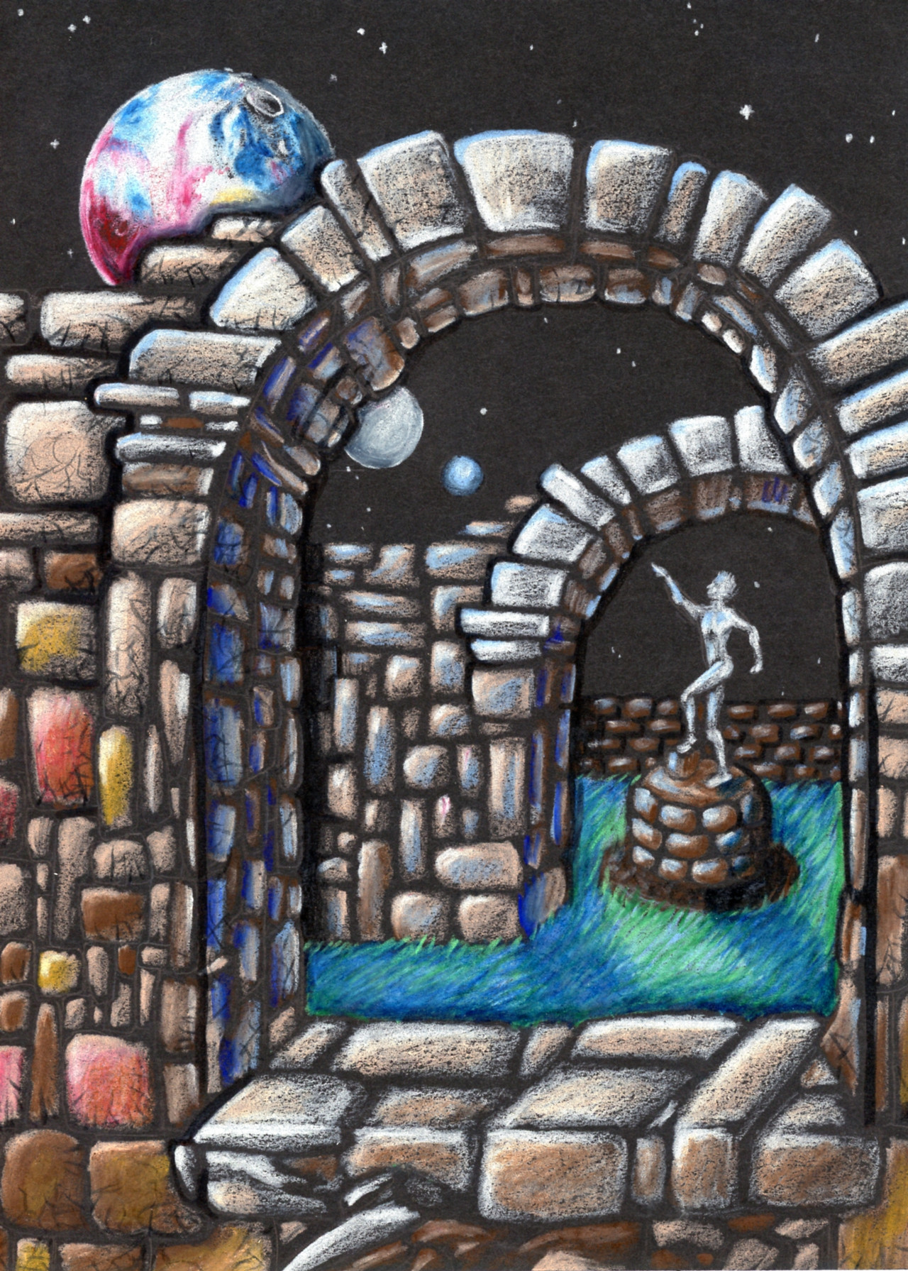
This is the Great Library, the foremost center of learning in the world (inspired by the great historical libraries of Nineveh, Babylon, Alexandria, Gundeshapur, Baghdad, etc). The blue and red little boxes on the shelves are book- and scrollcases containing the information on various academic subjects, philosophies, and schools of magic, each represented with their own symbol.
The little boy who looks like an animated bronze statue is one of the Genie-like spirits who seeks out new knowledge to bring back to the library so it may be recorded. On his travels, he meets a rather energetic (and occasionally annoying) forest-spirit (the redheaded girl) whom he has brought along to show the library he works in.
Quite predictably, the forest spirit gets excited with all the new impressions and mysteries around the place, and is soon pulling the knowledge-spirit along.
The poor librarian-girl to the right only narrowly avoided a crash there...
Related content


Comments: 15

👍: 1 ⏩: 0

👍: 1 ⏩: 1

👍: 0 ⏩: 0

For ProjectComment
This is definitely a very ambitious piece you've drawn. There are a lot of details and there's a lot going on here. I definitely agree that ancient antiquity is a great source for stories to be told and I applaud you for trying to get your own characters and stories going.
Since you specify that you tried to practice perspective here, I'll give a bit of a specific critique for those aspects. You've gone for a one-point perspective setting here, which is the easiest to start with. It's nice to see that even within the one point perspective you try to get some action going, to keep the scene from being too stiff. There are a few things I would like to point out on your perspective though.
When you apply one-point perspective it's important to keep all lines aligned towards the same vanishing point. You do this well with the lines in the middle corridor, but the tiles in the wings on the side should follow in parallel like the other lines to the same vanishing point. These rooms don't align to this same vanishing point though, which makes them look off to the rest of the building.
A second pointer would be that your horizon line is rather high compared to the characters in your scene. Generally for a regular shot you would place the horizon line around eye-height of an average character, so the viewer of your piece feels to be about the same height as the characters. Of course you can play around with this, placing the horizon line lower can give the characters a sense of power as the viewer has to look up to them, or placing the horizon lower can make them feel smaller, since the viewer looks down upon them from this view. I'm not sure if you did this intentionally, to make the characters seem small in comparison to your building; it looks to me like you just placed your horizon and vanishing point in the middle of your image. Playing around with this and making sure it's all intentional can give you more tools to tell your story more effectively and experimenting with things like this can allow you to improve your compositions.
A third point on your perspective would be that as horizontal lines get closer to the horizon they generally group more closely together (specifically talking about the horizontal lines of your tiles here). It's the same as what happens with the colums, as they get farther away from the viewer and closer to the horizon they appear to be smaller even though they are the same size. This same effect happens with your tiles, as they get farther away they will seem smaller and you can achieve this effect by placing the horizontal lines closer together as the vertical lines converge. There's a very technical way to get this exactly right, but if you keep this rule of thumb in mind you can definitely get a nice effect with a lot less effort.
A final point on your characters; since you mentioned the foreshortening. Especially when you try your best to get accurate perspective on your environment, it's especially crucial to get this done with your characters as well; since if they don't align properly your characters won't seem to fit properly in your world. A good way to get started on this is to start off placing your characters in your composition as very simple boxes, make sure that these boxes align properly with your perspective grid and once you've gotten that done, slowly add details to your boxes to make them into characters. Just as a small example; your characters are drawn quite below the horizon line, which would make the viewer look down on them. However, you have drawn them pretty straight-on; which makes them seem flat and out of place in your library. Getting difficult poses like these, with a lot of foreshortening and action, correctly in perspective is very difficult, so I would recommend to start practising your characters in environments in very basic standing poses and expand slowly from there.
I hope my comment does not seem too harsh; again I will definitely commend you for your ambition and your willingness to practise perspective; it's a tricky subject to master, but once you do your images will seem a lot more real and you will even be able to break some perspective rules to tell your story in a more interesting way. I really hope that my pointers will help you along; if you have any questions, by all means feel free to ask them. And just keep on practising, in the end you'll be amazed what you'll be able to achieve!
👍: 1 ⏩: 1
Firstly, I thank you for taking your time to make such a detailed, thought-through, and helpful comment as you have. I’m sorry for that my response has been so delayed.
My ancient setting is a labour of love, and I’ve been practicing my long-neglected art skills to try and make art that I feel is worthy of a setting I’ve spent so much time on.
When I started drawing the picture, I chose to put the horizon rather high up on the paper in order to emphasize the size of the corridor – and thereby the size of the library itself.
Going too close up on the characters would make the library look small, rather than the gigantic repository of knowledge it is supposed to be. I had originally planned to add more things to the background – stairways and such, but there was only so much one could cram onto one part of the paper before it would become cluttered.
The choice of one-point perspective was mostly for it is better to start out with smaller and simpler things before going on to the more complex.
Getting the corridor right took a while and turned out okay, but I tried again and again on the side rooms without ever getting it right, and it is still bothering me.
A plan for future pics of this kind would be to first make all of the lower part of the picture have the basic tile shapes of the corridor, and then add the walls and rooms on the sides, erasing tile lines and adding other details as one went along.
Another thing I would change would be to have the pillars not only have white bases, but white top-stones as well, so one can see that they attach to the corridor ceiling. I feel that I have drawn the pillars as if they just go up into the air without connecting.
The horizontal lines are arrayed closer to each other the farther away they are from the viewer; the tiles closest to the doorway look much smaller than those near the bottom of the paper, though I need a little more practice to get the shapes more even.
The foreshortening is where I fell the most flat, yes, and it will take a ton of practice to get it right.
Again, thank you very much for your Comment!
👍: 0 ⏩: 1
You're very welcome!
A good way to make a place seem very large is by placing the horizon level low, so the viewer's point of view is low as well. That way the focus of your image is more on the ceiling, rather than the floor. Going for a three-point perspective will enhance this feeling even more, though of course that's a lot more complex, so take your time to build up to that.
I think your suggestion of getting the floors with the tiles done first would be a good way to go about it; start with one plane and add the others afterwards; it's a good way to simplify your process.
And try not to get overwhelmed by improvement; improvement will happen over time as you keep drawing, and as you get better, you'll also get better at judging your artwork, so there'll always be things to keep improving upon. The most important thing is to keep doing what you enjoy.
👍: 0 ⏩: 0

hi, im from
first of all, i'd like to say that the piece is wonderful, and the characters here are very cute
the perspective on the corridor is very well done, however the wall on the right closest to the librarian does look slightly off (imgur.com/a/OdB8o <- illustrate this). www.youtube.com/watch?v=0ICyLN… <- this is a helpful tutorial for one point perspective if youre ever struggling. the characters here have a lot of emotion you can infer from their expressions (such as the redheaded girls lively attutide), and the story behind it is very interesting! but i would recommend using less saturated bright colours, and only use bold bright colours on the focal point of the image, because otherwise it looks a bit chaotic and there isnt really anywhere for the eye to rest whilst looking at the piece. adding onto this, the art would also look more appealing if you coloured the image with all the lines facing one direction so they're even, but it isnt necessary.
despite this, this is a wonderful drawing and you have a very pretty style. wishing you the best of luck on your art journeys and i hope this helped!
 (Smile)")
👍: 1 ⏩: 1
Thanks for your comment!
I'm happy to see that you like my character designs and backstory.
Thanks also for the video.
Truth be known, practicing on perspective is an important (but not only) part of why I've drawn my last three pictures, and, yes, there is more to be done.
Perhaps the background would have been less distracting if it were a little bit darker and shaded, though it is a magical place where light basically just exists with little rhyme or reason to where it comes from, which complicates things a little from an artistic perspective.
Things that have troubled me the most when I made this picture is partly that the perspective on the corridor is somewhat crooked, as you pointed out, and the alignment of the tiles on the rooms on the sides are not perfect (especially on the right).
I wonder whether or not it was a good idea to use pure white on the floor tiles or if I should have used some sandy colour instead so that the pic does not look half-coloured. The doorways could also have been done a little more like each other.
Would little white stone on top of the pillars look nice, to match the support stones below? I worry that the green pillars directly going up to the blue roof makes it look like the roof just floats above them.
Thank you for the input!
👍: 0 ⏩: 1
hey, its no problem!!
i personally think the white stones would help the pillars look more attached, but the picture would still work without them.
i checked your gallery, and i can tell through the pictures you've improved perspective very quickly. if you keep drawing, im sure you'll get better in no time!
im excited to see how you improve. have a nice day! :>
👍: 1 ⏩: 0

Good work with the perspective of the corridor. The color scheme is very simple and bring a lot of personality in the characters. One thing to critique is how you color. I do notice how scribblely the wall look. All I can put it is to not color on the paper too hard.
In that matter, You did pretty great
👍: 1 ⏩: 1
Thanks for the input.
I am currently trying to colour things better and practice a bit on shading.
I have also considered getting into digital art as a way to work with art and get an easier way to colour things evenly.
Using colouring pencils in combination with water paints might also be something, but the scanner I use always scans things too brightly (hence my going a bit overboard with how hard the pic gets coloured).
👍: 0 ⏩: 0


Love how the girl looks with the flowers in her hair and the boys express of raw aaaa shit i'm gonna regret this.
Looks really goodd Imdraproc.
👍: 0 ⏩: 1