HOME | DD
 Inkthinker — ZING - WIP ink v.II
Published: 2006-09-25 08:09:35 +0000 UTC; Views: 1345; Favourites: 17; Downloads: 9
Redirect to original
Description
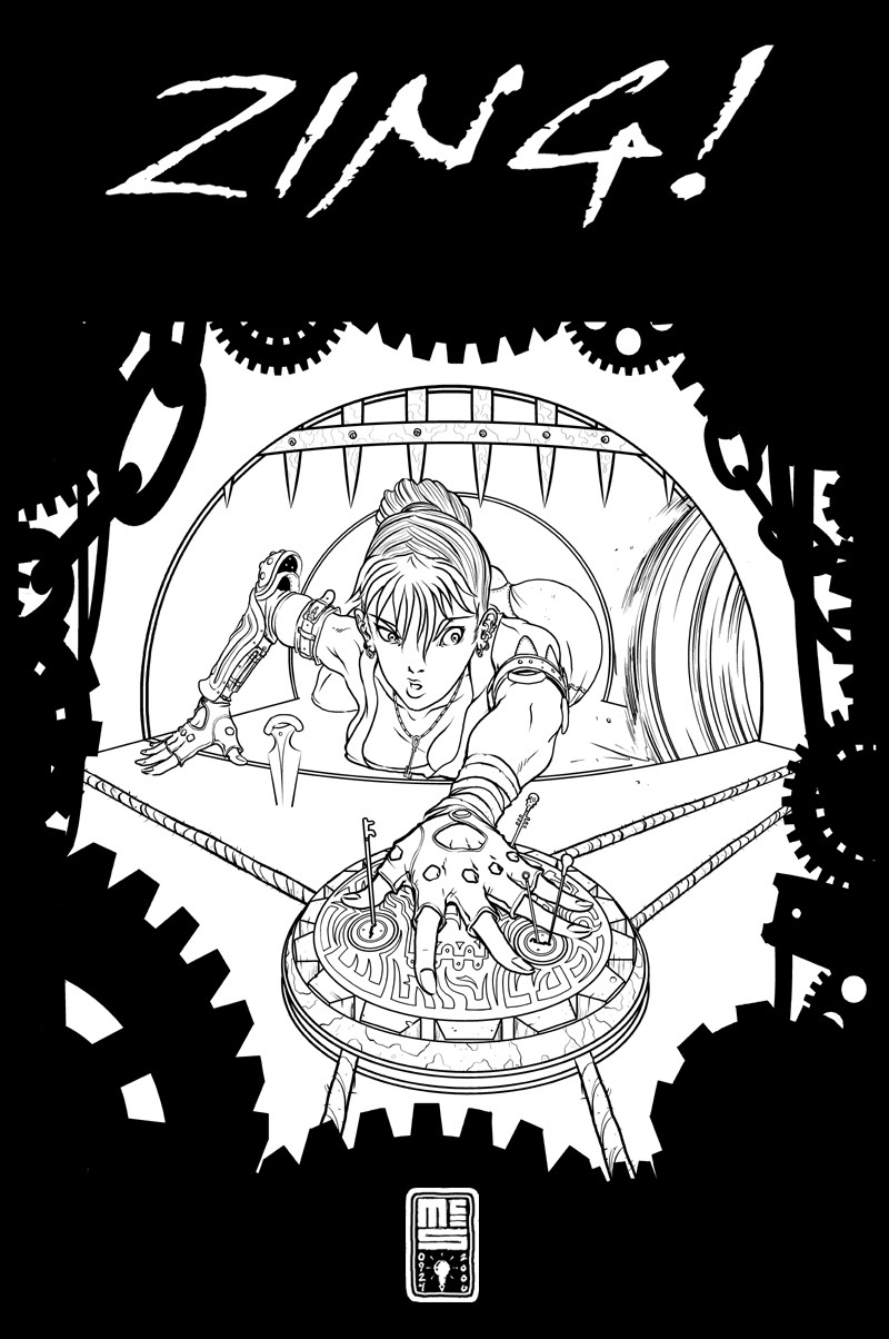
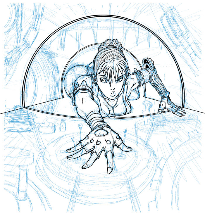
Still puttering with this. I'm not sure I like the frame yet or not. You can see an earlier version here: [link]Anyhow, still lots to do. Let me hear your thoughts so far.
Related content


Comments: 27

and then her neclace gets stuck in the groove of the saw...
such a sad sad time for her
👍: 0 ⏩: 0


my first impression:
the frame is abusive eye catching, mainly due to color amount. You can add the fact this shape and meaning doesn't suit the character design.
The simple and round environment really suits for a logo design, if you want to color it maybe use of dark tones can add dramatic effect on it
All of this are just tips hope to help you
👍: 0 ⏩: 1

I appreciate the tips, but I'm not really sure I understand. Can you clarify?
👍: 0 ⏩: 1
sory for my poor expresive english.
I'v read someone talk about the simple background, looking at the image again i noticed that BG was composed of circles, taking the fact i was working on logos recently this point of your image reminds me some logos main shapes. I sugested you to view the draw this way.
The image its suposed to be action / dramatic turned so this feeling can be achieved by given the image dark and special lightning
👍: 0 ⏩: 1
It's okay... I'm barely competent with English myself.
I think I get some of what you're saying. The lighting isn't something I'm thinking about a whole lot just yet, though it's beginning to weigh on my mind some. I'll likely do that with either grey tones or possibly even ziptone... I'm not very good with color yet.
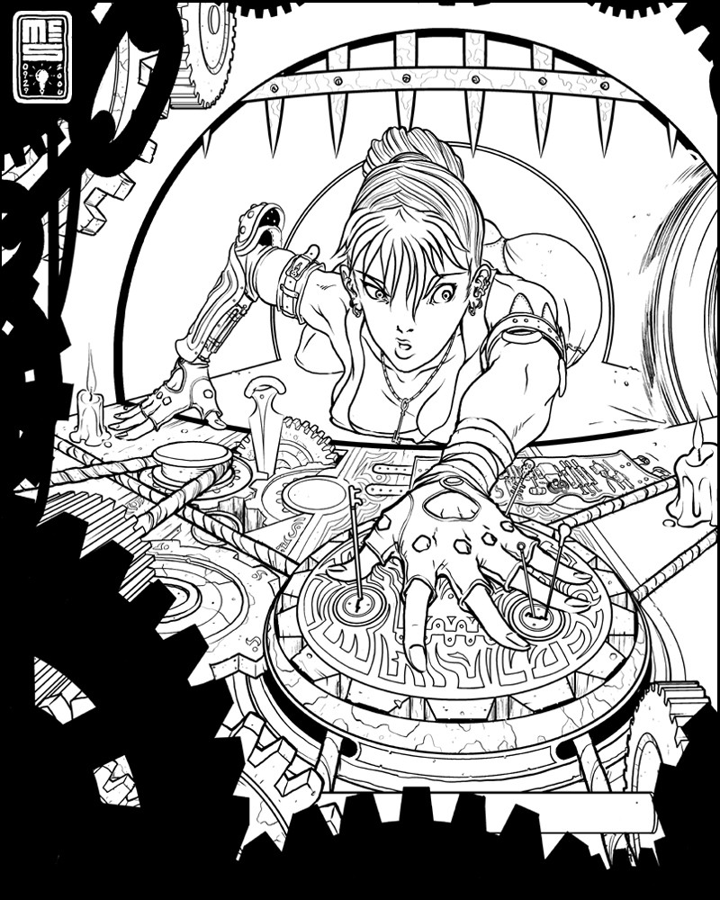
I just uploaded a new update on this, as well... it's gotten more complicated.
")
👍: 0 ⏩: 0

It's looking near perfection, as to be expected from a master!
👍: 0 ⏩: 0


the frame does detract
but everyone's already mentioned that
for me... i find the background a bit.. simple?
it sorta makes it hard for me to concentrate on her
like an imbalance.. because she's so detailed and the background is so.. sorry.. bad at explaining *waves hands in the air*
👍: 0 ⏩: 1
Give it time, give it time... I still have a lot to add to it, it's a work-in-progress.
👍: 0 ⏩: 1
oh.. ok
i thought it was the final so i got a bit confused XD
👍: 0 ⏩: 0

It's looking grat. The frame does not convince me though. Perhaps you should drop the silhouettes and actually draw some gritty gears. Just a thought cant wait to see this finished.
👍: 0 ⏩: 0

sharp work man.
I'd really liked to see those gears, but rather then black, just really dark colors to act as a boarder, and make the character scene lighter.
👍: 0 ⏩: 1
Nobody wants to let me cheap out with silhouettes. >_<
But yeah... I'm leaning more and more towards an interstitial layer of strongly detailed gears and such that lay between the two fields and help transition to the frame. I've still got a loooot of detail to add to it.
👍: 0 ⏩: 0

i like the frame but it is too dominant. maybe crop it tighter?
i don't like the "Zing!" on the top. It makes the piece look like a magazine cover. instead of a giant "Zing!" I think it would better to put the word "click" in small type down near her hand. ...as if the "click" sprung the trap. you know -- more subtle-er, tongue-in-cheeky.
...but mostly I love the drawing! it keeps getting better and better. keep up the excellent work!
👍: 0 ⏩: 1
Well... the ZING! is something I want to include, but you're right... I can probably find a better way to incorporate it.
I think I may crop it tighter, and add an interstitial layer of dark and heavily detailed gears that help transistion between the two. Maybe.
👍: 0 ⏩: 0

I like the way it's coming along! Your expert handling of line density serves to accent the perspective and form.
👍: 0 ⏩: 0

I'm diggin' the frame concept, but it's a bit... big? Maybe pull the frame closer to the edges, making the main picture a little bigger? I dunno... just a thought. I've no room to critique your work anyways. Ha.
-Stay Classy
👍: 0 ⏩: 1
I don't think there's any prior credentials needed to critique... people like what they like, and sometimes I think it's better to get an unvarnished opinion from regular people than a polished dissertation by an "expert".
👍: 0 ⏩: 0

i like the frame, it makes it more atmospheric, im lovin her expression too, hehe
👍: 0 ⏩: 0

Lookin sweet! I love how her body squishes under her weight. Her expression is wonderful!
I think the gear border is a great idea, but I would at least try blurring it to take it out of focus. It may look bad, but I think it was a good suggestion.
Superb 100% professional work. I'd expect to see this in a great art book of yours some day.
👍: 0 ⏩: 0

Yea, the black frame does seem to be a bit much, dont know how much of that could be fixed with color, but it could be done
👍: 0 ⏩: 0

Hey Ben,
I dig it alot!!
I am by no means able to critique anything, but I do kind of agree about the gears and stuff, maybe just oa bit of blur to make it look like you are looking past something.
Also curious as to what the floor and tube is made of? I can see the knife sticking in so I assume wood ar some kind of crack exists??
I was using a circular saw today and kept thinking of this pic everytime I heard the "zing"..LOL..and her expression is something I think everyone can safely say they have felt... the 'Oh Shit.."
Anyway, whatever you do to her it will be great!!
Cheers
Kris
👍: 0 ⏩: 1
I haven't got started on the floor and walls yet, but it'll probably be some sort of brick texture. Probably be more ropes and gears and scattered tools and carved patterns in the foreground as well.
👍: 0 ⏩: 0

It's coming along pretty nicely.
I'm leaning away from the frame but I'm not really sure either.
👍: 0 ⏩: 0

I think the gears/chains/misc stuff border is too dark. It kind of draws attention away. My suggestion, if you still want to go with just shapes instead of doing all the details in the border is to just outline it and leave the rest white.
👍: 0 ⏩: 1
Like just a line, rather than a solid? Hmmm... interesting idea. I'll give it a try and see how it looks.
👍: 0 ⏩: 0