HOME | DD
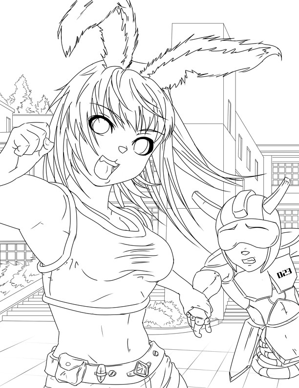
 jadeedge — ConnectiCon Cover -lineart-
by-nc-nd
jadeedge — ConnectiCon Cover -lineart-
by-nc-nd
Published: 2007-05-19 01:25:05 +0000 UTC; Views: 2021; Favourites: 52; Downloads: 55
Redirect to original
Description
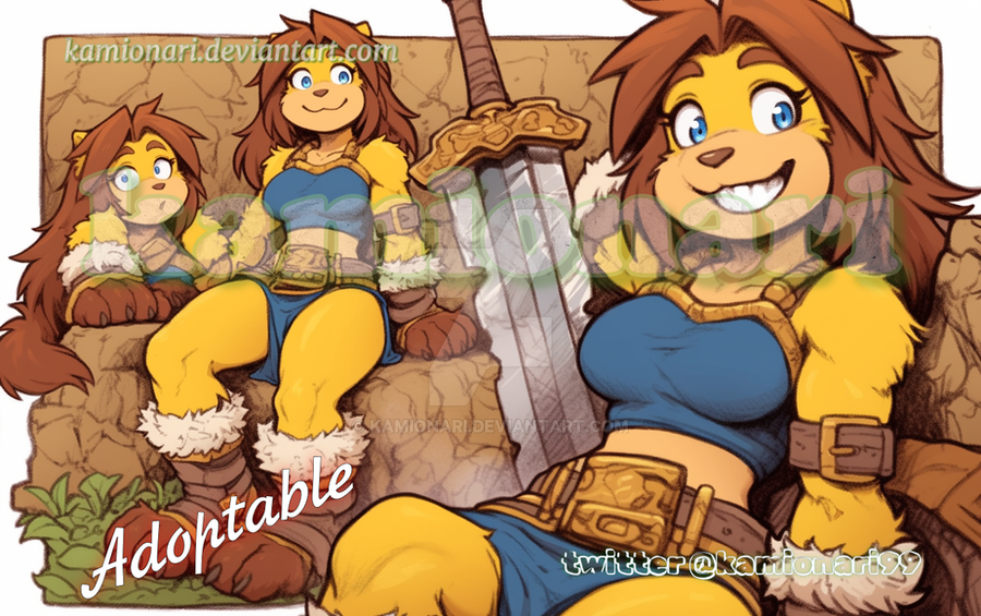
Cover for 2007 ConnectiCon.I ditched the old idea of the bunny girl outfit & Vegas. decided to go with a more traditional view.
")
I still need critiques!! i know a few things are off... like the belt and D23's head... but that's what i get for messing with proportions.

Related content


Comments: 17

I really like the hips myself but one of the breats looks like it might be bigger than the other o.o
👍: 0 ⏩: 0

The right hand doesn't quite look big enough! It's effectively right in the viewer's face, yet it's just a tad larger than her left hand, which is much further into the background. I'd suggest that you make this hand bigger and force the perspective more; it'd give the image a lot more movement!
The bottom crop is easy to understand, but I would suggest completing the character in the back as well as the bunny-girl's arm. If she has an elbow / full arm, the image will be easier to understand.
As always, beautiful image, and wonderful clean linework! The buildings are a nice contrast-- I like where this cover is going better!
👍: 0 ⏩: 0

I don't know the characters' background, so I can't really say much about them. I did noticed some things on the background, although minor details that wouldn't really affect the picture, you should still take 'em in consideration.
I noticed the stairs look kinda flat and unaligned of each other. You should put some more lines to give it dimension. For a robot, he doesn't have knuckles like that of a human. Maybe a full circle would touch that up. You already noticed the belt, so I won't bother going there.
And that would be it from my part. Good luck!
 (Smile)")
👍: 0 ⏩: 0

Looks good so far, but her hips seem to be facing an awkward way...
Anyway, yay for Conneticon! Are you cosplaying there? I am!
👍: 0 ⏩: 1

maybe... i usually go to cons to work.
prolly a causal Ichigo with the 1/2 hollow mask or something...
👍: 0 ⏩: 0


For some reason the girl reminds me of Haruhi Suzumiya.
Good work
")
👍: 0 ⏩: 0

Whoo, more bunny! She looks like she'd be bouncy. I like a lot of the details on her belt, and I'm always a fan of nice stomachs.
Not bad buildings/background either.
👍: 0 ⏩: 0


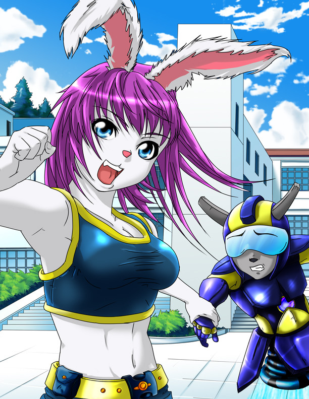
I have to say, I do like this version better. X3
Can't wait to see it finished.
👍: 0 ⏩: 0

Awesome!!!
Sorry for the short comment, but I'm kinda out of time right now. I'll try to get back to you with some critiques and ideas!!
See ya!
D_A+
👍: 0 ⏩: 0

i agree that they look like she is running but they should get larger or move out in some way so they would keep the same volume, there is one thing i would love to see in a piece of art, somehow this piece reminded me of it, you know that belt that dug always had on his head for quail boy? somehow i think that would look perfect in this pic
👍: 0 ⏩: 0

I think she and he is well proprotioned, the boobs are fine because they look like they are bouncing because she walking/joggin/etc.
👍: 0 ⏩: 0

Yeah, I'd have to say that her hips seem a little low and not in agreement with other proportions, and the way her shoulder is curved and connected with the rest of her body isn't flattering. Also, her body's just too twisted around and should face the front a little more. And maybe move the nose down her face a little and I think it'll be good.
👍: 0 ⏩: 0

Agreed her breasts are abit high and her underarm along with the arm give her a muscular feel. Besides that it's pretty darn nice as always. You can never go wrong with bunny ears.
👍: 0 ⏩: 0

The lineart here is better, but I really liked the old design...
👍: 0 ⏩: 0

Very nice! I'm looking forward for the finished version!
For the critique, I think the space between her shoulders and her hips is too small, and her boobs a little too high. Not a big deal though^^
👍: 0 ⏩: 0