HOME | DD
 Jammerlee — Collab - Birthday Bash Pg2
Published: 2010-04-03 23:53:58 +0000 UTC; Views: 9827; Favourites: 198; Downloads: 105
Redirect to original
Description
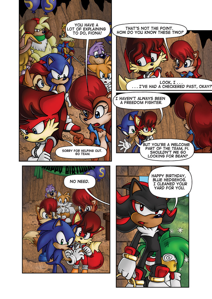
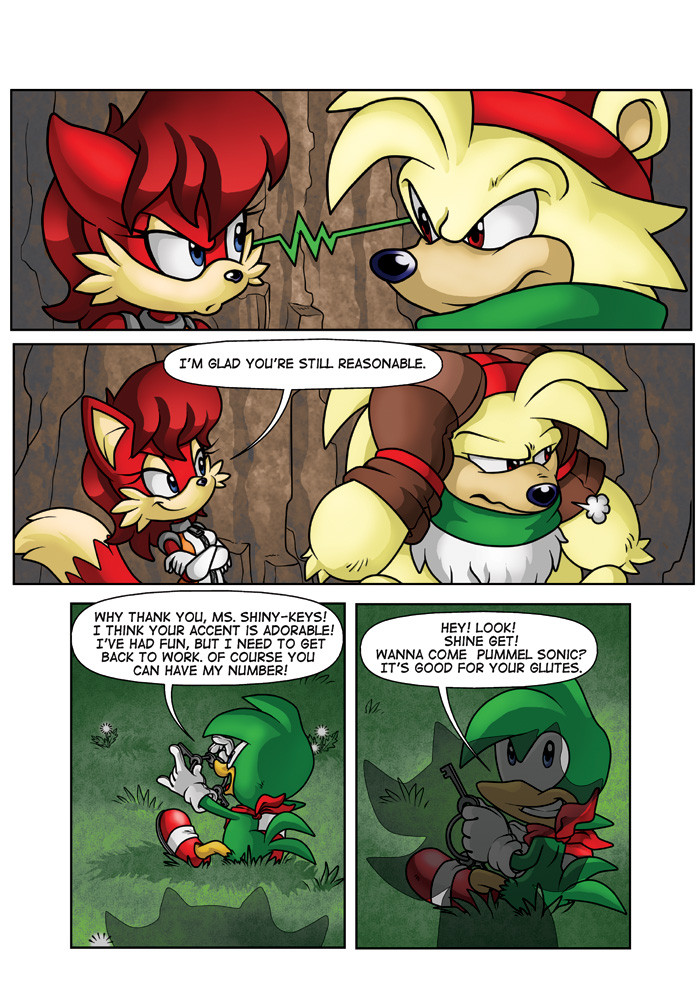
The second page *CatbeeCache has done for sequential practice that I've also colored to practice my comic book style. This page... kicked my ass up and down. It took faaar longer than it should have to color for professional use e_e Plus, I really need to work on finding a good method for highlighting hair and rendering gold. Yeesh. I hate working in CMYK too - the blues are FAR too limited.Critique is highly requested/encouraged.
Lineart:
COPYRIGHTS: All characters are the property of Archie/Sega. Script written by Ian Flynn, lineart by *CatbeeCache , coloration by myself, Jamie A. Lee
Related content


Comments: 32

👍: 0 ⏩: 0

👍: 1 ⏩: 0

👍: 0 ⏩: 0

This is better than the original,with the face expressions and the quality!Plz continue!!!!
👍: 0 ⏩: 0

Always thought Sonic and Fiona looked great together, Fiona looks cute.

👍: 0 ⏩: 0


You guys copied the exact same diolouge from the official Archie comic!
👍: 0 ⏩: 1

Ian provided scripts from some of his earlier issues to allow people to practice with.
👍: 0 ⏩: 1
I read the comic. Diolouge is exactly the same. I'm not mad about it. Just wondering why someone would do that. Sorry if I offended
👍: 0 ⏩: 1
*shrug* Like I said, Ian provided the scripts for people interested in breaking into the industry to practice on. That's why the dialogue is the same. Deebs was following his original script.
👍: 0 ⏩: 1
okay. Thanks for the clarification
👍: 0 ⏩: 0

I know this is an old deviation but I gotta say your colos really complemented the lineart! It's detailed but not dark or muddy. And the colors are bold without being too jarring or bright. I really love how you handle colors!
👍: 0 ⏩: 0

the character behide Sonic has a fox tail...and looks like Sally?
Love the comic btw!!!
👍: 0 ⏩: 0
Yeah it wuz they copied the whole thing
👍: 0 ⏩: 0
The script was made by Ian Flynn, one of the writers at Archie, but the artwork is made by a friend of mine and the coloring is by me. And yes, we have Ian's permission to use it.
👍: 0 ⏩: 1

Ah. Thank you. I knew that i saw this in a comic.
👍: 0 ⏩: 0


Wait, there's two Sally's? Then who's the animal next to Sonic?
👍: 0 ⏩: 1
Are you referring to Elias? He's Sally's older brother
👍: 0 ⏩: 1
I know who he is, haha...thanks.
👍: 0 ⏩: 0

Shadow is brilliant. The script is fantastic, well done to Ian Flynn! The colouration is actually very good, Fiona is done very well. ")
👍: 0 ⏩: 1
Thank you ^_^ I actually aspire to become a comic book colorist (ideally for Archie Sonic) so I'm glad to hear I'm doing well~ Deebs aspires to become a penciler for them as well, so I'm sure she'll also appreciate the compliments ^^
👍: 0 ⏩: 1
I think all parts of it are very good; script, lineart and colours. Kudos to all three of you!

👍: 0 ⏩: 0


Hi there! First of all, your character rendering is fantastic! You've got a great style and an excellent understanding of how light plays across these characters features - a task many find difficult due to the uniqueness of Sonic's character models.
CMYK can require a little bit of getting used to when you first start out... But it doesn't have to feel limiting! When you're picking out your colors, try to limit your mixtures: that is, avoid using K tone as much as possible. It's going to muddy up your colors when things should be bright and colorful. (For example, I make Sonic's base-color blue 70% Cyan, 35% Magenta with C-100,M-85,K-20 as the shading color... This is still a very deep, rich blue but it pops off the page much better.)
Backgrounds are a tricky thing, as you definitely do not want them to be competing with your characters for dominance but you don't want them to be ignored,either. Here, your backgrounds are much too dark and your characters are blending in. A trick to try out: Make a copy of your final rendering and desaturate it, taking out all the color. It's much easier to see if your characters and backgrounds are too close in their color mixtures, then. This is fine in some instances - Antoine and Bark in panel 1, for example, are part of the background story-telling so they don't need to be brought up... But if everything is like that, it becomes hard to read.
Definitely lighten your BG, and be aware of how light hits the room, too. Your walls and floors are bleeding together in panels 1 and 4, so my suggestion would be to make the floor a much lighter color than the wall to separate them. This, too, will help make your wonderful character rendering pop out. The green in panel 5, too - the grass and everything, should be much brighter, too. We're looking outside to a sunny afternoon.
The trick to rendering gold or metal or any similar texture - which, trust me, you'll have to put to use alot in any Sonic book - is contrast. HIGH contrast. The way light reflects off these surfaces is very unique and cool. Your highlights on gold should practically be white, and the shading a deep, dark, brownish gold. Still avoid the K tone here, too, if possible. I think you did a splendid job here with Shadow's rings, but definitely sharpen the contrast a bit.
You're off to a fantastic start with fantastic results. Keep it up! Speed comes with practice, after all. Keep at it, and you'll be hitting that couple of pages a day in no time.
 (Wink)")
👍: 0 ⏩: 1
First of all, thank you so much for both your critique and your kind words! It's terribly hard to find good advice for printed media, and as I'm a self-taught artist with little experience in the field as of yet I rely heavily on whatever input (and online tutorials) I can get. The style I've developed has actually largely been inspired by studying your own work in the comic - particularly your use of reflected light
I've taken your advice and played around with the page a bit - Wow! That makes a HUGE difference! I had actually intentionally made some of the characters darker so they sort of melded into the background - I was trying to create a sense of depth and bring more focus to the characters I wanted it on, but now I can definitely see where I went overboard. I've played with the opacity of the filters I used to achieve this, as well as upped the brightness and saturation of the background itself. I also played around with my gradient maps on the characters a bit - I added a bit more cyan to Sonic's highlights to make him pop more since I was bothered by how flat he looked compared to the others.
Anyway, I've uploaded an updated version now. Does it look any better? I'm afraid the background might yet still be a bit too dark... Anyway, thank you so much again!
👍: 0 ⏩: 0

These are fantastic! I love what you've done with the background and those highlights on the characters, particularly Sonic's spikes, look pretty good
 (Smile)")
👍: 0 ⏩: 0

