HOME | DD
 janaschi — fragile like soap bubbles
Published: 2007-05-20 17:56:17 +0000 UTC; Views: 53031; Favourites: 1595; Downloads: 0
Redirect to original
Description
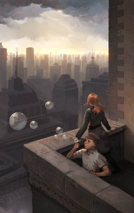
Hey everyone~I want to submit this old picture
 (Smile)")
I never finished this one but I still think it was enough work to show it here
 .
.It isnt finished because I wasnt satisfied with the perspective and the overall composition. :/
Maybe I will paint some similar picture in the future but just better.
special thanks to !chrike for his usefull overpaint.
Related content


Comments: 141


I use Photoshop CS for all my newer work
👍: 0 ⏩: 0

It needs just some tweaks tho ,but it looks pretty finished to me. Amazing mood, perspective and colors. No wonder you're one of my favourite artists!
👍: 0 ⏩: 0


Amazing scene. Everything was painted so wonderfully~ <3
👍: 0 ⏩: 1


Dang, I need to practice my values more to achieve your skill level...D :
Goes and cries in the corner due to envy*
👍: 0 ⏩: 1
Come on, you know you bash everyone with your skills! XD
👍: 0 ⏩: 1
Wah??? Compared to you, I have zero skills : (
👍: 0 ⏩: 1
nononoo and when you are in my age, you will rock even more, you cant say against something! D:
just take it as a fact! XD
👍: 0 ⏩: 0


")
👍: 0 ⏩: 0


geiler scheiss, sone casablanca romanzen stimmung haha : D der kleine junge is niedlich,schade dass er in die luft pustet xD aber das gesicht is dir super gelungen :3
👍: 0 ⏩: 0


So pretty. Shame you never finished it, but it works so great as it is. I love your use of colour here, with that gorgeous gold light.
👍: 0 ⏩: 0

finished or not that painting is amazing
bloody amazin
👍: 0 ⏩: 0

Wah ! It's a really poetic and atmospheric painting.
Admirable work ! Colors, lights, characters, they all make this scenery so peaceful !
Bravo !
👍: 0 ⏩: 0

It's really great even if you say it's not finish!...I like the light! really nice!
👍: 0 ⏩: 0

I think it's a great piece all th same. Really captures a mood from what appears to be one of my favourite eras, or at least influenced by.
👍: 0 ⏩: 0

beautiful colour palette, and spot on expression with the kids face! everything else is done nice too!
keep it up yo!
👍: 0 ⏩: 0

Tolles Bild!!!!
Mit welchen Programmen hast du es gemacht?????
Gruss mr.manders
👍: 0 ⏩: 1
dankö
Photoshop CS wie immer *prog streichel*
👍: 0 ⏩: 0

wenn ich das nur hlb so gut könnte *_*
wirklich sehr gut obwohl 2 Kritik Punkte habe ich leider oô
bzw nur einen
der junge ist echt gut gecolort und alles
doch der linke arm sieht ein wenig selsam gebeugt aus.
und wie er dieses Luftblasen teil hält sieht ziemlich gezwungen aus
aber ansonsten ein wirklich gutes Painting :3
gibs nicht irgendeinen Trick den du mir verraten kannst damit ich das auch so kann ? XD
mfg j hahn
👍: 0 ⏩: 0

Ich find die Haare von der Frau so toll... Und der HG leuchtet richtig
👍: 0 ⏩: 0

Beautifull, the background looks like watercolours
👍: 0 ⏩: 0

I think I see what you mean about perspective. Some of the areas do look a tad bit...funky?(the ledge the boy is resting on is the immediate one I noticed). But I can't say nothing bad disregarding your coloring skills. Old or not, flaws included, it's still a stunning piece
👍: 0 ⏩: 0

Um ehrlich zu sein hab ich auch ein kleines Problem mit der Komposition. Ich denke ehrlich dass das Bild ohne den Jungen besser werken würde.
Nichts gegen das Kind, ich find den Kleinen zuckerig und mag auch sein Outfit, das mich an die Fünfziger (?) erinnert, aber irgendwie stört er mich als Bildelement. Denke dass das Bild ohne ihn stimmungsvoller wäre, diese sehnsüchtig vom Betrachter abgewandte Frau wirkt für mich sehr schön mit der Weite und Verlorenheit des städtischen Hintergrunds zusammen, diese eher fröhlichen Bildelemente Junge und Seifenblasen stören für mich die Stimmung und die Komposition.
Eigentlich macht es keinen Sinn mit der negativen Kritik anzufangen, aber naja, du hast ja selbst geschrieben dass du nicht so zufrieden bist, deshalb wirst du's mir sicher verzeihen.
Toll finde ich wie gesagt die städtische Kulisse, die Frau, die sehr viel Stimmung vermittelt obwohl sie vom Betrachter abgewandt ist, und die Tiefe des Bildes.
Isoliert gefällt mir der Junge auch sehr gut, aber das schrieb ich schon
👍: 0 ⏩: 1
Danke für die Kritik
Zuerst hatte ich das Mädchen alleine dastehen aber das fand ich unsagbar langweilig ")
👍: 0 ⏩: 1
Jo, ich mag die Idee mit dem Jungen auch sehr, find nur - wie gesagt - dass er sehr isoliert wirkt in dem ansonsten ja doch sehr melancholischen Bild. Dann kommt noch die perspektivische Komponente dazu - also die Achsen, die der Jungenkörper beschreibt und die Seifenblasen führen das Auge ja weg von dem Punkt, zu dem die Haltung der Frau führt...
Naja, das haben andere schon beschrieben. Ich denke hättest du den Jungen an stelle der Frau auf die Mauer gesetzt und ihn die Bubbles blasen lassen wärs auch ein schönes, ungewöhnliches Bild geworden. So ist es eben etwas uneins, aber keinesfalls schlecht. Ich denke dass man experimentieren muss um weiterzukommen, und da kann nicht immer alles perfekt laufen. Finds toll dass du's postest, auch wenn du weißt, dass es nicht rund ist. So kriegst du vielleicht den ein oder anderen brauchbaren Impuls.
👍: 0 ⏩: 1

Hm, meiner Meinung nach ist der Junge genau richtig da wo er ist und ich mag es total, dass er da so unbedarft seine Seifenblasen in die Luft pusten kann. Ich finde ihn überhaupt nicht störend, sondern im Gegenteil als Bestandteil des Bildes sowohl formal, als auch inhaltlich genau richtig.
Ich sehe in dem Bild die Frau, deren Gemütszustand man nur erahnen kann... sie schaut auf die graue, mit geometrischen Formen geprägte Stadt hinab - für mich verbreitet sie die melancholische Stimmung. Man kann sich da vieles zusammendenken, was ihr widerfahren sein könnte, weshalb sie nun da steht... für mich siehts so aus, als war es nichts Schönes, sie wirkt auf mich, als ob sie in irgendwelchen düsteren Gedanken, verloren da steht und auf das hinunterblickt, was sie geprägt haben mag, von dem sie ein Teil ist. Dazu trägt meines Erachtens das beengende Kleidungsstück bei.
Das Kind hingegen scheint das alles nicht wirklich mitzukriegen, wie Kinder nunmal sind. Die leben in ihrer eigenen kleinen Welt und wissen nicht allzuviel von erwachsener Verhaltensweisen. Für mich symbolisiert er durch das Seifenblasen pusten etwas freies, oder den Wunsch danach frei oder befreit zu sein in dem Bild. Da finde ich auch wieder die Verbindung zur Frau, die ebenfalls diesen Wunsch haben könnte, wie eine Seifenblase losfliegen zu können. Seifenblasen zerplatzen aber...
Ich mag auch die Seifenblasen, weil sie die sehr geometrische Struktur des Bildes zerstören und das, obwohl sie selbst geometrische Kreise sind.
Naja - ich sag das nicht, weil ich Jana verteidigen möchte, sondern eher ihr Bild. Für mich persönlich sticht es nämlich aus vielen anderen ihrer Bilder heraus. Die ganzen Kommentare über die angeblich schlechte Anordnung der Protagonisten kann ich absolut nicht nachvollziehen.
👍: 0 ⏩: 1
Oh, ich sag nicht dass die Anordnung SCHLECHT ist, nur dass sie für mich nicht funktioniert - und zwar insofern dass für mich und meine subjektive Wahrnehmung keine klare Stimmung rüberkommt - und das wegen der Anordnung der Personen.
Das ist natürlich eine völlig subjektive Sache und ich finds spannend, dass du das so völlig anders siehst.
👍: 0 ⏩: 0

I love the colours and lighting.
I can see why you're not sure about the composition, there needs to be some sort of focal point. The boy could be facing more in the direction the girl is facing so the bubbles lead your eye into the painting.
Nice work!
👍: 0 ⏩: 1

I would instead have the girl facing to the viewer, alongside the boy. That way the girl will have a personality and expression, instead of just a pose. And the viewer will understand that what the girl is looking at is similar to what we see behind her. You could still have the bubbles, rise forward and then up, leading the viewer's gaze into the background and simulating the girls gaze.
As an explanation:
The awkward element in this image is that girl and boy face in different directions. They seem unrelated. Each of them is okay, so just put them side by side.
And it is always a bit of a turn-off to see the main character of a painting from the back. We want to see people's faces, we want to know how they feel. So I would definitely not want boy AND girl look away from me.
But anyway, that is a great painting. I was just about to fave it, when I read that you were unhappy with it ...
👍: 0 ⏩: 2
Thank you for your comment.
Im always glad when someone take their time for me
Well.... When I got what you wanted to say then you say its better to draw the peron looking to the viewer. And its bad to draw characters looking away. Correct me if I'm wrong.
I personally have no problem when there isent any relationchip between the characters. I didnt want to show their relationchip in the main focus.
There are many great examples showing awesome pictures with characters from behind.
Some examples : [link]
[link]
[link]
I think your ciritique has no reason at that point.
There are many more ways to show the feelings of the characters by not drawing the face.
The perspective bother me the most.
Its very boring because is the typical 45° perspective...
If I had tilt the picture a bit there would be more focus on the characters or of the city, now the picture is too unbalanced.
Well, there are so many things that bother me...drawing a new picture would be less effort instead of changing the picture
So I will leave it this way and dont touch it anymore.
 (Wink)")
👍: 0 ⏩: 1
You are right about a character facing away. And you may be right about the perspective: it is a bit unexciting, though that doen't bother me.
My main critique is that the image looks like two ideas in one painting: the boy with the bubbles drifting over the city; and the girl looking out over the city. To me they don't really go together, especially since they face in different directions. I would have made two paintings.
Did you try to do scribbles with different layouts and perspectives, before you started to paint? You could even post some of them here, next time, and get some feedback beforehand. You could use us as some kind of multi-person art director.
But anyway, I am rather happy with the image as it is -- while you are not. So, to be helpful, I tried to find what might make you feel unhappy with it. And I found a thing that I would have done differently. But then you are the artist, and you must find a way to realize your own vision. To know that my vision is different won't help you none.
And from my own experience I especially agree with your closing thought: that it is more fruitful to understand your mistakes and make the next painting better, than to try and "repair" this one. When I have finished a drawing, I have put everything that was in me into that work, and there is nothing left. Just the thought of redrawing or changing a finished work makes me tired and depressed and blocks my creativity. Making art is like a fight for me: a struggle to bring to paper what is in my mind. This is an exhilarating and exhausting process. And when I am through and come out the other side, I have either won or lost. But I cannot go back and start again. There is no "undo" in my mind.
You know, I truly love your art. It may not be perfect, but in my eyes it is very alive and I can spend a long time sitting here in front of my screen and dream myself into your landscapes and sceneries. There is a quality to your work that has nothing to do with perspective or layout, but more with the "lifeblood", with the part of you that you put into your work.
I am really looking forward to your upcoming work. And next time I will write what I LIKE about it, and I will leave writing down its faults to you :-P
👍: 0 ⏩: 1

I have no trouble with the two looking in different directions at all. In youth, you can be absorbed by soap bubbles, and when you grow older, your perspective changes (well, for most of us).
Minor improvements would be the treatment of the bubbles - they don't look really fragile and perhaps there should be some lens distortion in them - and the title, which is too obvious and explicit. Subconsciously you might have put a lot in this picture, and I wouldn't cut your viewers away from all that by a title that narrow things down so much.
But, this picture is about all of us and that's what makes it great.
👍: 0 ⏩: 0
You make a good point about the viewer wanting to see their faces. The only thing that would bother me is that if the girl was positioned next to the boy they would both be looking 'out' of the painting to the left so there would be no need for the top half of the painting.
They need to connect with the background. Unless of course *janaschi changes the composition to landscape, it would work then.
👍: 0 ⏩: 0

Honestly, I don't get some of you amazing artist. Unsatisfied with works when I would kill to be able to draw something even half as good. Well, no matter what you say, I think this is amazing, and you're just too amazing to see that.
👍: 0 ⏩: 0


<= Prev |