HOME | DD
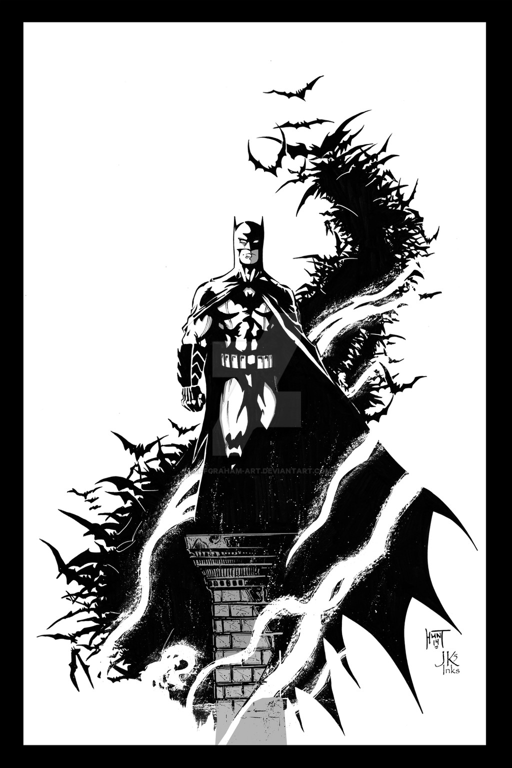
 JeffGraham-Art — Ken Hunt Batman - Sample Inks
Published: 2014-03-20 22:32:02 +0000 UTC; Views: 1512; Favourites: 34; Downloads: 24
Redirect to original
Description
This is a quick sample I did up over top of Ken Hunt pencils. He's got a ton of Batman stuff in his gallery, but I really dug the simplicity of this pic, and some of the challenges it offered.The main purpose of this piece was to push myself with brush; about 85% brush on this. A little white added by both pen & brush & one other method.
I got this all cleaned up in Photoshop, then for giggles dropped in some zip-a-tone effect, which I kinda liked so I went with it. This is my first attempt at digital effect aside from fiddling around with PS.
Pencils:
Original:
Inks: :inconJK5-Inks:
Cheers,
J
Related content


Comments: 21

 (Smile)")


p.s. I visited 's page. He rocks. So, I'm really surprised by this piece. I have to think he phoned it in - like, long distance. The other thing that puzzled me is why you picked it?
👍: 0 ⏩: 1

The reason for picking this piece was because it offered a chance at trying some different things. Rendering vs non-rendering, something with the grays, different textures for the smoke.
The other thing I like was the simplicity of the image. Bats wasn't surrounded or drowned in Gotham which seems to be a common thing.
I should have probably taken the time to set up the image a little better. Maybe a better layout on the page? Not so central to the page? A little asymmetry in the page may have helped the composition a little? Maybe the bats done in a gray? Alleviate the black smudge of the image when squinting?
👍: 0 ⏩: 1
Mia Culpa? No. It's fundamentally flawed. But you have your own agenda with practice and I'm sure it benefited you, one way or another. It's all grist for the mill.
👍: 0 ⏩: 1
Ahh...gotcha. Makes me curious; how someone, say an accomplished artist, can on one hand produce a piece covering all the fundamentals leaving few flaws, but on the other hand, produce a piece lacking the fundamentals...is it training/practice leaving a gap in knowledge, or just a lazy day?
👍: 0 ⏩: 1
This is a good one to ponder. My thought is that once the fundamentals are drilled in, they're there to stay - they're baseline.
Of course, only the artist knows how the piece happens. For example, sometimes I go through my archives and attempt to resurrect something I did years ago - and the outcome can be little better than what I did originally. And then, again, there are guys who will simply take something they did years ago and, because they have a name, now, use that to sell it. . . and so it goes.
👍: 0 ⏩: 1
Taking the easy way out...using something fundamentally flawed because it's there & easy rather than starting from scratch & developing a piece without flaws.
Gotcha!
 (Wink)")
👍: 0 ⏩: 1

Also, Some never nail the fundamentals, so their baselines are always uneven. Good days and bad days are so far apart, it's hard to believe the same person did the work.
Finally, as artist's get older, their foundations start to show more strongly - like the bones in their skeletons. You start to see where their concepts are limiting, incomplete, or flawed, and what their pet peeves are - the things they never completely nailed down. For example: Gray Morrow had problems with feet way before his illness. Wallace Wood's work sometimes lacked rhythm. Mike Hoffman fudged proportions (big heads/small bodies). John Buscema - feet, again. Frazetta, proportions (yes, the great one had dips in the baseline - they show even in his famous works). Joe Kubert . . . steady as a rock and always climbing.
👍: 0 ⏩: 0
A faithful rendering. But since the pencils are weak for so many reasons, so too the inks.
I think the penciler's core idea was a good one, but it got messed up in each stage of the execution. Faults can be traced to the foundation - gesture (wooden), proportion (head and neck too big for body), anatomy (muscles painted on like decals), chiaroscuro (a) the blacks are fragmented, (b) two equal distributions of black/white, one above the other, split the center of interest (good instinct to gray the pedestal, but too little too late). (c) The fragmented light side design of the figure runs tangent with the choppy fringe of bats, so tends to fuse with it. (d) the white pick-up lines tend to reinforce this with a graphic design that undercuts a 3D effect.
Ont the whole, the main problems of drawing on one hand, and of composition and the technicalities of framing on the other, were not anticipated, thought through and solved. It's hit and miss.
Does it pass the postage stamp test? No.
👍: 0 ⏩: 0


Thanks Ken!
I really liked the simplistic layout of the image; just Bats, with a little bit of other subject matter, and lots of white space. I felt it offered itself to a variety of moods, should someone attempt sample inking it. I liked the way it looked, just black, no rendering or gray, very reminicent of Miller. Or, you could go the complete other way, which I did a little, and offer some rendering, some gray. Lots of fun to work on. Thanks for the opportunity!
👍: 0 ⏩: 0
