HOME | DD
 jerryhazard — Relapse v1
Published: 2004-01-19 08:34:35 +0000 UTC; Views: 307; Favourites: 4; Downloads: 206
Redirect to original
Description
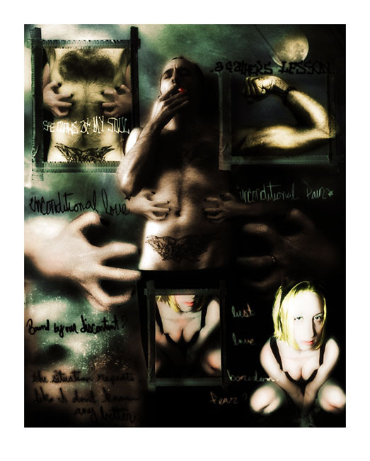
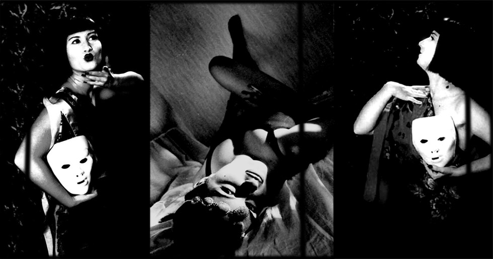
this is only a test.some may be miffed that this was not placed in digital darkroom, but , I figured it was obvious, and I consider this more expressive, than a flaunting of digita...
Anyhow. First draft of a work I must expel to be able to move ahead. First draft because it has elements I envisioned, however, it's way too jumbled/cluttered/chaotic - er, more than planned anyhow. I understand all the elements here don't work. I need to figure out how to strip it down so the negative spaces (which will be created by subtracting some things) will work with everything. Minimal is not my strongsuit.
Constructive criticism is therefore solicited. Help!
Related content


Comments: 32

Your comments have seemed to go right over my head. So I'm not really sure what's going on with the process and trials...but I am sure that I really like piece. Relapse is a frightening and lonely thing, and I believe this image captured that quite well. Great job on this. I shall continue poking through your gallery.
👍: 0 ⏩: 0

I actually suprised that I like this piece, because it's just not normally something that would catch my eye, personally. But, I stared at it for a bit and...I like the feel.
👍: 0 ⏩: 1

Thanks a lot, really. It's not the kind of work I'd usually post, but i had the need to creat this, it wasn't an idea so much as an action.
I'm a big fan of your works, so much the better - thanks again for the comment!
👍: 0 ⏩: 0


What I love most of all is the colours and overall softnes of the whole thing. The athmosphere is gritty and mysterious. I think it does work as is, but in my opinion the woman is taking too much space, maybe she could be a bit more transluscent, or at least not duplicated?
👍: 0 ⏩: 0

if this is a first draft woooah can't wait to see the final, love the collage look! this is so strong, love the dark tones and lights moody and exspressive, did an amazing job

👍: 0 ⏩: 0


I think it's looking great. All the high contrast and all its dirty sexiness is awesome. My only blah is that it be a little bigger. It's very original and powerful. I like it allot.
👍: 0 ⏩: 0

i love the central figure of you with the hands coming from behind you, but i am not sure how crazy i am about the other parts of it. 
best wishes jerry.

👍: 0 ⏩: 1
Yea, you're right, the figure and the hands are really the central points of the expression (?!), but I get carried away so easy, and sometimes just don't know when to quit.
Thankyou for the comment dear!
👍: 0 ⏩: 0

I have looked at this a number of times and these are my thoughts. I apologize for them being a bit jumbled, but these were my initial impressions and questions. I do wish it was just a bit larger.. there is so much here and its a bit difficult to take it all in at the present size.
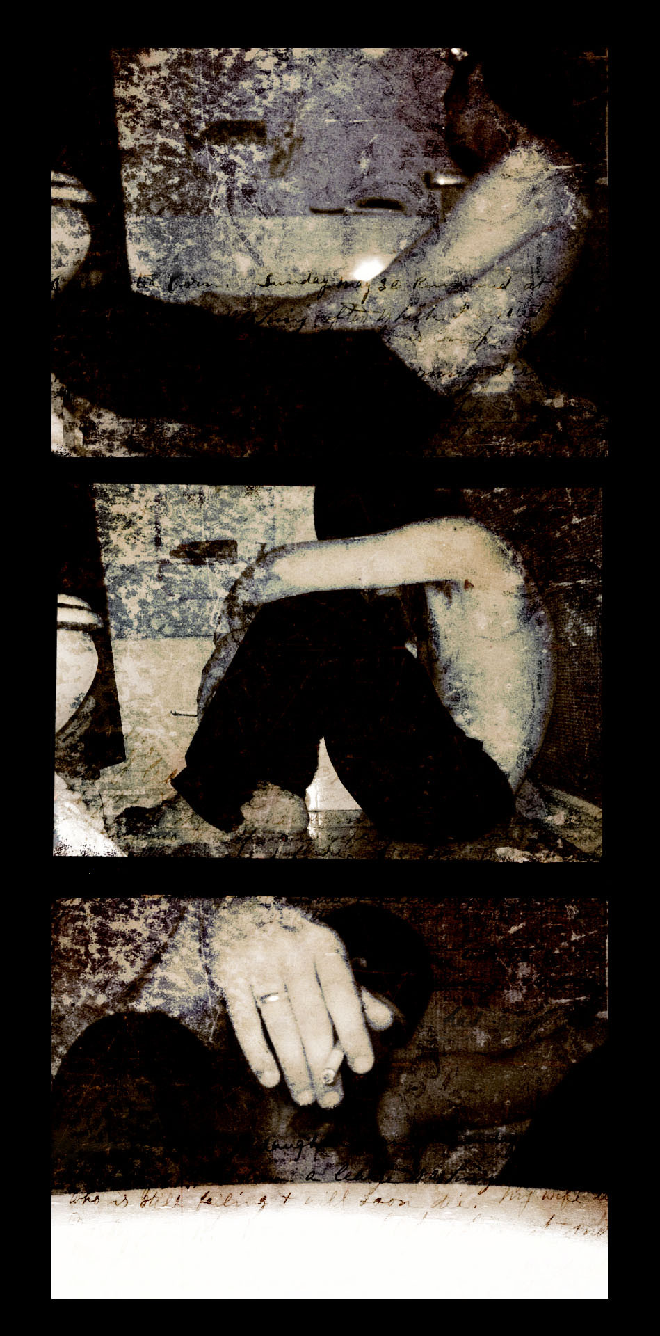
I am looking at this image and I notice her left hand has a band on the ring finger in the largest image (of the hands) in the middle. This is suppose to signify a wife, or ex-wife..?
I wish I could make out the text in the lower and upper left corners a bit more. I am just missing a couple words, but somehow I feel they are instrumental in getting the jist here.
Then.. the arm in the upper right corner is flexed to signify strength, but appears to be bound somehow at the wrist..?
The cigarette perhaps to signify a hedonistic indulgence, or to pacify an emotional anxiety..?
The green and starry night background of it all is dreamy, but also a bit creepy. Like this side only comes out at night.. an alter ego of sorts..?
As the woman is so brightly lit, I might assume that it is being said that she is the focus here, and there is not an equality in this relationship..?
So far as it being jumbled, I think in some sense that helps to convey what's going on. The situation can't be anything short of an emotional upheaval. So a cluttered atmosphere only aids that chaotic feeling.
Don't know if this helped at all. But I will say that this piece interested me greatly and took much of my attention each time I viewed it.
👍: 0 ⏩: 1
Thank you very much for the thoughtful critique/interpretation. You're pretty much on the mark (although I've never been married ) The ring was a subconcious inclusion in the image, as I didn't really notice or take though of it while I put it together.
You hit all the elements pretty spot on, either the composition was effective, or you are just way too kind ")
From your comments, the image seems to work, as you noticed and found all the intended inferences, and couple that were not. Thank you very much for taking the time really check it out, very appreciated!

👍: 0 ⏩: 0

As always great shot man.  (Smile)")
👍: 0 ⏩: 0

i quite like it actually
i'm not entirely sure how to give any constructive criticism on this one, since these type of expressive imagery is not quite my fortay, or something i've even tried.
good luck though!
👍: 0 ⏩: 0

i like all the elements of this, especially the handwriting. as far as improving it, well, that's really up to you. it may be a bit too "busy," but i really do think you should be the one to decide what should and shouldn't be removed, or darkened, etc. step away from it for a while, then come back and really contemplate what you think needs to be added or removed, or replaced.
i like it so far. good luck with it all!
👍: 0 ⏩: 1
Thank you! I thought it was a bit busy too, thusly the posting
thanks again!
👍: 0 ⏩: 1
don't worry, i have trouble with minimalism too! good luck with the piece.
hopefully we can talk on messenger again sometime soon! it's been too long.
👍: 0 ⏩: 0


nice work here
👍: 0 ⏩: 0

the chic stands out.
hey, did you know the chic was too bright.
jerry, the woman is way too hot. not that way. she's too bright.
you rock, bro!
 (Wink)")
👍: 0 ⏩: 1
Yes, you are all right about the bright chick, I thought the contrast might lend to the impact and guide the message a bit, but visually it's just a bit off the mark. Thanks, much appreciated!!
👍: 0 ⏩: 0


I think the master character wouldn't be crop (but i can see a kind of black chothe on his legs, so i don't know if it's possible), it could be better if it stay on the foreground. I really like the frame on the rigth arm. And yes i also think the girl on the rigth back is a litle bit too brigth.
Anyway i think it's gonna be brilliant !
👍: 0 ⏩: 1
I was hoping nobody would notice the crop
I think perhaps I'll chop the image in half, like from the waist up, it will cut out some the negatives space - something I have hard time leaving alone.
Thanks a ton!
👍: 0 ⏩: 0

Nice design orangement. I also like the colors you picked for this. Very moody looking. Reminds me of the movie Memento. ( I think thats how it is spelled?)
👍: 0 ⏩: 0

a fathes lesson. that's superb. I agree about how bright the girl is though.I want to oppose reflectors comment (not to confuse you) just because i think this has just the right amount of " elements" in it.
👍: 0 ⏩: 1
I think the magic image lies somewhere in between, I think there are too many elements, but they could also be distributed a bit more thoughfully as well.
yes, the girl is way too bright, she's getting the axe!
thank you much!
👍: 0 ⏩: 0

These are very bad thoughts jerry. If you keep thinking about these things you maybe sent to hell! ha ha ..
Ok. I agree with other comments that the girl is too bright. But I think the problem is flat lighting on her as much as overall brightness. So I would use the gradiant tool on just that picture to make one side darler.
Also I think there are too man elements in the picture. You may want to just not repeat pictures and put one behind the other instead of framing all in the same composition. That would give you just 3 subjects in the same picturee which should make it less cluttered.
👍: 0 ⏩: 1
You're right, it's not necessarily that she's too bright, but the lighting is so different than the rest of the image, and since there hardly any texture on her, it is difficult to darken her to match, even with careful levels and curves tweaks.. I some images that will probably fit better....
In the final image, there will be less elements, unless I can can come up with a better way to tie them together, as they are all key to the expression.
Thank you very much for looking, your input means a lot.
👍: 0 ⏩: 0


this is excellent work
like the other guy said i think the girl in at the bottom is too bright, and the her image seems much cleaner/crisper than the rest of the piece, but still its an amazing piece of work
look forward to seein the next versions
👍: 0 ⏩: 0

i like the composition, but i think the girl on the back is too bright
👍: 0 ⏩: 0