HOME | DD
 jessehbechtold — Soothsayer
Published: 2013-06-19 03:16:18 +0000 UTC; Views: 1286; Favourites: 43; Downloads: 0
Redirect to original
Description
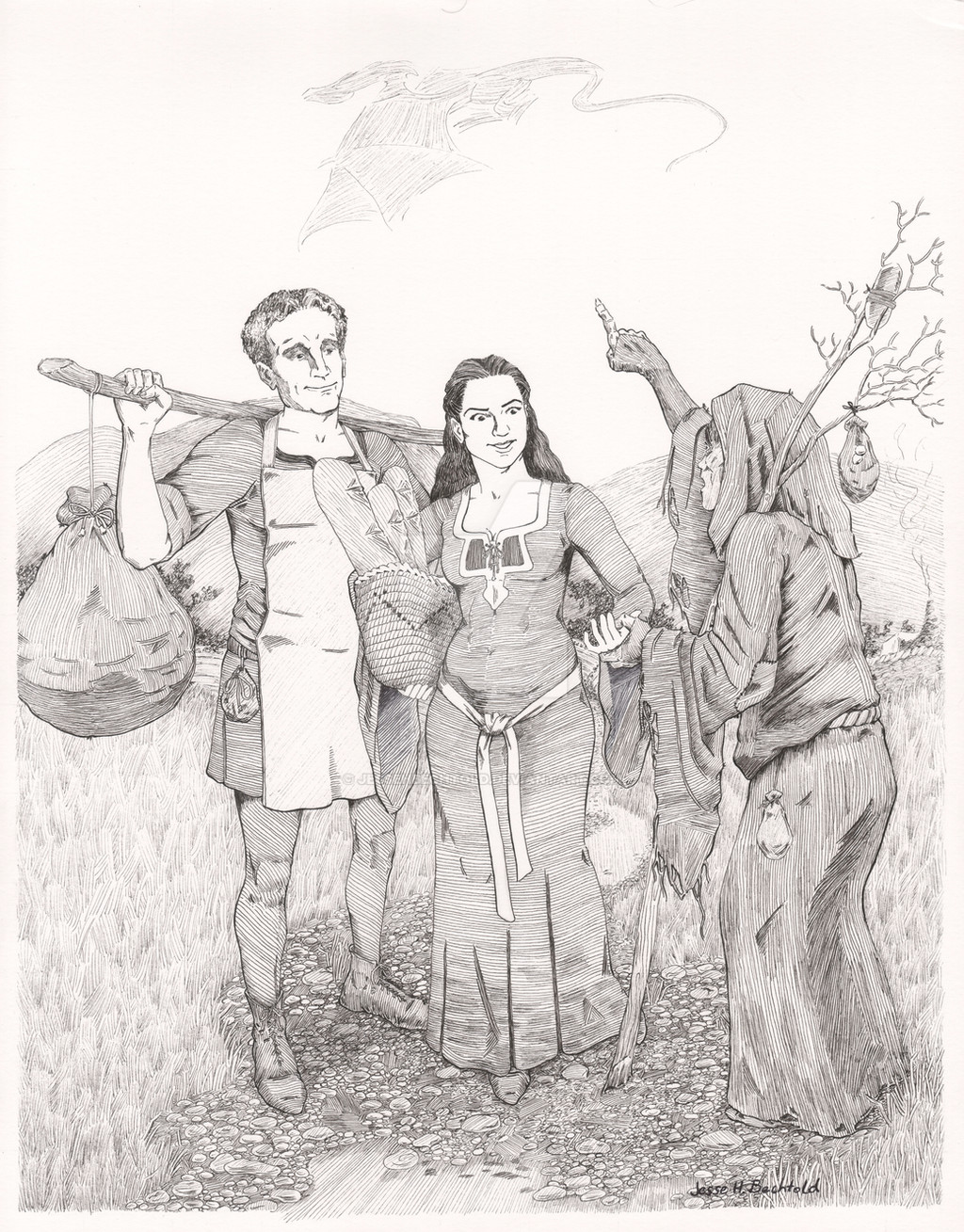
This is probably the first time I've ever set myself a deadline and actually kept it. I just wish I could give myself a raise for that...sigh...So, this is the first picture in a series of about fifteen I'm orchestrating to tell a story a simple narrative using single plate illustrations only, much in the way Hogarth would to series of etchings and paintings to do the same. I learned a lot with this one and I'm quite proud of it actually. I can of course see places for improvement, the moment I don't see those means I need to put my pen down, but in all I could myself making a step. The landscape is a bit hard to see, but it is based on Wales (I figure if a dragon is going to be in the story Wales makes quite good sense). It'll feature more in later images as this narrative will be a great excuse to get into some Bruegelesque compositions. Very proud of the young woman and the rocky, slatey mud road in the foreground, the textures really work for me, though I need to decide if I should put in color. Any comments and critiques quite welcome!
Pen and Ink on Bristol Board
Related content


Comments: 19


wonderful line work. I think varying the pattern in the grass (making it smaller?) would add some depth. Also the dragon would be more interesting if it was turned from a centered profile view to something more asymmetrical. Great work on the foreground-ground. It would be fun to see this with some color washes.
👍: 0 ⏩: 1

Thanks, I think I'll try some color digitally and see how I like it. I agree to a degree about the dragon, I was going mostly for recognition more than anything else, so I can unleash a truly dynamic dragon later on.
👍: 0 ⏩: 0

Jesse, excellent work...and kudos to you for embarking on a storytelling mission. I'll look forward to "reading" the rest. You're right, in that the rocky, muddy road is really well done. And...ok, maybe this is dumb...but the shoes are excellent! Especially the guy's right shoe...that line work is worthy of the masters! And the upper half of the girl's dress...beautiful line work.
Can I pass on a piece of advice I got from another artist? "...just always think, that any geometric pattern with right angles will flatten an image, which is counter productive to all the work you do to flesh out your image. The uniform repetition of armour or fabric ebbs and flows with the form it covers. It's only a geometric grid if its laid flat on flat surface. It's painstaking."
When I look at the guy's legs, or his right arm, or the lower half of the girl's dress, it looks a little flat. It seems like there should be more contours around the edges...that would give those areas more depth. It may also help to vary the line width more, which will get you greater value differences.
I'm working on this stuff myself, and I'm certainly no expert. I'm not really posting anything right now, because I'm trying to work out some things stylistically. But I have uploaded a couple of pieces to my stash, just for the purpose of sharing them with some of my inking buddies. I'm not saying these are great examples, but I'm working with line weight and contours, and yes going back to the old masters for "advice". [link] and [link] . I really struggle with fabric, and I think my next piece will be an exercise in rendering the folds of fabric with lines.
👍: 0 ⏩: 1
Now that you mentioned it all I can see are those problem spots with the contours! Aaagh! Oh well, I can always go back in and beef them up thankfully. And thanks for the critique, I've been struggling with contours lately, or maybe I should say, struggling with the idea of contours. I used to use what I call the "Mucha Contour", but I love good "alla prima" painters (like Sargent) and I've been trying to capture that quality with pen and ink, much how I feel Booth did, and because of that I've been down playing contour a bit more than I used to, but I think you're right, need to get a little more back in there. The hatches describing form better in the lower half of the dress and the guys arm...yeah...I readily concede that, I thought the same thing after looking at it again after a good nights sleep. But, still happy with it, increasing the contours and varying line width more be easy enough and, well, next time I draw a dress I'll have to pay more attention to underlying form. Actually, the next in the series will be interesting because I'm going to try some blur effects. So...it's going to look really cool or really...um...abstract expressionist.
👍: 0 ⏩: 1
Wow. OK, I'm somewhat familiar with Sargent (his "Portrait of Elsie Palmer" at the Colorado Springs Fine Art museum is mesmerizing seeing it "in person"...that was really my first exposure to him and it blew me away), but I wasn't familiar with the term "alla prima". Now I get it, and see the connection between that style and what Booth does with ink. Wow. That is a great insight. I always thought his flat patches of hatching were kinda weird, but they totally work. Now I can see the stylistic precedents and that's very enlightening.
So yeah, don't go all Gustav Dore' just because of my comments; working on a alla-prima-ish hatching technique is really cool. I'll be interested to see what you come up with next.
👍: 0 ⏩: 1
Oh no, you're absolutely right about the flatness in some areas (forgive me if I disagree about the guys legs, I'll give you the arm and dress though) And thanks for noticing the shoes, I am, actually, proud of how those came out. In the Nelson Atkins museum in Kansas City there's two Sargent studies, a portrait and full body portrait and, well, OH MY GOD! They have a Rubens and a Caravaggio too and Sargent's the one I stare at for hours drooling slightly. He's one of those few painters that makes me want to throw away my pens and try painting again. Actually, I wonder if Booth ever thought of his technique as alla prima himself. I don't think so, but that would definitely be a question I would ask him around the proverbial "what historical figures would you have for a dinner party" table.
Dore' (as I believe) was one of his inspirations, certainly etchers and wood engravers were, and etching can have an alla prima look to it depending on how you do it. Ideally I'd love to find some sort of compromise between Booth's hatching and, say, Mucha's contour and Dore' I think come close to that even though he was before either. Plus, Dore's atmosphere, as I'm sure you know, is jaw dropping at times! Even more successful than Booths when at his best, and that almost feels like heresy saying that.
👍: 0 ⏩: 1
You should check this guy out: [link] . He strikes me as a mash-up of Dore', Booth, and Wrightson, but wow, some of his work is stunning. Especially the first Harry Potter piece is very Dore-esque. I love his use of what looks like white ink over black.
👍: 0 ⏩: 1
His stuff is pretty awesome. Is it pen and ink or scratchboard?
👍: 0 ⏩: 1
It's actually a combination...something I didn't know about before. In the UK, they call it scraperboard, which is basically a scratchboard surface without the black ink. It's white, and you draw on it. In areas where it's mostly black, you just lay down your black ink, and then scratch in your white lines. In other areas you just ink as you would on white paper. I picked up a couple of pieces of something they call clayboard here in the US, which seems to be the same kind of thing, but it's on a thin piece of masonite. I'm going to experiment a bit on that before I order any scraperboard, as it's pretty expensive. The best brand seems to be EssDee (ww.jerrysartarama.com/discount-art-supplies/scratchboard/essdee-british-scraper-board-and-accessories.htm).
Here's another guy who seems to have mastered the scraperboard technique. He's a commercial artists, and has some good tutorials on his site: www.inkart.com/index.html
👍: 0 ⏩: 1
Yeah, I've heard of scratchboard, there's a number of great artists out there who use it, I'll try to dig up a few names as my mind is a bit blank now.
👍: 0 ⏩: 0


I appreciate it, thank you!
👍: 0 ⏩: 0

Oh yes, very well done. Good luck with the series, it should be good.
👍: 0 ⏩: 1
Thanks, the funny thing is, I'm kind of "writing" it picture by picture, so I know where I want to end up, I'm just hoping it ONLY takes fifteen plates or I'll still be doing this come Christmas when I actually want to publish the thing!
👍: 0 ⏩: 0
