HOME | DD
 jflaxman — Garjael: a work in progress
Published: 2010-10-06 23:28:18 +0000 UTC; Views: 3148; Favourites: 32; Downloads: 111
Redirect to original
Description
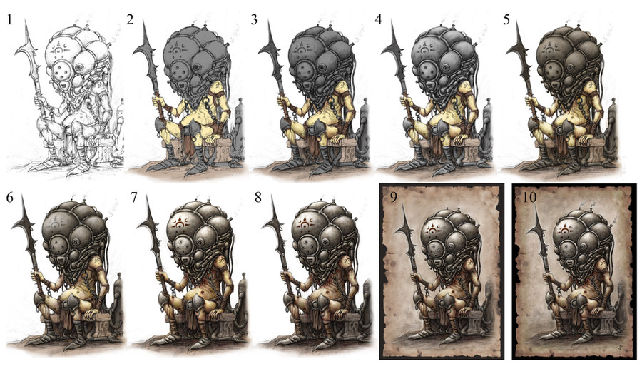
Garjael: A work in progressHere are the various stages I went through to complete a recent work. If you're new to Photoshop this might make things easier, and if you'd do something differently, feel free to give advice!
1. The original is drawn in pencil. I usually start with a 4H and add darker lines with a 2B. When I'm satisfied with the result I scan it at 500dpi and open it in Photoshop.
2. I've added a new Multiply layer and filled in the basic colours using a hard brush at 100% opacity. It doesn't look that great right now, but this is only the beginning.
3. I've added a second Multiply layer and given the picture some basic shading using a softer brush at a much lower opacity. I haven't used much colour yet as tone is more important now.
4. I've flattened the image and added highlights using a soft brush at a low opacity. The picture doesn't look as flat, but I feel it's too bright and clean - the backstory calls for a more weathered look.
5. I've added a new Multiply layer and darkened all the metal and cloth with a hard brush on 100% opacity. I've also darkened some of the shadows around the bench with a softer brush on a lower opacity.
6. I've flattened the image and started building up the highlights and shadows. Hard surfaces like metal should have greater contrast, while softer surfaces like flesh should have more subtle variations. Different brushes can be used to help bring out different textures.
7. I've taken the last step further and added finer details like the symbol on the helmet and blisters where it meets the skin. The flesh is mostly shaded with yellows, reds and browns, but adding subtle hints of blue, green and purple will give it more weight and depth. With practise the right combinations can make flesh look healthy or diseased - here I'm going for diseased.
8. I felt I'd overdone the yellow, so I reduced the saturation, giving my subject a pale, almost necrotic appearance. This fits in with his description in my extended narrative.
9. I've torn and stained a piece of paper to give it an ancient look, scanned it and opened it as a new file in Photoshop. From there I've cut and pasted my first picture onto it. The edges had to be cleaned up with brush and eraser tools, but this didn't take me very long.
10. I've retouched the edges of the paper with a soft brush on a low opacity setting, added some final touches like the fumes escaping from the helmet, and flattened the image. Now the picture is complete and ready to print or post online.
Related content


Comments: 6

This was most helpful! Very interesting to receive an insight into process behind your creative work.
👍: 0 ⏩: 1

Thanks! I used these techniques for most of my work before 2014. These days I usually scan a drawing, copy and paste it, change it to a Multiply layer and add the colours and background in normal layers under it. It's similar to cell painting used in traditional animation; I've found it saves time and gives me more control over colours and tones. I might post another series like this soon!
👍: 0 ⏩: 0

Im loving the design and the beautiful way you've coloured this. Awesomely done indeed!!
👍: 0 ⏩: 0

interesting.. could be useful for my future illustrations, thanks man ")

👍: 0 ⏩: 0

I kinda like the contrast of the white background.Character seems to pop more in #8
👍: 0 ⏩: 1
You're right, #8 stands out better especially on smaller prints. I'll post a variant some time soon.
👍: 0 ⏩: 0