HOME | DD
 Jim197 — USS Enterprise at Midway 331

Published: 2012-06-12 11:26:35 +0000 UTC; Views: 5158; Favourites: 76; Downloads: 234
Redirect to original
Description
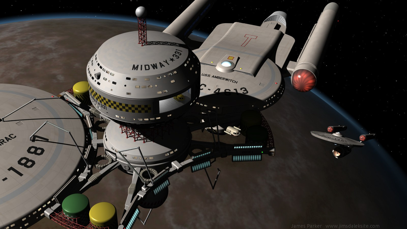
The USS Enterprise docked at the space station Midway 331.I'm calling the Midway 331 space station model finished for now, though I will probably come back to it and make some improvements in future (because nothing is ever really finished). I'm very happy with how it has turned out, although it isn't what I originally had in mind: it is bigger than I intended, it's ugly and top-heavy, and the middle section is over-complicated, but I think it is probably all the better as a result.
Rendered using POV-Ray 3.6 on 11th June 2012.
Picture updated on 16th September 2012 to add a watermark.
Related content


Comments: 28

I like this station design, definitely built for function on the frontier.
👍: 0 ⏩: 0

I love how the docks are curved to wrap around the hull of docking starships! But what happens for starships whose hull configurations don't match the diameter/curve of your docking ports?
👍: 0 ⏩: 0

Thanks, I'm glad you like it
 (Smile)")
👍: 0 ⏩: 1

You're welcome!
Rumor has it there's yet another hacker going around, please be careful.
👍: 0 ⏩: 1
I will, and thanks for letting me know
👍: 0 ⏩: 1

Thank you, I'm glad you like it
👍: 0 ⏩: 0


Thank you very much, I'm glad you like it
👍: 0 ⏩: 0


Excellent work! I love how the look stays true to TOS.
👍: 0 ⏩: 1
Thank you. I tried to build something broadly consistent with the original TOS look, so it's nice that other people think I achieved it in some measure.
👍: 0 ⏩: 0


Thank you, you are most kind.
👍: 0 ⏩: 0

How can it be "top-heavy" in space?
Great job.
Take a look at mine if you have the chance. Just a "front" view though. [link]

👍: 0 ⏩: 1
Thanks, I'm glad you like it.
It's top heavy in the sense that the bulk of the mass, and therefore the natural centre of rotation, is 'above' the docking ring. This means that if the station-keeping thrusters fail and it starts to rotate, docking a rescue vessel would become well nigh impossible. However they have transporters, so it doesn't really matter.
👍: 0 ⏩: 0

I love it, especially the dock's robot arms and the shuttle bay. Definitely looks "TOS functional." It's simple while pushing the detail factor forward. That top tower with the sphere looks especially stark though, like it could use a little more. Maybe some small tanks or other sensor/communication style bobbles lower down on the gantry or at its base. It's no biggie really, especially if you're trying to avoid things being too top heavy.
As for the colors, I think the red is fine. Great even. I love the yellow tanks though. That looks very natural. The green tanks feel a little agrarian to me, but where I live and commute that color green just screams "John Deere at your local farmers' CO-OP!" So that's been the extent of my exposure to it  (Wink)")
All in all, I love your modular style and bold approach at putting it all together.
")
👍: 0 ⏩: 1
Thank you, I'm glad you like it.
I agree that the top tower looks rather bare, but as you surmised I was trying to avoid adding any more to the top end. I wasn't even going have the tower, but I felt that the design looked more 'Trek' with it.
The green is there because I was trying to get away from starfleet colours, and green is the one obvious colour they never seem to use. Maybe that's with good reason though. I will leave it as it is for now, but maybe change it when I next revisit the model.
👍: 0 ⏩: 0

Looks great to me. Very functional, which I always like to see.
The only thing I'd question is the red gantry work - not sure it quite works. I think maybe it's the colour...but that's just a personal preference, I think.
Everything else is really well done.
👍: 0 ⏩: 1
Thanks, functional is what I was aiming for.
I was trying to be fairly bold with my use of colour. It's all too easy to keep building ships or stations that are all white or grey, and I wanted to get away from that. I admit that the bright red is very bold though; I had to fight the urge to tone it down. I will how it wears with time, and maybe dull it down when I next revisit the model.
👍: 0 ⏩: 1
I'll look forward to seeing any changes you make.
Despite my reaction, I whole-heartedly agree with you on colours. Given the working environment, it would only help to clearly show which bit of the vessel or station is which!
👍: 0 ⏩: 0