HOME | DD
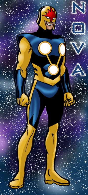
 Joe-Singleton — Nova redesign
Published: 2010-10-04 23:13:07 +0000 UTC; Views: 1404; Favourites: 13; Downloads: 37
Redirect to original
Description
I was inspired to do a new design for Nova, and while I was at it, I took a shot at some of his villains, as well.Related content


Comments: 6


I have to say this is a great design for Nova - again combining both the classic 70's icon traits with the modern Annihilation design. Thanks for sharing Heroblog!
👍: 0 ⏩: 1

I was surprised how easily it came together. Sometimes, it's a real chore to come up with a new design.
👍: 0 ⏩: 1
My own redesign was based on comments submitted by members at Nova Prime Page yahoo's group. For the most part many like the Annihilation design however the "spikes" have always been a slight contention point (pun intended) especially when you see how big Mike Deodato draws them in SA! I took the comments and thus designed a uniform incorporating also design aspects for the modern US military and hence the look I got.
Like I said great design and you're very welcome to pitch in a few for the Nova 619 universe when time permits! And yes I liked Powerhouse best! Daz.
👍: 0 ⏩: 1
Yeah, the spikes could be a problem. Some artists just have no sense of what's needed in a fighting suit. Those spikes are like offering your enemy a handle to grab, and in the old days of edged weapons, a place to "catch" a sword.
You know, thinking back on the old Nova series, it was quite the sausage party. It was like a boys' clubhouse, "No girls allowed". Nova needs a female adversary, doesn't he?
👍: 0 ⏩: 0