HOME | DD
 Joey-Zero — Adam Payne
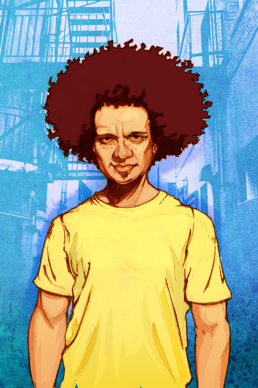
Published: 2006-11-09 14:04:57 +0000 UTC; Views: 3709; Favourites: 70; Downloads: 36
Redirect to original
Description
This dude's a local Soul/funk artist here in Boston... Check out him and his band...[link]
Keep an eye out for some more work based on his band. They're pretty slick.
Related content


Comments: 40


So, I just found out about Adam's tunes today... followed his myspace link of this image to your blog and then to here... wow man - GREAT WORK!
👍: 0 ⏩: 0


pretty sick man, the only thing i dont like about it is how his fro is mostly one solid shape, it makes it look kinda flattened. really like how you outline them though.
👍: 0 ⏩: 1

Yeah I might go back in and add a little more texture to it... I tried to stylize it to separate it from the rest of the image, but it wasn't as effective as I wanted it to be.
👍: 0 ⏩: 0


quick question.. how long does it take you to create stuff like this from scratch? do you place a photo on the lowest layer and then draw over it, or what's the deal?
it's just that you keep churning out incredibly detailed and realistic vectors one after another, and i'm in awe of your talent..
though now that i look closely, do you think his 'fro could use a bit more detail?
other than that, stupendous piece, as always.. props..
👍: 0 ⏩: 1
I drew this out in pencil first, scanned it in and just did all the coloring on layers underneath the layer the pencils were on in Photoshop. So it's not a vector. I wanted to sort of leave the fro more stylized to separate from the realistic person, you know?
👍: 0 ⏩: 1
yeah, i feel ya.. it does give it that contrast of sorts, between the rest of the frame.. great illustration, no matter how you put it..
")
👍: 0 ⏩: 0

Thank you... Yeah I'm running the whole orange and yellow background thing into the ground.
👍: 0 ⏩: 0

Oooh I'm diggin those tunes. This piece does a killer job reflecting their vibe too. Awesome yet again my friend!
👍: 0 ⏩: 1
Yeah, they're pretty coo'.
👍: 0 ⏩: 0

Woiii man.. I'm baccckkk!!! hahhahha shittt.. u alwasy shock me..!!! 

👍: 0 ⏩: 1
most welcome.. mate..!! 
👍: 0 ⏩: 0

killer! Love your line style and feel to the whole illustration. REALLY nice stuff!
👍: 0 ⏩: 1

This smacks of character and your colors/textures in the BG help make the portrait itself 'pop'nLock!
nice one.
the band's gotta an interesting sound to em too.
👍: 0 ⏩: 1
Thanks dude... Yeah they do.
👍: 0 ⏩: 0

Thanks so much! It's all charming at first, then it gets lazy, doesn't take out the trash, doesn't put the seat down...
👍: 0 ⏩: 1
Yeah, after reading it, I really didn't get it either. Sorry 'bout that... Another failed joke I guess.
👍: 0 ⏩: 1
 (Wink)")
 (Cool)")
Thanks... Yeah I dig the music a whole lot.
👍: 0 ⏩: 1

Soul,funk etc,my favorite musicstyle
👍: 0 ⏩: 1
Yeah, it's really good stuff.
👍: 0 ⏩: 0

God damn that's awesome looking, Joe! Every line looks perfect, and I'm still in jealous-awe...
-Shane


👍: 0 ⏩: 1