HOME | DD
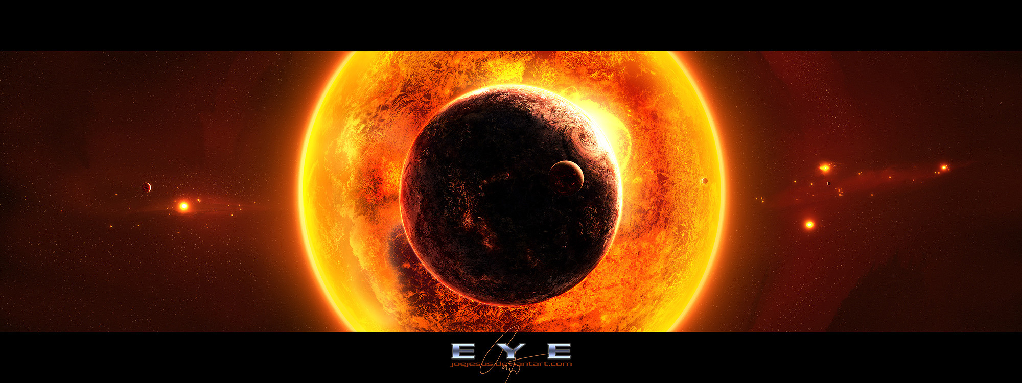
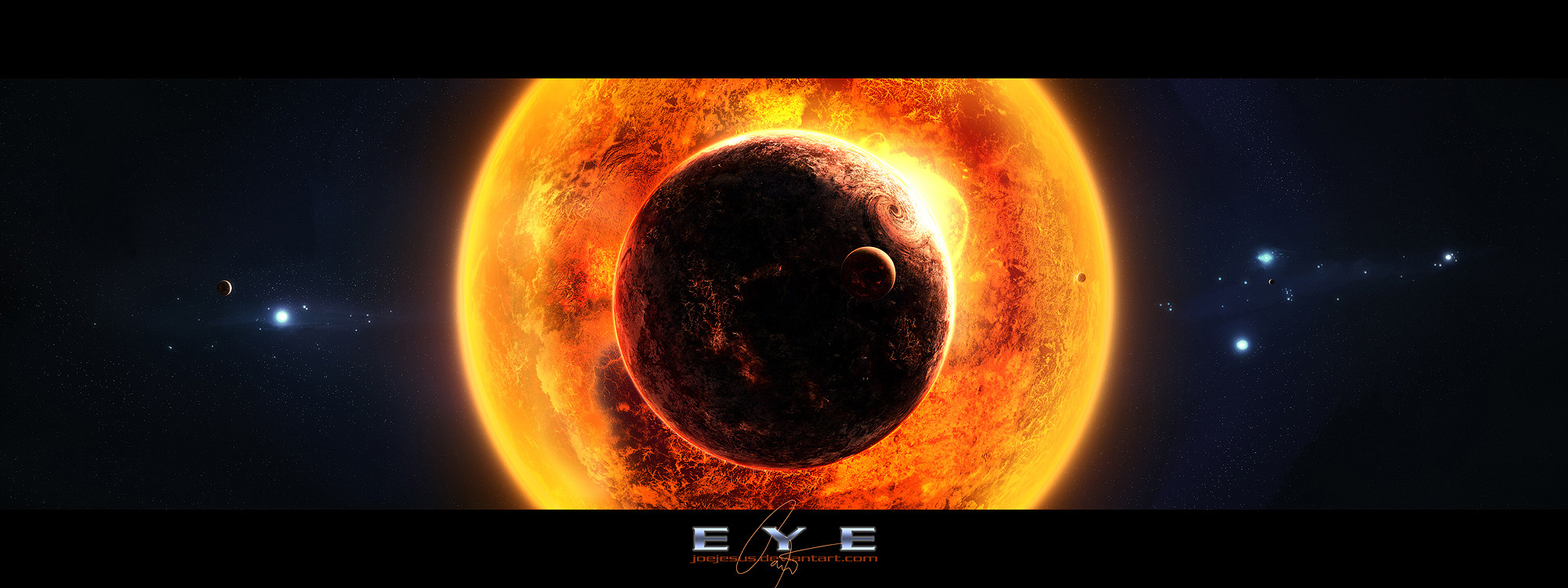
 JoeyJazz — EYE - warmer version
Published: 2008-01-10 16:33:28 +0000 UTC; Views: 14046; Favourites: 266; Downloads: 0
Redirect to original
Description
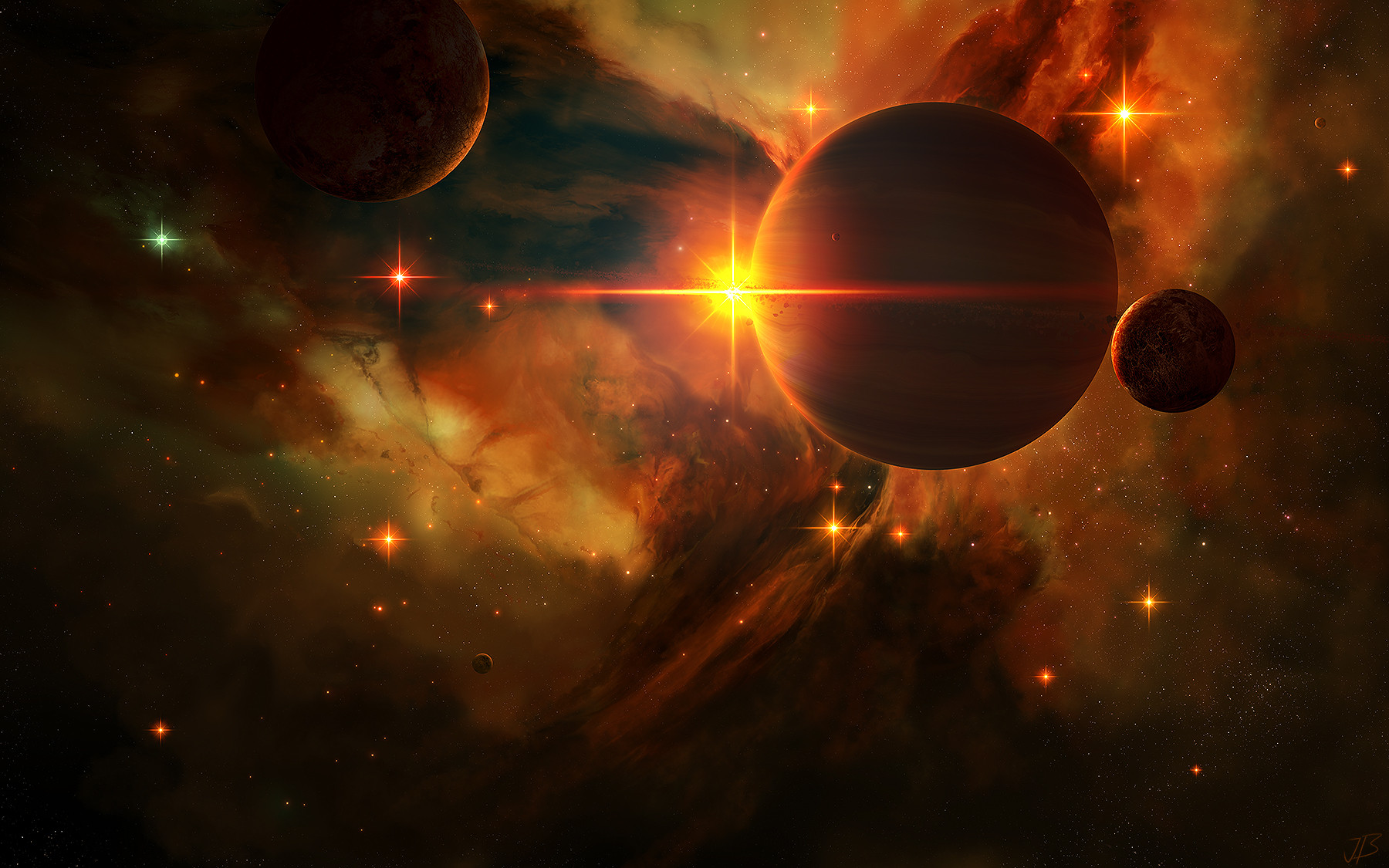
This is a warmer version of the EYE deviation... [link]Originally in scraps, but hey - people need to choose what they like...
Edit: Changed the overal shininess of the sun...
thx for suggestions
Related content


Comments: 36

Now this is a great piece of art. Good job, very impressive, all your art is fantastic.
👍: 0 ⏩: 0


Normally I like the 'cool' or blue versions, but I like this one. It just is visually more pleasing to my eye. If you're looking at something so bright, it tends to outshine everything else in view, and that is what is happening in this version. It is beautiful.
👍: 0 ⏩: 0

hard to say because the blue makes the warm colors stand out and the warm colored version makes it look like its emitting the light out of it beautifly
👍: 0 ⏩: 0

no problem. i just hope you get your art theft issue resolved. some people are just ruthless/brazen thieves. don't let 'em get you down (cause i'm selfish and want more awesome art)
 (Wink)")
👍: 0 ⏩: 1

It was probably already solved - the wallpaper with my picture is gone and the advertisement vanished as well
👍: 0 ⏩: 0


👍: 0 ⏩: 0


i do believe i like the cooler one better. both are amazing though...
👍: 0 ⏩: 0


Spectacular... literally.
Before full-view it looks just like an eye... but after... jeez, that looks cool! Or, hot? Either which-way, +Faved!
I could have sworn I already commented on this a few days ago... Then I remembered today, that the power went off for a second right when I was making this(But after I faved ")
I prefer this to the other version... while they're both great looking works, the red suits this piece more, in my opinion.
👍: 0 ⏩: 0

Spectacular!
But, the sun looks more lika super-heated giant... o.o
but doesn't really matter, it got my attention.
👍: 0 ⏩: 1
Well, there would be probably just a bright light with tiny black circle in the middle - it is quite impossible to depicture the sun realistically at this scale
👍: 0 ⏩: 0


I prefer the outer nebulae and the inner planet in this version. But it's true that the sun is lesser in this version, it feels a bit burnt, and a larger outer and inner glow would be nice I think.
👍: 0 ⏩: 1
I'll try to work on this one - the problem will be with the inner glow - now it is at its maximum
👍: 0 ⏩: 1
Ah! Try gaussian blurring something.
👍: 0 ⏩: 0

i agree with alex, could use some solar flares
still very hot
👍: 0 ⏩: 0


This is stunning, i think i like the blue version better.......colour go great  (Smile)")
👍: 0 ⏩: 0


I personally thought this would have been the "main" one. The glare given off by the sun would flood your vision with a red glow which fills any areas darker than the Sun itself. It also looks hotter as a whole, and those other stars don't seem to be too far off from their death either.
👍: 0 ⏩: 1
Yeah, I actually realized that none of those two is the main one (later I'll add a print even to this one) - its just the question of choise (hey - their are both my childs, I like them both - the blue one is older though
👍: 0 ⏩: 1

i prefer this one, the red background coincides with the large sun, the light output of that sun would be pretty large so this portrays that nicely. faved
👍: 0 ⏩: 1
Yeah, its a kinda warmer 'gay' version... ...some (4%) people like it that way...
..just kiddin'...
👍: 0 ⏩: 1
hahaha. if wasnt so far away id throw a pie at you, wait a pie is to good, maybe a brick painted to look like a pie hehe
👍: 0 ⏩: 0

Brilliant, this is brilliant. I'm not sure about the blue background in the other version, but this goes directly

👍: 0 ⏩: 0