HOME | DD
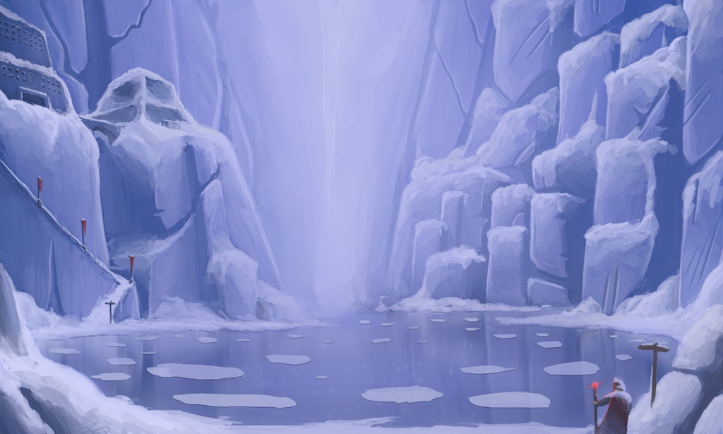
 joeypoolart — The Wanderer | 02

#clouds #conceptart #digitalpainting #epic #fantasy #landscape #mountains #snow #storm
Published: 2017-12-13 23:31:14 +0000 UTC; Views: 601; Favourites: 18; Downloads: 0
Redirect to original
Description
The second painting in a series of digital paintings called "The Wanderer"This one was a joy to paint. It was challenging but very satisfying to "sculpt" the clouds into this composition. I also omitted using photo texture, because of that, the painting feels "owned".
Critique is always welcome
 (Smile)")
www.instagram.com/pool_joey/
Related content


Comments: 2

This is just plain stinking gorgeous. I faved it immediately when I saw it, because the work on the clouds and mountains...I can't even. Lovely colors, soft light, so pretty.
Now I'm back because I saw that you welcome critiques, and I welcome a challenge to my brain. It goes without saying that everything is perfect. But beyond the perfect, and after some thought, I started playing around with some ideas.
Thought 1: I wonder what the picture would look like if the small figure popped more, whether that's with some color trick or contrast trick.
Thought 2: Ignore that. What about this - the funnel of the clouds is aimed from the top right to the bottom left. What if the figure was on the other side of the picture, on the mountains to the right? Then the figure wouldn't be observing the cloud whirlpool, but potentially be a direct line of sight/approach of it. (or perhaps summoning it, or in some other way interacting with it).
Thoughts 3: What would happen if you punched things up a bit more by adding in a second color. You have blue - what about yellow for some color contrast in the highlights, or in the depths of the whirlpool. Menace! Intrigue! Mystery...
All that said, keep doing what you're doing. Because what you're doing is magic.
👍: 0 ⏩: 1

Thanks Ninebark, for the amazing feedback!! It is always hard to make the last decision when finishing a painting, so many choices, and I always get completely blind towards my own work after a while. So the critique really helped!
I should try to put the figure on the other side of the paintings, it feels like it is indeed the better choice. The figure disappears to much in the corner right now.
A second colour would probably help a lot in creating more contrast, intrigue and a stronger dynamic. It does feel a bit flat sometimes. I guess the reason I didn't do it was because when I started I set out to make a more monochromatic painting, but I guess I should not feel restricted to keep it that way.
Again, thanks for the great feedback and all the kind words!! I am definitely going to try your suggestions out!
👍: 0 ⏩: 0