HOME | DD
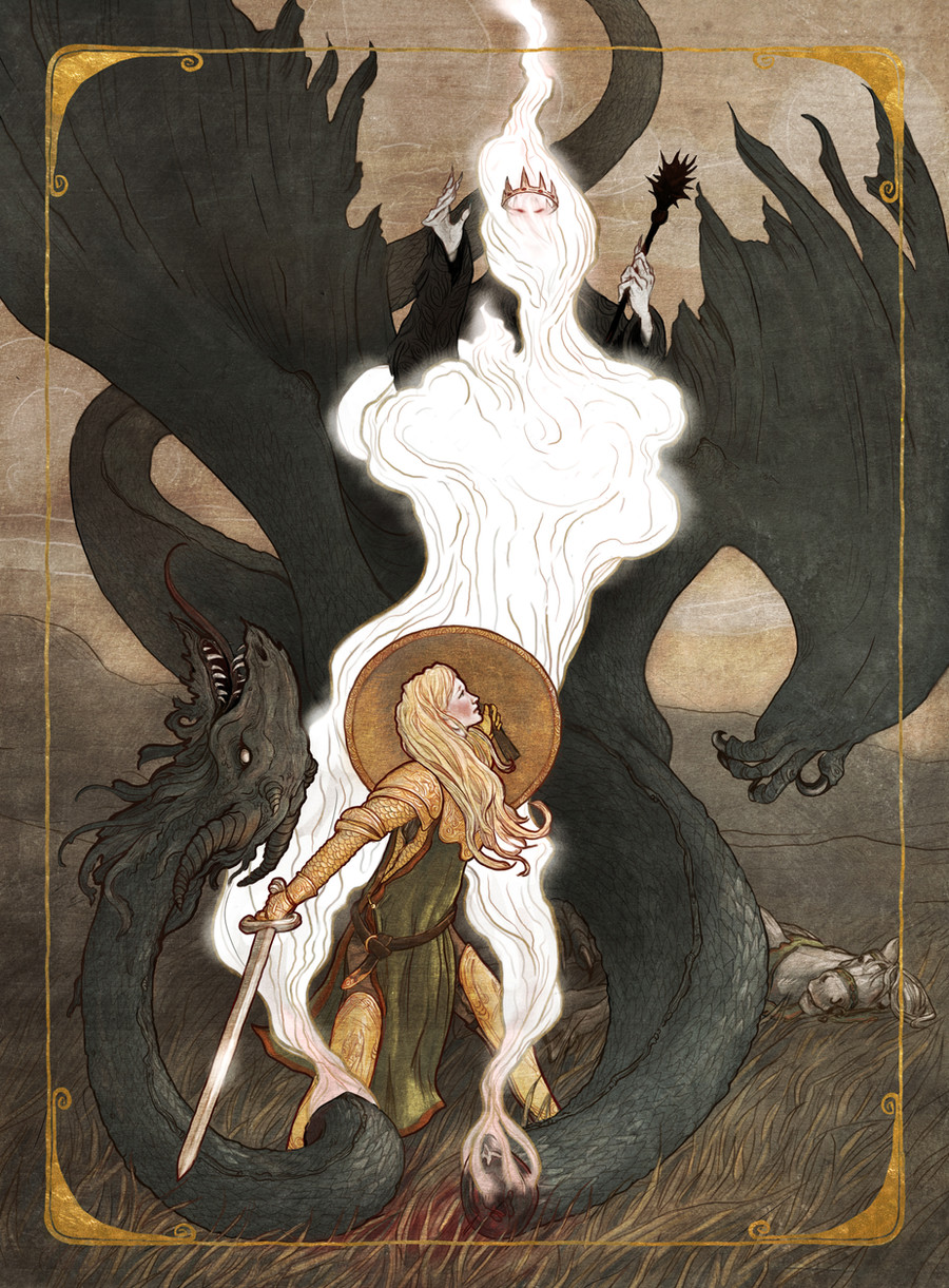
 JonHodgson — Eowyn and the Nazgul

Published: 2011-05-18 13:38:29 +0000 UTC; Views: 22802; Favourites: 557; Downloads: 0
Redirect to original
Description
©2011 Jon HodgsonMy entry for the ArtOrder community contest "Eowyn and the Nazgul": [link]
My schedule was crammed with deadlines around the time of the contest, so I chose to do something that I knew I could get finished, and which would hopefully stand out against all the inevitably brilliant and epic oil paintings.
I really wanted to take part, so whilst I don't think this is a winner I at least got something done in time, and could join in with all the Middle Earth fun. I think working on an actual Tolkien product, but not able to share in the public challenge fun would have just been too painful to bear!
Artrage, Photoshop, Painter, Smoke
Related content


Comments: 49


This is awesome! I shared it on a LOTR Facebook fan page I admin...don't worry, I gave credit, of course XD But anyway, I love it!
👍: 0 ⏩: 0

 (Wink)")

I've always thought that water colour was one of the hardest art forms. Well done!
👍: 0 ⏩: 0

The composition makes this one truly stand out. Fantastic.
👍: 0 ⏩: 0

I just heard about this on Ninja Mountain (I have been catching up...4 more episodes and Ill be up to date ")
This is really stunning!
The composition is gorgeous.
👍: 0 ⏩: 0

This is the closest portrayal of King Theoden that I imagined when I read the book. I really don't like the look of him the film. I like the "food chain" you have going on in this picture.
👍: 0 ⏩: 0

")

which of these above (Artrage, Photoshop, Painter, Smoke) do you use mostly?
👍: 0 ⏩: 1

Hi,
For the actual painting part these days I mostly use Artrage. I have replaced Smoke with FlamePainter, which does more in the vein of those special particle effects. An image like this one is usually assembled in Photoshop, so that plays a heavy role. I don't use very much Painter, but occasionally it has it's uses.
👍: 0 ⏩: 0


I love the 70'ties feel of it. It feels clean of disturbance and "taint" from the movies (which I love) and like something you would find of a paper back cover for return of the king long before the movies came out. Great work.
👍: 0 ⏩: 0

OHMAIGAWD
Beautiful, totally captures one of the most dramatic scenes in the trilogy.
👍: 0 ⏩: 0

I regret that I can only give this one Fave. Great work!
👍: 0 ⏩: 0


Good contest to be involved in, Jon. And a really good entry; great approach.
👍: 0 ⏩: 0

One of the best work in this contest! I love it. Great work!
👍: 0 ⏩: 1
Thank you. Very kind. I'm really liking Jeffrey Alan Love's second entry. Really nice economy he has going on there.
👍: 0 ⏩: 1
Yes, it's very graphic. I like it too.
👍: 0 ⏩: 0

Loving the design and overlapping layers of mistiness. Very sweet
 (Smile)")
👍: 0 ⏩: 1

I liked this one. The only thing I didn't get was why the horse has two heads.
👍: 0 ⏩: 1
I know! It's like a horse with 2 heads, 2 necks, 2 bodies, 8 legs and two tails. Weird, eh?
👍: 0 ⏩: 1
It's a freak! Kill it! Ohhhhhhhhh. I see what you did there. Nice work anyway, as I say.
👍: 0 ⏩: 1
You could have asked "but where's Merry's horse?" as well.
👍: 0 ⏩: 1
On a merry-go-round, presumably
👍: 0 ⏩: 0

neat composition, but the eye and the ring are too much. could've worked if you had included the entire tower, but the ring is kind of excessive.
👍: 0 ⏩: 1
I think they work well to drive the composition and add to the overall lyrical thing I was aiming for. But hey. Opinions etc.
👍: 0 ⏩: 0


Saw this earlier today on ArtOrder. Yours stood out, as it's very different to the other entries. Great composition and painterly execution as always Jon.
👍: 0 ⏩: 1
Thanks Mike. Against some of the esteemed advice I thought the only way forward on this one was to make something a little outside of a straight fight scene. For me I know I would just somewhat pitifully ape the McBride illustration, so I thought it best to find some other route to illustrate the scene.
👍: 0 ⏩: 0


Thank you. I really didn't expect it to be so well received.
👍: 0 ⏩: 0


One of my favs from the entries. I was bummed that I couldn't fit this challenge into my schedule...
I think a few pixel wide frame about a half inch from all sides would look pretty slick. I would definitely hang this bad boy in my game room! Great work!
👍: 0 ⏩: 1

I love the composition. And the rest too, of course. But it is so eye catching!
👍: 0 ⏩: 1
Thanks! It works nicely at thumbnail size, which is a bonus!
👍: 0 ⏩: 0