HOME | DD
 Joshi38 — Water Colossus

Published: 2011-06-17 19:15:13 +0000 UTC; Views: 3326; Favourites: 65; Downloads: 2
Redirect to original
Description
30+ HoursWacom Intuos2
Photoshop CS5
Logitech G13
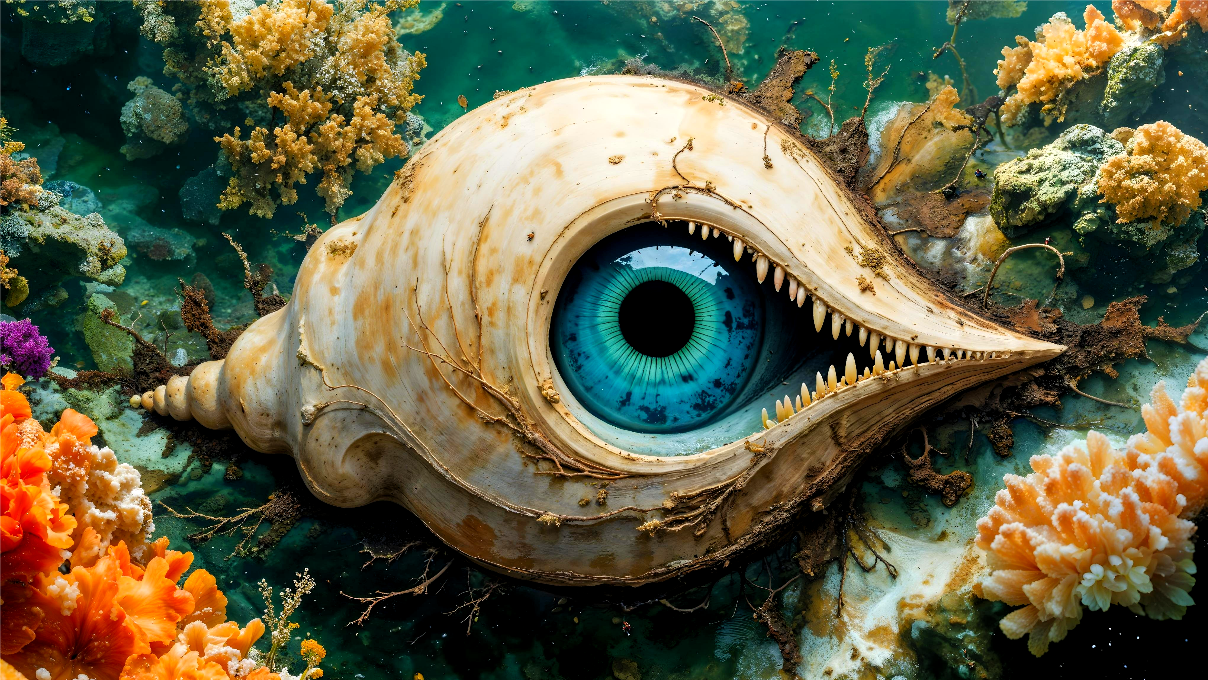
My idea of a water colossus.
Enjoy
EDIT
Punched up the colours a bit.
EDIT 2
Punched down the colours again, I preferred them the first way. Also removed a couple of ships, it was a bit too cluttered.
Related content


Comments: 42

More than 30 hours? Wow, I wish I could work so long on one piece. Really great. The water looks so realistic. Did you use a reference for it?
The mood of this one is really great, dig the colors. The ships don't look that realistic yet, because of the lightning I think. But I'm no pro, so I think here are some better painters how can tell you exactly why. Because there shape is top. Especially love the tentacle in the rose light .... and the clouds ... and omg, the water.... *stunned* ....
👍: 0 ⏩: 1

Thanks for the comment. Yeah, I was never really happy with the ships, the monster came out really well, but the ships... guess I just need to practice more.
I used reference for pretty much everything, including the water.
And yes, 30 hours, I tend to just work until it's done. That's 30 hours spread out over a number of days or weeks mind, since I don't tend to have a great deal of time to paint in between work and stuff.
👍: 0 ⏩: 0

This is really nice work! You're more ambitious than I currently am about tackling imaginative paintings.
Couple crits, if you don't mind:
1) The highlights of the eyes seem too bright for the light source they're coming from, I think. The eyes also feel very large to me. As creature size gets bigger, eyes are proportionally smaller I've observed (but Icould be wrong about that).
2) The lighting on the sails seems off. Looks like you're trying to achieve rim lighting in addition to simulating the translucency of the cloth. The problem I see is that you're smooth-shading the backside of the sails. I don't think that's quite right.
Here's what I would do (keeping in mind you can take my opinions with a grain of salt!): Use a hair-thin pencil brush for the rim lighting. This should be the brightest part of the sails' shading.
If you want to light up the back of the sails, keep it low-key and flat (no gradation from light to dark). Keep in mind that the sails cast shadows on each other, and that will affect what parts of the sail receive the translucent effect.
Finally, a couple ideas. The scene is very exciting, but I think you could punch it up with some atmospheric effects like sea-spray in the foreground and maybe some mist spread throughout the piece that catches the blue-glow of the monster. Maybe rotating the view would add a sense of action as well?
Anyway, hope this helps. It's a neat painting so far, regardless of any crits I may have! Love the lighting and the painting you did on the ocean. That doesn't look easy.
Take care!
👍: 0 ⏩: 2
Hah, yeah, if I were still working on this, I'd likely do a few things differently (I still don't like the ship that's farthest back, I haven't integrated it well enough into the scene). So yeah, this scene would have benefited from some atmospheric effects (something I'm actually working into a piece I'm doing right now).
And yeah, I was never too pleased with those sails. I think you got the right idea there.
And you're correct about the eyes, realistically, eyes can only get so big before they start to become inefficient (largest eye on a living animal today is less than 10 inches in diameter).
👍: 0 ⏩: 1

I think the eyes could be even bigger. If it was a really overseized frog, big eyes wouldnt be wrong. I feel like something is missing on the right side of the picture, maybe clouds? Over all, a cool picture.
👍: 0 ⏩: 1
 (Smile)")
Oh goodness. I just realized this was posted over a year ago. Guess you're done with it now, lol! Maybe my comments will be useful in the future anyway, haha.
👍: 0 ⏩: 0

The monster looks great! The colors are great! It's easy to not wander off the page and I keep getting drawn to the monster's face, which is good. The water looks good, especially being dark water with the strange lighting, that looks difficult to do well? I appreciate the level of detail and what looks like insect influences in the colossus' design. Overall, a really great job and way better than I could hope to do anyyyytime soon, haha.
It would be cool if the picture were clearer about whether this is truly something to be afraid of (e.g. picking up a ship and slamming it around) or whether it's just misunderstood and they're attacking it out of misguided fear, which would need to be illustrated a different way. It has nothing to do with technical stuff, it's just having a story told in the piece helps to draw viewers in. Though I see someone else recommended something similar to make it a more dynamic piece.
I'm not sure whether you intended this to be out in the middle of an ocean or close to shore but I can't shake the feeling that there's something off about the water depth. It doesn't feel like very deep water to me, I'm guessing from the way the ships appear to be sitting on top of the water, skimming the surface, instead of weighed down and sailing through the water. Also, there's the way the monster is standing so high out of the water. It would be difficult to do that in the middle of the ocean with nothing underneath you, so it gives the impression that it might be standing on something - i.e. ground.
👍: 0 ⏩: 1
Thanks for the nice comments.
I did originally have the monster holding a ship in one of it's tentacles (the tentacle on the far left was posed for that), but decided against it later on as the piece was becoming too busy.
As for the water line, you're right, the boats should have been placed further down to indicate better depth.
👍: 0 ⏩: 1
You're welcome! I guess it'll be something to keep in mind the next time you draw a giant monster in the ocean. Because who doesn't want to draw those!?
👍: 0 ⏩: 1


How logitech G13 helps you with your drawin? ;_;
Isn't it a gamekeyoard?
I like the picture <3 very cool
👍: 0 ⏩: 1
Yeah, it's a gamekeyboard, but I used it to program in a bunch of shortcuts for photoshop, makes things a lot faster when I paint.
👍: 0 ⏩: 1
Oh cool!
Can you give me some examples? :> I'm so interested in this keyboard. It looks amazing.
👍: 0 ⏩: 1
Well, the G13 comes with 22 keys along with 2 more on the side and an analogue stick, but it has 3 modes that you can switch between (so basically, multiply all of those numbers by 3). All the buttons are fully customisable (though it takes a while to understand how it all works, but worth it once you figure it all out).
So you can do things like set one button to choose the brush tool, another for the eraser, another for the pen tool and so on and so forth, it's all up to you and it's worth having a look at what you do the most in your painting program.
At the moment I'm not really using the thing to it's potential. Because I mainly paint, I've set the first 20 keys to correspond to adjusting the opacity and flow of a brush. The remaining two keys are set to Alt, so I can use the colour picker on the fly and space bar for moving the canvas around.
The two buttons on the side let me choose the brush tool and eraser and then I use the analogue stick to control brush size and softness (up/down for size, left/right for soft/hard). This is really helpful as it means I can control brush size and softness entirely on the fly without having to go to my keyboard.
Funnily enough, I haven't really used this thing much for gaming, I just prefer WASD for that, but for Photoshop, it's been really helpful, I haven't regretted that purchase at all.
👍: 0 ⏩: 1
Oh wow... ;___; Thank you very much for this detailed description.
And thank you for taking your time for me.
Now I'm even more interested, but I guess 100 $ is a bit to much for this gimmick.
BUT! Really helpful thank you! I think I'll think about it :>
Thank you very much! >___< Oh..and marry x-mas ^^
👍: 0 ⏩: 1
No problem, happy to help.
👍: 0 ⏩: 0

Daaarg, this would be perfect if the eyes didn't look so cartoony
Well, cartoony isn't the word...Let me clarify.
Let's see, it's excellent in the lighting front and back- which makes this very dramatic and there is some atmosphere.
But honestly there is no emotion whatsoever. That leviathan has this empty...non threatening look to it. And how it's kind of hunched over, it doesn't seem all that big either despite the clear size difference against the ships.
Perhaps you could have had the monster at a perspective, maybe him arching over tall at the ships and tentacles smashing at the boats, and one arm raised ready to thrash at another merchant ship.
There's more action and a much more dynamic perspective.
👍: 0 ⏩: 1
Thanks for the honest critique, I keep that all in mind.
I think when I was doing the eyes, I was stuck on the idea of a real octopus, which has relatively dead eyes, it didn't occur to me to give it any kind of expression.
As for the size, I hadn't noticed before you brought it up, but it may have something to do with the middle ship being so big. Despite the much smaller ships in the distance closer to the monster, I didn't really define distances as well as I should have so the big ship looks like it's a lot closer to the monster than it is, thats maybe why the monster looks smaller.
Thanks again for the comment.
👍: 0 ⏩: 1
You don't have to give it a specific expression. If you look at classic mariner myth drawings of sea monsters- such as the giant squid, the eyes look lifeless, yes. But they are large and gaping. the dots you gave your monster make him look more cartoony.
Also in those old drawings there is much motion and actions through the whole drawing, your painting is in the middle with the action and most of it below the monster. Not much of it in the viewers face.
And no problem, I just want to help :3
👍: 0 ⏩: 1


Your art has been placed in the intermediate "8" gallery.
👍: 0 ⏩: 1

I love the lighting in this, and the monster is really interesting!
👍: 0 ⏩: 1


This rocks you know. Hope it wins ")
wonderful skills!
👍: 0 ⏩: 1

Wow, really cool design you have going here with that sea monster! I also love how you've handled the lighting. The water looks beautiful too. I wonder the guy in the crows nest is thinking.
Keep up the fantastic work.
👍: 0 ⏩: 1

It's the dreaded Angler fish/Octopus/Crab/Ant! Or the "Angoprabnt"!
Very nice, though. And I bet those sailors are regretting their choice of ramming the creature instead of using cannons.
👍: 0 ⏩: 1
I was going to have cannon fire, but all of the cannons that you see are pointing away from the creature, it'd look like they were firing on each other.
")
👍: 0 ⏩: 1
I noticed that.
I hate it when I realize I've made a mistake in something that's taken me hours. Usually, when I discover the mistake, I'm too demoralized by it and have to quit for awhile. I couldn't imagine the frustration of realizing something like that in work without key lines.
👍: 0 ⏩: 1
I wasn't too annoyed by it, I think it works fine without cannon blast.
👍: 0 ⏩: 0
