HOME | DD
 kacktustoo — Shell World
Published: 2010-03-26 22:29:44 +0000 UTC; Views: 9347; Favourites: 91; Downloads: 0
Redirect to original
Description
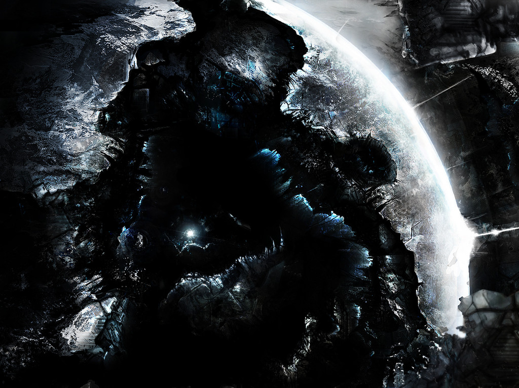
They are known by many names shield worlds, dyson spheres... Slaughter worlds, but to most they are known as shell worlds.Created thousands of years ago, many have been lost or destroyed, possibly by massive gravitational forces of a black hole or neutron star, or possibly something else...
Of unbelievable size, a shell world consists of planets, inside planets, inside planets, 14 to be precise, as dangerous as they are mysterious even the culture with all of their advanced technology are cautious of the secrets hidden within...
------------------------------------------------------------
This piece was based on the awsome works of iain m banks and inspired by the god that is "phoenix-06" (adam burn) i have been working on this one for quite a while, i apologise if it looks confusing.
but basically the image shows the inside of a shell world, looking into the damaged remains of 5 layers within it, all destroyed, including the exposed core.
I apologise if it looks wiered or whatever, that is why i'd really be gratefull if anyone could comment on how i could improve it, whether it be light, texturing etc, i'm really trying to push my technique and style.
thanks very much and this is by far the most complicated one i've ever done...
")
cheers (:
Related content


Comments: 31

if you could post it bigger or allow download we could see better and give more precise opinion, but on the face of it I would suggest that each layer have its own color scheme to differentiate them(?)
👍: 0 ⏩: 0
I like this; I know it's not what you intended but being this dark makes it more realistic IMO. Outer Space doesn't have spotlights!
👍: 0 ⏩: 1

very true
we'll never know what it would actually looks like in real life xD
👍: 0 ⏩: 0

hey mate!
yeah its really hard to tell whats going on. the planet is not seperated from the background somehow. the scale and crispiness of the textures covering the background matches the detail of the planet's! by overlaying everything with texture you connect it together. (keep that in mind when you actually want to do so  (Smile)")
great! keep it up
maybe you can try to take it easy with the contrast and the saturation. it feels a bit to burned out on the highlights and just to much black in the blacks
👍: 0 ⏩: 1
yeah again one of my weakpoints (among practically everthing else lol) thanks for the advice!
Someday i shall be as good as you!!!
👍: 0 ⏩: 1
of course you will!
👍: 0 ⏩: 1
thankyou very much (:
can i ask how long you have been painting etc for?
👍: 0 ⏩: 1
painting? how long overall?i started digital painting when i got here on dA
👍: 0 ⏩: 1
wow epic even when you first started you were amazing!!
could i ask for some tips on painting, i have these very wierd phases where i sort of loose the ability to paint, i usually take a break and begin studying other artists work for a guide and asking for tips, then i get back into painting, it's a wierd cycle *shrugs shoulders* , but i've always liked your painting style, would you start with a bisic grey then develop the shape etc
thanks very much
👍: 0 ⏩: 1
lol i wasnt amazing. stop that
these weird phases are normal. it really is this way. sometimes you just cant force it. being inspired and motivated is like being on drugs. you feel how it tickles , the excitement! after running out of inspi-power the mind has to rest ^^
but there is one advice. if you happen to paint without ANY inpiration just take it slow! really! cause you will only produce crap when you rush it. try to step back and think about the strokes you make. when you start with the motion of creating something sooo awesome you will cry out in tears after 10 minutes
i kinda start with chaos? a basic shape, a whole silhouette. its importing for me to be able to imagine something in that choas. i want it to be very unconcrete in the beginning. details come last. and when you start with greyscale tones you can make chankes really quickly. also! you wanna try to develop 3 grey tones at least. these tones have to be homogeneous togheter. one for the hichlighted area, one for the darkest area (the opposite side of the sundirection) and a middle tone. try to establish them pretty early in the sketch phase where it is easy to overpaint and try out things. with a basic homogeneous shading you will be able to make bigger changes without trashing it! im talking about levels and curves now. use these to tweak the whole lighting situation till you are satisfied. after that you can take the whole image further, add details and color
i hope this brain crap of mine helps

👍: 0 ⏩: 1
thankyou very much!
no joke you really inspire me (:
yeah i have noticed it's about mid way through a painting i tend to get into a loop, which ends up ruining the painting all together, it's basically me asking "what should i do now?" over and over, which is why i ask you in particular for help.
i think after about a week and a half of doing nothing (apart from 3d lol) i think my moral and inspiration has peaked once again ")
i really appreciate the help!!
ps. *Cough!* You'r epic!! *Cough* (:
(please say if i'm getting on your nerves)
👍: 0 ⏩: 1
thanks for the kind words
if you keep asking yourself what to do next it just means that there is room to progress
just keep on going! when you get better you will just know what to add next and what makes an image more asthetic
👍: 0 ⏩: 0

- wish i was able to draw something as detailed as this. But then again i only do concepts with pencil, not with photoshop and such.
Wish i still had photoshop. Even though i dont use it much it was still fun to have when i wanted to do a detailed colored peice.
👍: 0 ⏩: 1
wow! thanks very much! yeah i still have a problem with contrast and depth lol
to be honest i envy anyone who can paint and draw really well with pencil etc and if you want to use photoshop it's awsome (trial version MUHAHAHAHAHA!!)
but anything like canvas paintings as awsomer!!
👍: 0 ⏩: 1
hehe - well i tryed making a few stars before - one was REally well done the other was... basically a giant Coush ball xD
👍: 0 ⏩: 1
gotta continue working on my stars xP - though when i draw planets in pen/pencil it looks better
👍: 0 ⏩: 1
why don't you draw them to get the best quality, scan them in then work on the colours etc on photoshop
👍: 0 ⏩: 1

" and inspired by the god that is "phoenix-06" (adam burn)" haha nice I wouldn't go as far as proclaiming myself a god.
I really like the image, its a little hard to tell what's going on at first if you haven't read the description first, Think its because its rather dark in places, its hard to see each "planet" I love the idea though, is it an adaptation from Banks's work or is it a mash of different concepts? Kinda reminds me of Dante's Inferno with the 9 rings of Hell but in planet form.
👍: 0 ⏩: 1
wow! i really cannot believe that i have had THE phoenix-06 comment on my work lol i must be doing something right! (:
i'm really sorry if i'm actually weirding you out, but i'm really addicted to digital art (and i get quite energetic after a bar of chocolate or something) and someone like yourself who can do art to such an extent that it looks real, like you or andreewallin, i just admire that ability and i just have to be able to do it no matter what. i'm actually striving to eventually become an artist for the luminariam (maybe not now but in the future) and "smilingdemon" recomended that i work on the depth more, so i've been really trying for it (:
Thanks a million for the advice, any time you give me some it just really helps!
oh and yeah it's from the novel "matter" havnt read all of it, but about 60 pages in it goes into far more depth than i have
ps. your name is Adam Burn isn't it?
if it's not i'll edit the description (or if you'd rather i change the bit about a god, me i'd prefere to keep it (:
thanks again!
👍: 0 ⏩: 1
Yeah its Adam Burn you got it right, and your not weirding me out so don't worry about the "god" thing haha, makes me blush though, still makes me giddy when ever anyone comments on my work as you did, funny that you compare me to Andree Wallin as I view his work as being miles ahead of my own.
And Smilling is right I think the area with your work you need to look at most is depth I think you go too far into contrast, try to avoid total black and if you do keep it to a minimum, obviously you could get away with it in certain space images. Adding a hazy or misty effect to each layer of the planets would bring them out a bit more, I do like the small faint light in the core, that's a nice touch.
If you ever need a spare eye to look over your work and make suggestions don't be afraid to drop me a note and I will try to get back ASAP, I started out here on DA and if it wasn't for other artists helping me out I wouldn't be here now

👍: 0 ⏩: 1
thanks very much!
i knew that there was something standing out almost punching me in the face, i tend to use black lines to seperate different areas, but very recently i've noticed that using colour looks far better and like you said, it would get rid of that over contrast a bit more.
also i'd definately compare you to anderee wallin, but it's wierd since every artist on deviant art has his/her own basic style, so it's really hard to say directly who's better, my 4 favourite artist on here are you, andreewallin, omen2501 and ukitakumuki, well it's obvious that i chose them as well (:
but apart from the awsome art! you reply practically to any question i ask, even though you get asked a lot and get a lot of fav's etc, which i really appreciate, soz i'm not saying the other artists are horrible or anything, it's just a big thing for me (that does sound a bit selfish, sorry)
ps lol i tend to say sorry a lot, because i'm afraid i might upset or annoy someone, but it gets to a point where i apolgise for anything which drives that person insane S:
thanks again! (:
👍: 0 ⏩: 1
Ha no worries and no need to keep apologising, now I've said that you will probably say sorry for apologising haha. And yeah I have sent comments and things to some of those artists but they are a lot busier than I am and have a lot more work to do, I'm still only scrapping into the industry compared to them who work on all kinds of huge projects, and more than likely don't really have the time to answer the onslaught of messages they must receive.
👍: 0 ⏩: 1
haha! if i wasn't restraining myself i would probably be saying sorry (:
but again thanks for all of the help and support etc
someday i'll be as good as you are! but by that point as you said you'll be andree wallin or giger now and i'll be you, well not literally but you get the idea (hehe i'll just morph into your form) lol
cheers!
👍: 0 ⏩: 0