HOME | DD
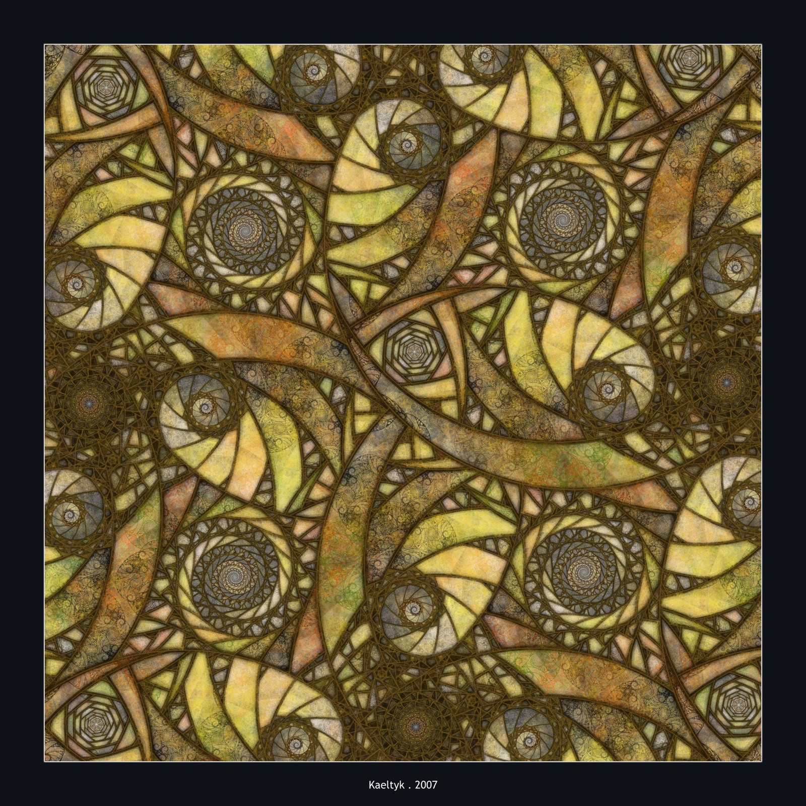
 Kaeltyk — Abstract XIV

Published: 2007-09-06 07:18:26 +0000 UTC; Views: 687; Favourites: 18; Downloads: 56
Redirect to original
Description
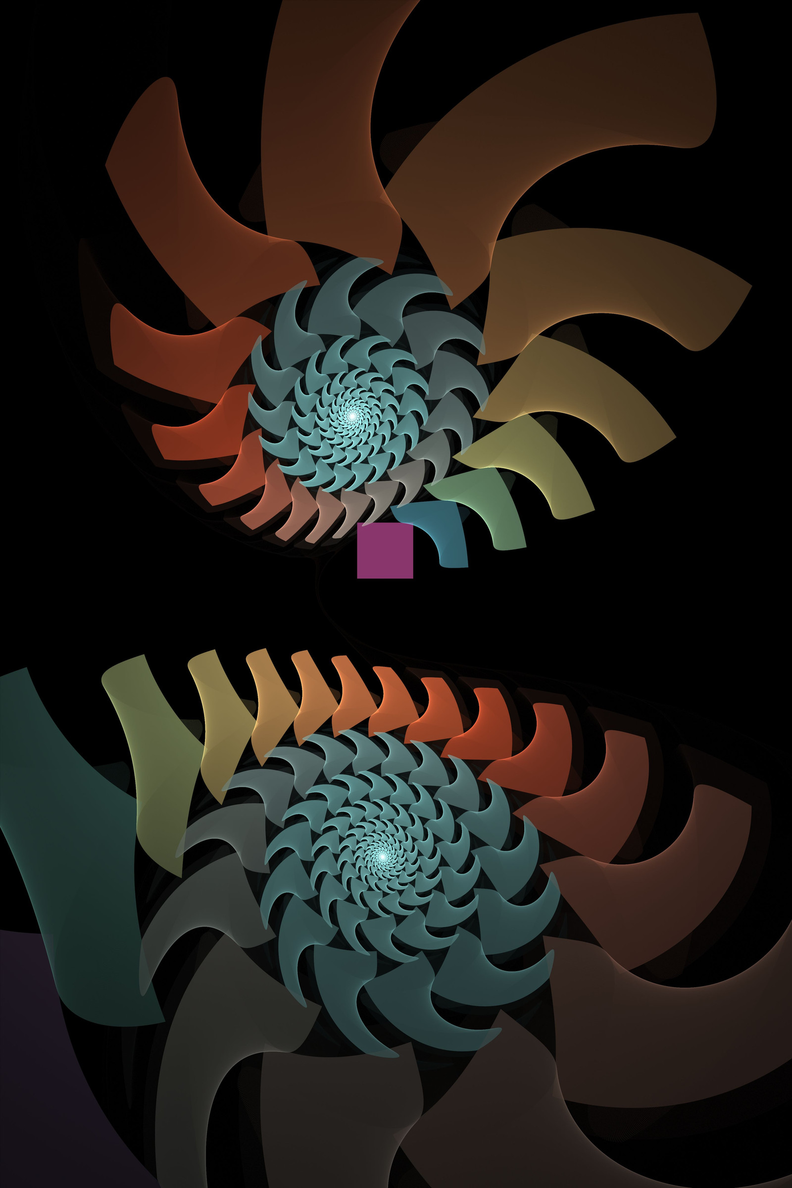
A the little sindow on the sky ?Not as complex as some previous works, I'm exploring some more transforms.
Raw Apophysis flame . Inkscape for frame and text.
Related content


Comments: 9

*gasp* I didn't know colors can be that bright. *rubs eyes* I thought I say it actually glowing. *blinks*
To me, this is a groovy art. XD Reminds me of olden times somehow. I love the ring patterns and great coloring and textures.
But I have to agree that the blue spot in the top does seem...out of place. Its too bold and the texture doesn't fit. But if I ignore that the whole fractal kinda makes me feel like I'm standing under a disco ball and looking up at it.

👍: 0 ⏩: 0


I rather like the blue spot, as it adds a nice color balance. I love the infinity symbol and the gradient choice for this piece. Nicely done
 (Smile)")
👍: 0 ⏩: 0

Very unique piece, Eric. I really like the simplicity of this one, and the gradient you chose for this pattern. Excellent job. A really memorable piece!!
I'm wondering - Did you use the Postprocess render process on this piece?
👍: 0 ⏩: 1

Thank you very much !
I did not use any postprocess, just rendered it with flam3 using transparency, then set up a unicolor background in gimp before framing it. That's the way I produce most of my flames, the only postprocess I did (until now) was layering transparent flames
👍: 0 ⏩: 1
Thanks for the reply, Eric. It is very interesting to know someone else's process of getting to the end product. I've never tried Flam 3 before. Take care!!
👍: 0 ⏩: 0

I love the movement in this, but the little bright blue part ruins the piece for me 
👍: 0 ⏩: 1
Thank you ! the little squares I don't even know how they are produced as the transforms are just linear, arch, julian and curl...
I took a long time to choose how to color the background of this one... in black it was too dark, in white the little bright part was way too bright, in brown it turned the overall image brown, in green it was earthly but the geometric shapes were not, the only color left was some blueish window, and skycolor came. If you'd like to see it in another color you can ask and I'll upload it on my site to show it.
 (Wink)")
👍: 0 ⏩: 1
nah, the artist's choice is always the best. afterall, it's your own work
I could suggest using a radial gradient for the background though, using separate colours for that window and the rest of the image. just a suggestion for you to try out.
the squares are, indeed, strange. I thought you used square blur or a tiny rectangle transform
")
👍: 0 ⏩: 0