HOME | DD
 Keatsy — FREAKS Pilot episode 2

Published: 2005-04-28 02:42:17 +0000 UTC; Views: 217; Favourites: 0; Downloads: 54
Redirect to original
Description
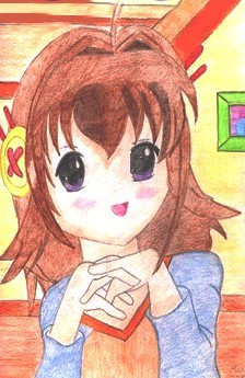
Second installment of the new oh so popular F.R.E.A.K.S comic, couldnt think of how to fit in emily, so she'l beat me in the morning....Yeah, anyways, a more general one... a special gft for those of you who read Ali's ID :thumb17650312: what with his favourite band bein weezer...
okokok, yeah i know, shite ending, but its... 3:39 am and i didnt know how to finish it, im new to this and i've scraped passes in english since i was 6.
Anyways, i need comments, especialy constructive ones, as soon as ive got the hang of it il stop doing pilots and get onto some proper story... Oh yeah, and im a lazy drawer hence re-using the pic i did for Vajt on her 1000...
hehe.... nach!
Related content


Comments: 30

your simple style (ie. without shading) fits the whole comic thing pretty well imho, but yes, lose the eye-searing amounts of blue. oh, and i think you listened to the advice about adding text after resizing to keep it clear, but i suppose that's what i get for commenting on stuff so late after you put it up.
👍: 0 ⏩: 1

lol, at least you are boy, hey you do art so i can comment on that as you do mine!
👍: 0 ⏩: 0

You did a very clean job! Maybe you could try adding shades to your character. I think it would look swell!
👍: 0 ⏩: 1
shades? as in sunglasses or shading? eithers hard as i cant do glasses and putting shading in would take away the aspect of simplicity ive been working for..
👍: 0 ⏩: 1
I meant a shading as in coloring. Not fancy shading, just one darker color.
👍: 0 ⏩: 1
ahhh, i gettit, il give it a shot after the next comic...
👍: 0 ⏩: 0

That's a good one. XD
I'll also say the text should be a little clearer, although I CAN read it. But that's the only thing I can "critique".
I'm still loving the "mysterious hooded figure" (which is how I'm thinking of him, although he has a name ")
 (Smile)")
")
👍: 0 ⏩: 1
you think so? cheers!
on hindsight after your critic, i may add speech after i shrink it down on word so as tyo keep it clear...
your M.H.F (TM) is called Ali btw
thansk!
👍: 0 ⏩: 1
Ah yes, I should've mentioned that.. it's best to add the text after resizing, otherwise it will look blurry if you don't sharpen the picture. It's what I do.
Can I still call him the M.H.F. though?

👍: 0 ⏩: 1
go for it, he'l probbaly be honoured when i tell him, he wont show it tho, but i reckon if he gets afan base then he'l be chuffed
👍: 0 ⏩: 0


HAHAHAHA!!!
dude, thats sweet...
*thinks* i must get in that comic....
👍: 0 ⏩: 1
i accept cash.....
lol, il include you in a cameo some tuime, no worries!
👍: 0 ⏩: 0

Hilarious!
It could probably use a bit of shadow - it's too blue...but still amazing...the MS-paintage seriously rocks! And the script is funny...
👍: 0 ⏩: 1
you reckon?
im really poor at scriptage unless i got sa good idea..
cheers tho!
👍: 0 ⏩: 1
Yeah I think the script was fantastic...ah being inside an MS-Paint construct must be fantastic...the possibilities are endless...beats reality anyday!
👍: 0 ⏩: 1
reality aint to bad, at least in reality you cant save yourself as a Jpeg by mistaker and ruin an hours work....
👍: 0 ⏩: 0


hahaha, this cracked me up ^_^ I guess it is too blue. pretty blue but yah. anyways I'm pretty bad with backgrounds and ms paint so I dunno how to give anything constructive ^_^;;;;;;
👍: 0 ⏩: 1
no worries, i hate the blue to in retrospect, i only used it to be able to distinguish between the rooms...
il change it... maybe a lighter blue, wadya think?
👍: 0 ⏩: 1
*thinks* that might work *nods* I'd prolly test a bunch of different colors though.
👍: 0 ⏩: 1
well, acting on the ladies advice then i shall!
👍: 0 ⏩: 0

hehehe.. if that happened to the real ali.. he wouldnt have a clue wot relation it has to weezer.... rich.. with an actual girl.... that he can remember what she looks like.... NEVER
👍: 0 ⏩: 1
lol, he told me int he next he wanted me to end it roughly with a slap, so hey, who am i to argue?
👍: 0 ⏩: 0

you know what makes a lotta comics just plain odd yet intresting. the change of background.. like the poster would change and stuff, and different colors going from like blue to yellow and what not... hehe. gl w/ the comic dude.
👍: 0 ⏩: 1
hmm, il keep thjat in mind!!
cheers for the comment!
👍: 0 ⏩: 0

Too blue, maybe add a pattern to the walls or maybe break it up with some simple shadows.
The use of real posters doesn't look to grand, but at least they aren't blue.
Also try making the text bigger, its kinda difficult to read.
I'm too tired to make any further comments on it, so...
Keep up the good work
one last point, I've never seen a laptop monitor a such as sharp right angle before, just a random last minute observation on something that you could change to add that little extra attention to detail... of course thats assuming that its a laptop over on the table by the cup of coffee.
👍: 0 ⏩: 1
ohhh! some good critisism, ok... i used blue because.. i dunno.. i went 'what colour all shall i use' all the rooms were in are the same bar posters and i didnt want the room to be confusing to look at (eg, whioch roiom are they in, i unno, etc)
I cant be arsed to draw out posterts and they liven it up some, dont worry tho, ui hate the bluye to, luckily this si only a pilot stage strip, so im working out kinks as we speak.
text to small.. yeah, i know... i have no photoediting package so i use word to make the images smaller, the actual room sizes are about 1100x800 then shrunk on MS Word (old skool!)
Angles are because i hold shiuft when i draw the lines to make it look non flat, so its an isometric style. i thought tits the only way il keep thing in perspective whilst leaving it simple
anyways, cheerrs for the constuctive comments, you dont know how thankful i am for it, most peeps say 'yeah, this is good' and leave it like that.
thanks again!
-Tony
👍: 0 ⏩: 0