HOME | DD
 kefkafloyd — Spitfire - Keep 'Em Flying
Published: 2011-09-26 03:08:26 +0000 UTC; Views: 8890; Favourites: 385; Downloads: 4669
Redirect to original
Description
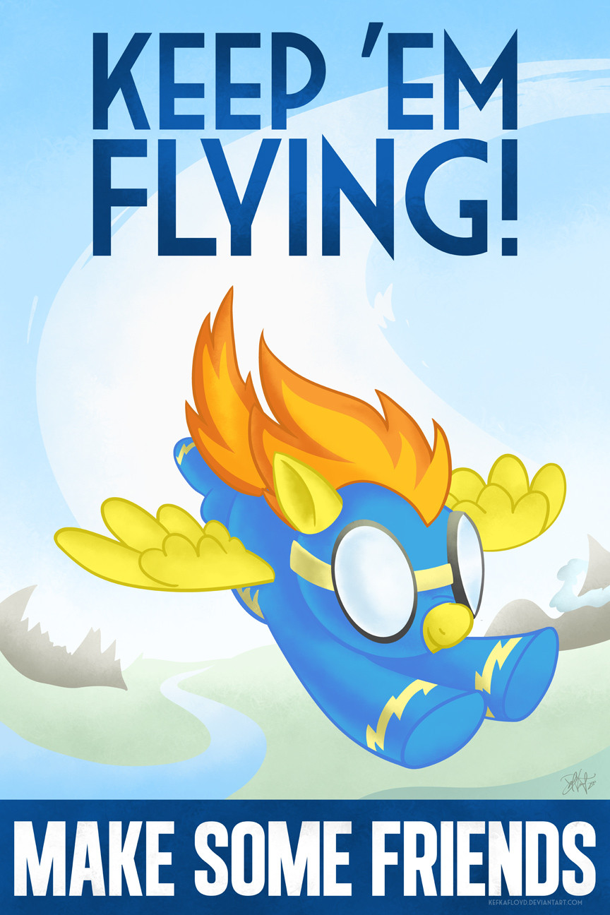
Keep the forces of Discord at bay - Make Some Friends and keep the Wonderbolts in the air!This poster isn't a parody or homage to any specific poster in terms of composition or style - it's a brand new design. Many posters implored American citizens to buy war bonds to support the Army Air Corps and "Keep Him Flying" or "Keep Us Flying" or "Keep 'Em Flying." Given that Spitfire is named after one of the famous World War 2 fighters, she was the only appropriate choice for the starring role.
Related content


Comments: 17

Got this in postcard form at your table at BronyCon this previous weekend; I sometimes have a hard time socializing with people and making friends and when I saw this, I was certain it would be a nice way to motivate me to make some friends so thanks in advance
 (Smile)")
👍: 0 ⏩: 1


Oddly enough, this reminded me of this poster. www.afficheprints.com/ebay/wvi…
👍: 0 ⏩: 1


Oh man this is amazing work. I really enjoy some of the awesome propaganda pieces that were created in the war's and this one replicates the feel perfectly.
Really amazing job and This would totally work at making me want to have friends.
👍: 0 ⏩: 1
 (Wink)")

I really like this kind of smooth-shaded look, very nice.
👍: 0 ⏩: 1

I might write a journal or something about it. I was hemming and hawing a bit over how exactly to do this. I didn't want to do the same kind of paint style I had been doing for the past several things. Stylistically, it's very different from the first Make Some Friends, so using that kind of style would have been wholly inappropriate.
The look I really wanted to evoke was this textured airbrushy look that you see in a lot of pieces from that period. I didn't do it exactly - the technique is extremely difficult and hard to master. Guys who could illustrate rings around me took years to refine it. I also didn't really want to do any extreme shading/value type things - using the stroke colors as the shadows was my primary goal. That way it would keep it away from over-rendering, though it is a bit on the punchy side. It's one quality of illustrative work that I really liked.
In either case, this worked out much better than my first abortive attempt at a Wonderbolts poster I tried back in April.
👍: 0 ⏩: 1
I guess there really is something to be said about keeping it simple sometimes.
👍: 0 ⏩: 0

This turned out extraordinarily well! The typeface is on the money and fantastic, as usual, and it's a very clean composition. Hopefully this isn't the last WWII propaganda poster we're going to see.
👍: 0 ⏩: 0

Screw the Wonderbolts!!!!!!! SCREW SPITFIRE (Great job on the artwork by the way, this is a fanon attitude in my work not my actual attitude)
👍: 0 ⏩: 0