HOME | DD
 kerrisarahthornton — Starting From Scratch II: Colour Values

#paintingclass #paintingguide #guidelines #guidesheet #paintingdigital #photoshoppainting #paintingcoloring #tutorialcoloring #tutorialpainting #howtotutorial #tutorialhowto
Published: 2016-07-06 23:34:06 +0000 UTC; Views: 151; Favourites: 0; Downloads: 0
Redirect to original
Description
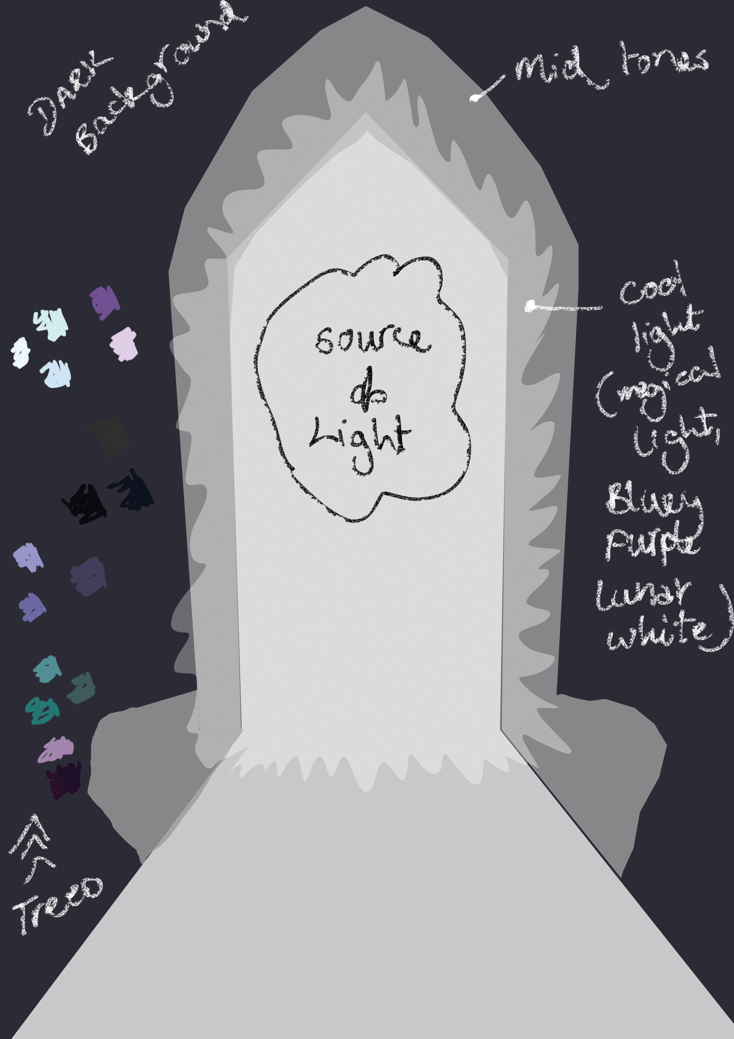
So the second step in my painting process. Now that I have a light/shade map to work with I roughly beginning assigning the colours in the correct tonal values, leaving the brilliant white/darkest black out, until the very end, for this picture at least.
I just sloppily got a brush and started zizagging colours to give more depth to the painting, and lift it of the page. I always start with the darker tones first, and I usually start with the darker blue tones first - for every painting. Then I build on top of that with dark red tones, and repeat this by layering opposite colours on top of each other. So:
Colour Blocking Dark Tones: Navy Blue to Marroon Red, Marroon Red to Dark Green, Dark Green to Dark Purple, Dark Purples to Oranges. ( And I layer based on where I feel the light would hit, if that makes sense? Then I repeat this cycle once I'm happy with the results in the higher tones, like Midtowns and then again for the highlights. ).
For this painting I am omitting the warmer colours, and using a cooler, magenta/cyan/(my favourite shade of green) Greeney Blue.
I hope this isn't too wordy and that you can follow what I'm saying!
Once I'm happy with the basic shape/colour plan of the piece it's time to eating up and add all the frilly bits (!).
Again feel free to use this as a guide if you like!