HOME | DD
 KinnoHitsuji — BSSCM Act 01 Page 04-05
Published: 2009-02-07 04:08:04 +0000 UTC; Views: 1834; Favourites: 23; Downloads: 1
Redirect to original
Description
I'm trying this layout for the next two pages, but something about the frame layout is bugging me and I can't put my finger on it... I think the pages read right individually, but together something is really awful... Ideas would be helpful.Maybe it's the right page. *argh*
Edit 1: Eliminated some of the frames, got rid of the margin on page 05 (on the left) Reads Right to Left, BTW.
Edit 2: I added the second page over the first (Page 5) because it was easier.
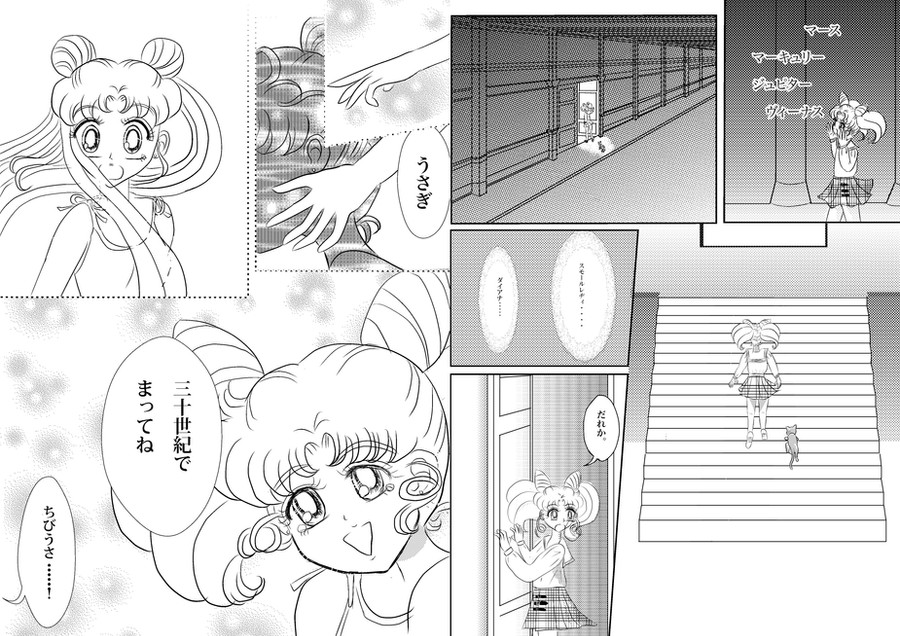
 ; This is a summary of page 168 of Volume 18, Act 52 of the original Tankoubon... only redrawn from Chibiusa's POV.
Edit 3: Added some preliminary sketches.
Edit 4: Added the hallway better than before. I also added the bubbles with the lace edge.
Edit 5: Added more preliminaries. The page should have shape now. I'm planning to make page 4 heavier with screentone than page 5, to give contrast and mood.
Edit 6: I added yet more screentone and finished panel 5. I also softened a few of the lines here and there to communicate a flashback attitude. It also opened the layout more as well, which I didn't anticipate. Because of that, I had to soften the line in the last panel of 4 to get it to work. I also changed the font over to Hiragano Mincho Pro.
Oh and you can't see Diana in panel 5 because she's too short.
")
Edit 7: I cleaned up the sketchy frames on page 4. Panel 1, 2, 3 all got an overhaul
Note that the frame 2 is referenced from Volume 16 pg 150 of the original manga. Does it look like the real thing?
Perspective was hell because I didn't recognize the 3 point perspective at first. I declare finished unless there is some glaring error I missed.
Since I'm feeling lazy I might back track at this point and do the English version. Less typing overall. ^_^
Edit 8: Minor gradient change.
Edit 9: Evened out the values on the screen tone. Should be slightly more balanced now.
Related content


Comments: 4

Ah! I haven't looked at this in a while.
Looking at this again, I think the third panel on page 4 needs a little work. There might be some benefit from zooming in on Chibiusa a little bit, and eliminating some of the empty space taken by tone... While still showing the palace as a desolate-ish place.
I also wonder if that page might benefit from having a more vertical layout if you're looking at them as two-page spreads? Hm.
👍: 0 ⏩: 1

Page 4 I'm dissatisfied with all over. The sequential action is a bit hard to follow and the value relationships need work. This is clearly a case of thinking of these pages independently and suffering for it. Only panel I'm please with is 2... because it was hard drawing that hall. And I'm somewhat attached to the hand positions on 1... though again, because it was hard to draw.
Also, I tried to pull something you just don't pull in manga... hopefully I can bail myself out of it with the next four pages. ^_^ It's good to make mistakes. Takeuchi-sensei ditched 5 pages of the Sailor Moon manga saying she didn't remember drawing them, so I don't think I'm doing that bad.
👍: 0 ⏩: 0
This... Is a pretty nifty layout idea.
But yes, it does look a bit strange in its execution.
My best suggestion would be to remove the border lines from the bottom left panel on the right page and just let that be open.
Also, the top right panel on the left page is strange. Is that supposed to be a division between three panels or is it going to be blank space? It's confusing, and I think that may also be adding to the problem.
Anyway, experimenting with panel layouts is always good to see. Sometimes you get weird ones, sometimes you end up with awesome stuff. :3 Keep it up!
👍: 0 ⏩: 1
It looks less cluttered now, but something is still striking me as strange... the left page (page 05) at the top, I can't quite solve it. I don't want to make everything square-angled since that's a transitioning movement... (A hand reaches forward for the first 2 frames, then we see it's Usagi and Chibiusa stolen pretty much from Volume 18 where Chibiusa says she'll see Usagi in the future.)
In shoujo it's odd to have the frames all square... But Irk! It bugs me. Something is wrong. The size relationships are right though. (Importance)
👍: 0 ⏩: 0