HOME | DD
 KinnoHitsuji — PSSCM01 Page 6-7

Published: 2010-08-13 08:14:45 +0000 UTC; Views: 2242; Favourites: 34; Downloads: 45
Redirect to original
Description
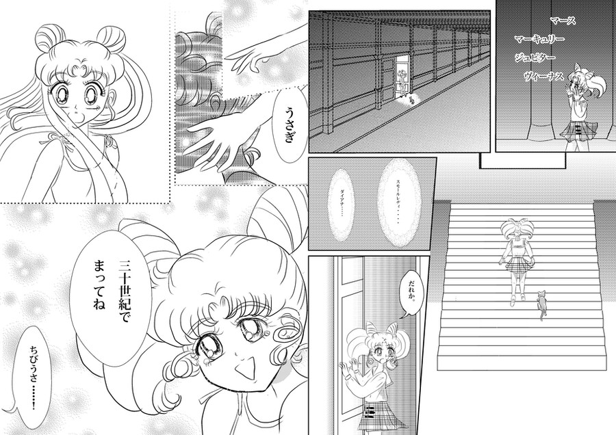
A few notes:- Qarmic Sans is the Font. I chose it because Comic Sans is kinda Ugly to me and because it seemed more like a Sailor Moon font.
I *did* do some tracing for these pages. Mainly on Guardian Cosmos, but there are some drastic improvements and changes despite the trace, such as the beading is perfected overall and improvement of the line quality, the eyes and face shape were also improved into a more current style for said mangaka. Most of the trace is actually on the dress and lining up the beads.
Chibiusa, however, is not traced (except from my own pictures.)
I did the screentoning myself... so that's not stolen either.
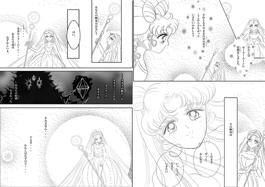
Lastly, hate it or not, the manga, especially Sailor Moon and the manga industry tends to rehash old plot points a lot. They often use the same text and similar situations. Thus much of this text is like the original. HOWEVER, while I did take the Japanese for this, I did alter large portions of the dialogue to fit the above situation.
") i.e. I am fluent enough to do that.
i.e. I am fluent enough to do that.Mostly I followed what the creator would have done in this situation... and from about page 10-11, copying dialogue won't happen again.
If you happen NOT to recognize this dialogue, kindly refer yourself to Stars 3 of the English manga or volume 18 of the Japanese manga.
And no, not 100% of the translation was from Kurozuki.
I did some refining along the edges.
Related content


Comments: 4

I would swear it is Naoko Takeuchi's work, it is exactly like hers. great job!
👍: 0 ⏩: 0


Nicely done. I like the toning used here - and even if there is a bit of tracing, you needed to get the character designs down!
I do have a couple of comments, though.
The text needs a bit of a border or something around it -- particularly in the toned areas. Perhaps a soft outer glow would do the trick? (That's what I do...) ...I suppose that would fit, since, well, Guardian Cosmos has one of those disembodied voice type things when I read her lines. xD
The other thing is the profiles of faces... If you would like me to do a redline to maybe help a little bit, I can do that...
👍: 0 ⏩: 1

Thanks, I see the mistakes with the profile now that I'm a few months away from originally drawing it. XD Always like that.
I agree about the text too. I took more care with the Japanese version, I think... I'm still pretty phobic of doing the English version. XD
👍: 0 ⏩: 0