HOME | DD
 kmkibble75 — The Mechanic

Published: 2017-07-03 16:10:20 +0000 UTC; Views: 620; Favourites: 31; Downloads: 0
Redirect to original
Description
I set out to do a quick line art of The Captain's trusty mechanic, but then it got away from me a bit, and this is the result. I'd originally inked the background, too, but then decided that I liked the sketchy feel left by the pencils better, so I went with them, as haphazard as the lines are.As for The Mechanic herself, I don't know too much about her yet, but I have the feeling bits of her right hand might still be left in the engine behind her. She used parts from around the room to make the replacement hand herself, so while it gets the job done, it might be kind of slowly poisoning her, whether she cares to admit that or not.
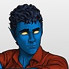
Though I didn't have this character in mind until very recently, her look was inspired by a headshot I did a few months ago (which feel like years, for some reason):
Any comments, critiques, or suggestions are more than welcome and very appreciated.
____________________________
Disclaimer: I’m red-green colorblind. Because of this, it’s difficult for me to tell similar shades/hues of different colors apart, and, therefore, I need to work with very limited palettes when I color pieces. For shading and highlights, I’ll generally adjust the ‘value’ portion of the HSV setting to make the base color lighter or darker; I’m unable to ‘cool’ shadows by adding blue or anything like that. I’ve often been told to be bolder in my highlighting and shading, and I’m trying to be so, but… sometimes it still seems pretty tame. I’m just saying this in case you mentioned I need to do that on a previous piece – I’m not ignoring you, and I appreciate the input. It’s just not very easy for me to implement confidently.
Related content
Comments: 20

She seems well dedicated to her job. A pure mechanic whose right arm is proof of the things she's gone through fixing and fiddling with machines and stuff.
👍: 0 ⏩: 0

Job well done! Due to lack of formal words, I settle for saying the Mohawk looks RAD! I admire your decision to draw the details of the background -- it brings a certain "pop" effect to the piece! The shading is just right -- it's not too dark, it's not too light. A small idea is to thin out her eyebrows; thick eyebrows make the forehead look small. Great piece all round!
👍: 0 ⏩: 1

Thanks -- I think the eyebrows are just a personal preference of mine. There was a fad a while ago to have pencil thin eyebrows, and I absolutely hated it -- so now I always make them kind of full. It helps with the expressiveness, I think, but you're right in that there can be such a thing as too big.
👍: 0 ⏩: 0

Hello, my name is Ana and I'm a newer member of . I have read your statement and considering the circumstances it sounds like you believe this is the best you can do. I am here to tell you that you are wrong. There is always room for improvement so don't cap your drawing abilities just yet. Some things I love about this piece:
I am in love with the depth of your picture. When It comes to backgrounds with my art I feel like I have no patience for it, and you do. So I admire that about you. The perspective in the picture is also very accurate and life-like, so I feel I should congratulate you on that as well.
Now, as far as critiquing goes, I will admit it is mostly shadow and highlight based. I understand you don't have the ability to see some different hues. So Instead of giving you a bunch of worthless critiques I'll ask some questions followed up with suggestions.
Can you tell even a minute (meaning small) difference between bubblegum pink and blood red? I ask this because if you can, you might consider giving you girl red shadows for her hair.
Another question. Can you tell white from muted black or gray? If so, then you could add harder white highlights to the edges of your background equipment so that it doesn't seem so dull.
Can you tell chocolate brown from tan? You might consider adding some chocolate brown shadows to that work belt hanging on the rail.
As far as anything else I would suggest to add deeper shadows to the eyes, some grayish-purple shadows to the shirt or apron hanging on her waist and more contrast to her face.
And believe me! You can do it! I already see the shadows you have and even I can barely distinguish them from your base colors.
Another tip to deeper shadows is that you can take a new layer over everything and paint over it all in dark blue opaque shadows. Then either lower the opacity or set the layer on overlay. What ever works.
Other then that, Excellent job. Well done!
👍: 0 ⏩: 1

Thank you very much for your kind words and for taking the time to comment. I'm glad the depth and such worked out -- the whole thing, kind of like the room itself, was a bit of a mess as I worked.
For the color thing, the best way I can think to describe it is to imagine you're cooking something, and you know it could use some oregano, but you have 20 or so spice containers in front of you and none of them are labeled. And on top of that, you're not 100% sure what oregano looks like. And you're not even sure that's what the recipe needs, come to think of it.
That's sort of how I am when it comes to mixing colors. I know the shadows need some blue, but I don't know where that blue becomes purple. Or whether the red I'm adding is actually orange, and so forth, so that's why I have to stick to the same family of colors and just play with the values when I'm trying these out. I'm most comfortable using +/-20, but am pushing toward +/-30 as a base and going more drastic when it's called for. So, deeper shadows to the eyes -- that, I can work with. 
Thank you again for taking the time to write this up --- I'll keep the list of suggestions in mind in case I work with similar colors in the future, and I'll see what I can do.
👍: 0 ⏩: 1

Hello! I'm here from Project Comment.
I reall like that you didn't ink the background, that gave it a very nice look. There is a lot of depth here and it is very impressively shown not only in the background but also in the way you made her lean against the rail. You're really good at clean lines and mechanical things, that's something you should definitely build on. Your anatomy is spot on, as well.
One thing here that is a bit offputting though is that you inked her and didn't ink the background. It looks a bit like you coloured in a page of a colouring book. The competing textures can work in some pieces, but this isn't one of them. The bag on the rail needs to have darker shading since it isn't right in front of us like she is. That bag and the hand near it are in the area of the drawing where you can see the background getting darker. The shading is also a bit confusing since the shadows on her face are going one way and the shadows behind her are going another. It dosesn't look bad unless you are looking at it closely but, some lighting studies could do you well.
👍: 0 ⏩: 1

Thank you very much for taking the time to comment. I see what you're saying about her toolbelt and her hand, I probably should have gone a bit darker with them. My primary concern with her hand was showing that it was real (that's why she's only wearing the one glove), but I should have found a way to work that while staying true to how the shadows should fall...
The inking/no inking thing is just kind of a style choice. I always consider the backgrounds to be secondary, so more often than not I don't want to spend the time inking them, but I get what you're saying. I'll have to keep that in mind in the future.
Thank you again for taking the time to comment -- your advice is appreciated!
👍: 0 ⏩: 0

Her hair is the coolest thing ever, and your lighting and angling really brings it to life here, more so than you achieved in her first headshot. Like the person above me said, the depth of this piece is mesmerizing, from the shadows on the mechanical backdrop to her positioning leaning against the railing, it's like I'm looking at a fully-fledged screenshot. I love the minute little personality details here as well, subtle things like that tear and the patches on her jeans, her tool bag and the little tattoos on her neck and shoulder all work with her body language to tell you this is someone who's pretty damn confident in her work and more than likely someone who'd seamlessly prove someone that doubted her wrong.
Reminds me of River's quote in Serenity: "I can kill you with my brain."
👍: 0 ⏩: 1

Thank you! I was a little unsure about the hair -- I don't think it turned out quite like I was aiming for, but it's good to know it still looks cool. And it's awesome that the Firefly line came to mind, since that's definitely the atmosphere I was going for -- this ship isn't quite as beat up as Serenity, but the engine room is more like an old school battleship than a state of the art nuclear aircraft carrier or Star Trek ship.
I was tempted to give her more tattoos, too, but I decided to take pity on FutureKevin, who may wind up drawing her again.
👍: 0 ⏩: 1

I commend you for taking mercy on Future-Kevin and resisting the urge to draw more tattoos. I curse my entire existence when I have to draw full-body's of Abby. Tattoos are so much easier to write than to draw. Terrible-decisions 101.
👍: 0 ⏩: 1

Yeah, it's amazing how many ideas are really cool for a one-off, but horribly complicated when the character becomes recurring.
👍: 0 ⏩: 0

Ohh I think that old headshot was the first of your drawings I saw
I think the anatomy in this piece looks great, as do the background, and you've managed to give your character "weight", it really looks like she's leaning on the railing, which imho can be really tricky.
From what I've seen (and remember) the shading and anatomy in this piece is your best yet! I've always liked your designs, and it will never cease to amaze me how you manage this while being color blind. Keep up your good work, you really are improving!
👍: 0 ⏩: 1

Wow, talk about making my month only three days in! Thank you for the kind words -- it really means a lot to have improvement being noticed (not to mention having old stuff recognized!).
👍: 0 ⏩: 1

Glad to have brightened your day!
Think she's a truly neat character design, and I noticed my old comment on the shading of her hair and must say both texture and shading of the hair in this piece has also improved greatly
👍: 0 ⏩: 1

Thank you, again! I actually had that specific comment in mind as I worked on her (it kept me on point in trying to get it better this time).
👍: 0 ⏩: 1


