HOME | DD
 Koilungfish — Quintesson Masks 2
Published: 2005-01-09 14:47:05 +0000 UTC; Views: 4579; Favourites: 62; Downloads: 90
Redirect to original
Description
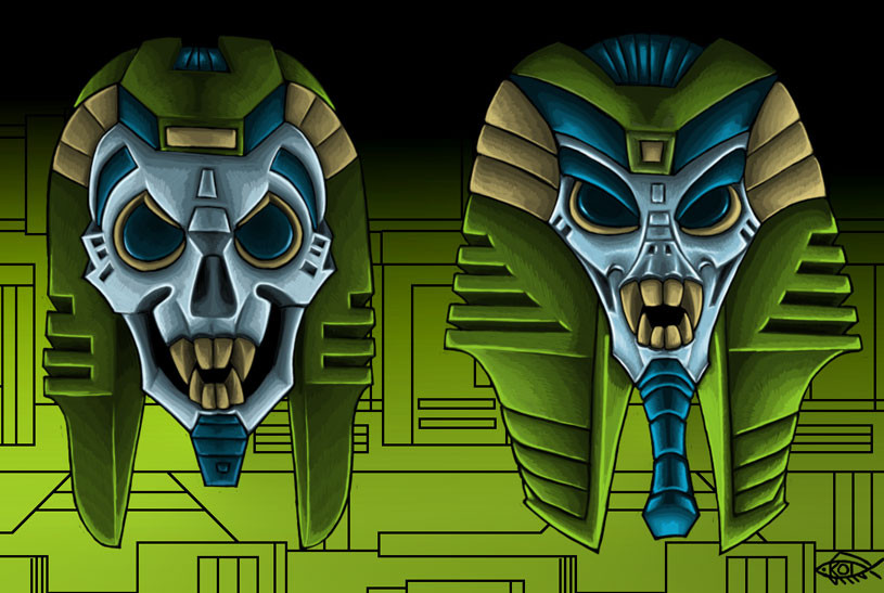
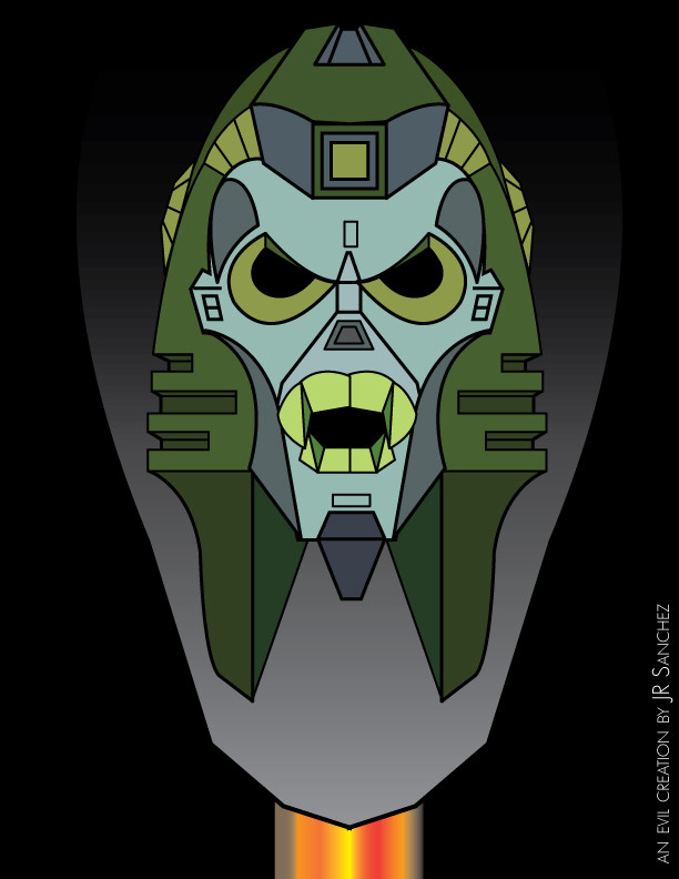
Pencil on paper, coloured in Photoshop. The idea behind this piece was to take the Quintesson Deathmask and emphasise the two influences that most inform its design; the Egyptian style, and the judge's wig on a skull. It should be pretty obvious which is which.The Judge mask was surprisingly easy to design - it came out clearly on the first attempted. The eyes aren't quite right, really, but they work ok. The Egyptian mask was much, much harder, and required adding various extra bits to make it work. The face doesn't work quite as well as the Judge mask, either - to make it look quasi-Egyptian requires certain curves that are convex in the original design to become concave, changing the form rather a lot.
Background looks as mangy as ever, but otherwise not bad.
Related content


Comments: 11

I always thought the death face resembles a cobra or an Egyptian pharaoh.
👍: 0 ⏩: 1


The death face is my favourite Quintesson face.
👍: 0 ⏩: 0


 (Smile)")

I think the egyptian one is my favoorite of the two. The dark eyelids thing is very egyptian. Nice one.
👍: 0 ⏩: 1


I much prefer the judge's wig on a skull version, rather than the Egyptian/insectile version, simply because of the whole "condemn you to death" rather than "watch whilst Ammit consumes your heart" bit--although of course one can draw a parallel between the monster at the balance and the Sharkticons in their pit. I don't really know why, but there's something about the nasal area I don't like. It's too pinched, perhaps.
The colours are most excellent.
👍: 0 ⏩: 0
