HOME | DD
 kon — i2 Test
Published: 2010-10-25 20:18:10 +0000 UTC; Views: 5536; Favourites: 22; Downloads: 0
Redirect to original
Description
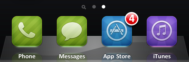
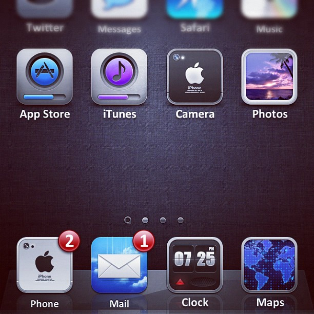
Quick illumine 2 aka i2 screen shot on the iPhone for testing purposes. kon
kon
Related content


Comments: 34


Can't wait, kon! This already looks awesome (:
just 1 question, this will be available for iTouch (4G) too, right?
👍: 0 ⏩: 0


Would be interesting to see the hole package!
iPhone 4 compatible yes?
👍: 0 ⏩: 0

OOOOOOOOOHHHHHHHMMMMMMMYYYYYYGAWDDDDDDDDDDDDDDDD!!!!!!!!!!!!!!!!!!!!!!!!!!!!!!!!!!!!!
👍: 0 ⏩: 0

looks awesome!! can't wait for this to be done
just a note - will you enable auto-creation of icons not included in this set?
👍: 0 ⏩: 0


Ahh, i've always loved your layer styles, the one thing I must say that I don't care for is the stripes.
👍: 0 ⏩: 0


looks good.
Do you plan on releasing the psd as well? Id really love those desaturated with the exception of the glow
👍: 0 ⏩: 0


I now feel like setting up illumine 1 for 4.0
Looking great!
👍: 0 ⏩: 0

Will you be making a version without the neon lights underneath?
👍: 0 ⏩: 1

The glow is kinda the point of the theme. Hence the title, 'illumine'
👍: 0 ⏩: 1
I get that, but I actually think it looks much better without the glow.
👍: 0 ⏩: 1
Well then I guess when its released you can edit out the glow in PS
👍: 0 ⏩: 0


")


The reflection seems off, but I guess it would look weird if the two glows were right on top of each other....
Can't wait.  (Smile)")
👍: 0 ⏩: 1
Maybe because the icons are smaller(?)
👍: 0 ⏩: 1
Couldn't you have a bigger canvas, then align the icons down?
👍: 0 ⏩: 1
Yeah, but then if you did that to all the icons, the springboard would look like its been shifted down and won't look good.
👍: 0 ⏩: 1
Well the issue is the reflection, so...
Why not just make illume icons bigger since you're retina-zing them anyway.
👍: 0 ⏩: 2
I don't know but I do remember the original illumine icons were small too. I'm guessing its just the style. Besides, this theme would look a lot better without the reflection, in my opinion.
👍: 0 ⏩: 0
They are already designed for retina, this problem cannot be fixed, this isn't simple; so its either have it the way they are or turn off the reflections using mobile substrate.
👍: 0 ⏩: 1
You can turn off reflection? I wasn't aware of that.
👍: 0 ⏩: 1
using mobile substrate; yes.
👍: 0 ⏩: 0

Awesome ! I love it. But personally I don't like the stripes on the
Telephone and Messages.
I'm very impatient.
👍: 0 ⏩: 1

")
All the tastes are in nature.  (Wink)")
👍: 0 ⏩: 1
