HOME | DD
 Kraehling-Janos — Excelsior variant, sheet 1 of 2

#excelsior #starship #startrek
Published: 2021-03-26 03:54:29 +0000 UTC; Views: 3319; Favourites: 19; Downloads: 16
Redirect to original
Description
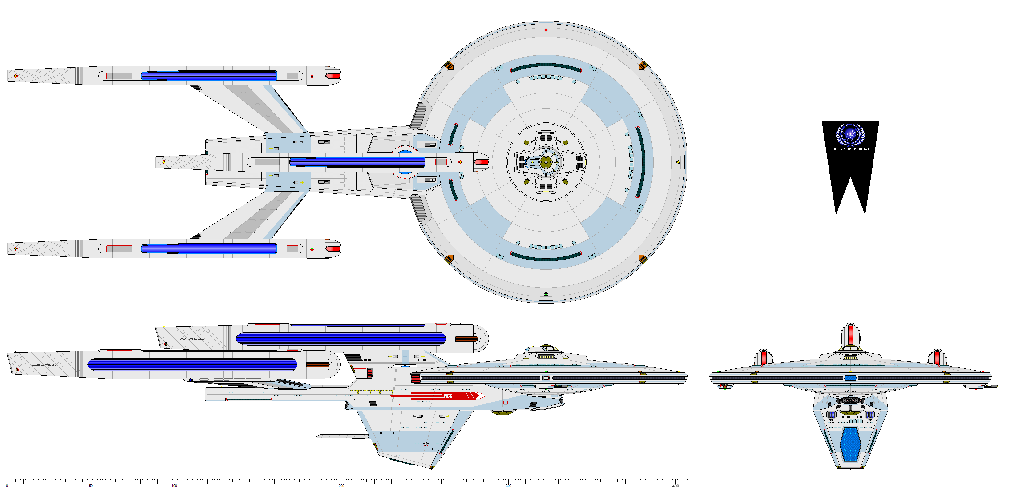
Totally bummed out by the great ugliness of the Excelsior class, the Federation Council saw to it that the upper echelons of the Starfleet Office of Design were pilloried and then drubbed thoroughly about the head and neck with wiffle bats. “One angle!” was the explanation by Council member Snorkis Tumflirps, “The ship looks kinda cool from only one freakin’ angle!” Undeniably true.Not sure what to do since Starfleet command insisted that it needed—above anything else—a bottom-heavy vessel, the Council eventually decided to order a redesign that preserved the gigantic flat-topped secondary hull. The result was the Ingram variant (see at www.cygnus-x1.net/links/lcars/… ), a huge improvement over the Excelsior but still goofy looking when compared to the Constitution or Miranda classes.
Not willing to throw in the towel just yet, President Puf Natatorium of Izar and senior Council members plundered other budget line items to fund a third variant of the Excelsior class. This time there was mediocre success! Still kind of hefty below the waistline, the new Alan Guth variant was a little bit more like what they wanted to see. However, only three vessels of her kind were built because Excelsior had deals for future picture and television appearances already lined up, meaning that all the funding went toward building an ungodly number of one of the worst vessels designs in Starfleet history until the neckless monstrosities known as the Sovereign and Intrepid classes appeared in the late 24th century. The ship shown here is named for Alexei Starobinsky, an astrophysicist of the 20th and 21st centuries who was a pioneer in the theory of cosmic inflation.
The ship’s motto was “В России тебя изучают звезды”, which is something in Russian apparently.
…
Seriously, though, I’ve mostly never liked Excelsior. I liked it when I first saw it on screen in 1984. It looked more futury and sleeker than the Enterprise. Then they started showing it from other angles. It does not look good from most angles. About 45 degrees either way off the bow and slightly below is the only way it looks halfway decent. So I decided to try my hand at a variant. I found it interesting in 1986—two years after the ship’s debut in The Search for Spock—Todd Guenther & Jason Genser decided to come out with their version of the ship. The blueprints (linked above) were beautiful. The linework was far better than a lot of blueprints you could get ahold of in those days. I also loved their redesign. I thought it far superior to the movie version. I’ve incorporated one or two elements/homages to it in my take. I hope it pleases some of you.
Pardon the few wiseass call-outs. By the time I get to the end of one of these projects I’m usually getting tired of it, so that comes out as snark.
Related content


Comments: 4

👍: 0 ⏩: 1

👍: 0 ⏩: 1
👍: 0 ⏩: 1
👍: 0 ⏩: 0