HOME | DD

krazytim — YourBiz Layout

Published: 2007-12-21 19:13:40 +0000 UTC; Views: 26966; Favourites: 138; Downloads: 1087
Redirect to original
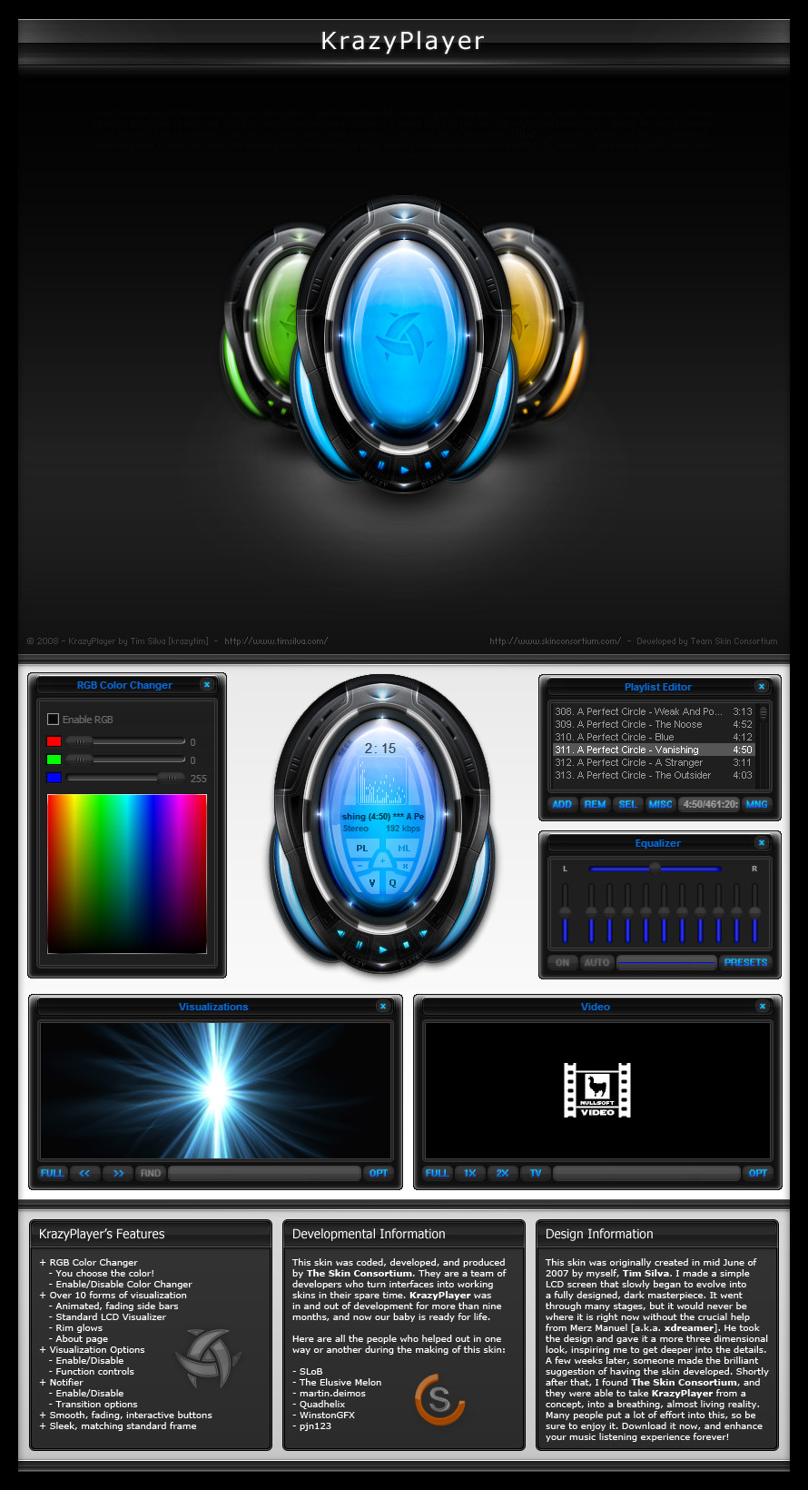
Description Read Me: This is a deviation submitted under my old account (krazytim). My new account (timsilva) is here: [link] - Please watch my new account.

Do not make comments or add this deviation to your favorites. Instead, go to the mirrored version of this deviation here: [link]

----------

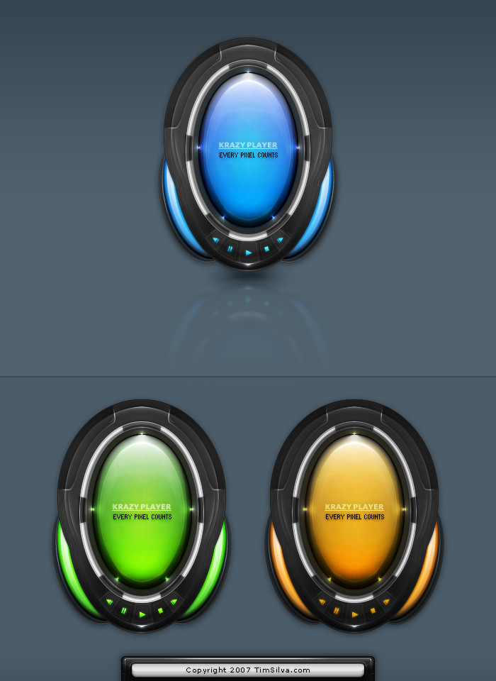
I wanted to make something orange. Just for fun, I was experimenting with a certain style that I have always been fond of.
Related content
Comments: 105

woser5 [2008-11-07 18:38:44 +0000 UTC]

Very good!

👍: 0 ⏩: 0

AlxDesign [2008-06-21 15:22:48 +0000 UTC]

Lovely choice of colors! Great as usual.

👍: 0 ⏩: 1

krazytim In reply to AlxDesign [2008-06-21 17:27:32 +0000 UTC]

lol thanks I submitted this in like December tho

👍: 0 ⏩: 1

AlxDesign In reply to krazytim [2008-06-21 18:48:42 +0000 UTC]

lol, I'm bad at looking at other peoples galleries

👍: 0 ⏩: 1

krazytim In reply to AlxDesign [2008-06-21 19:51:04 +0000 UTC]

It's all good I just thought it was kinda funny is all

👍: 0 ⏩: 1

AlxDesign In reply to krazytim [2008-06-21 20:24:06 +0000 UTC]

haha, yea... I'm a few months behind

👍: 0 ⏩: 1

krazytim In reply to AlxDesign [2008-06-21 21:51:48 +0000 UTC]

lol, your not the only one

👍: 0 ⏩: 0

iovra [2008-05-25 22:41:23 +0000 UTC]

Looks good, nice work. The colours work well together and I like the navigation

👍: 0 ⏩: 1

krazytim In reply to iovra [2008-05-26 02:58:23 +0000 UTC]

Thanks, glad you like it

👍: 0 ⏩: 0

yoboseiyo [2008-04-30 01:48:19 +0000 UTC]

that is really cool.
orange is my favourite color.

👍: 0 ⏩: 1

krazytim In reply to yoboseiyo [2008-04-30 05:37:37 +0000 UTC]

Thanks for the +fav

Ya, orange is pretty cool isn't it?

👍: 0 ⏩: 1

yoboseiyo In reply to krazytim [2008-04-30 22:43:19 +0000 UTC]

it really is.

👍: 0 ⏩: 0

K0M0X [2008-04-16 13:20:41 +0000 UTC]

its fantastic.

👍: 0 ⏩: 1

krazytim In reply to K0M0X [2008-04-16 21:21:29 +0000 UTC]

Thanks

👍: 0 ⏩: 0

VirtualAlias [2008-02-25 19:55:40 +0000 UTC]

Awesome composition. Simple, without being dull... That is such an eye-catcher, man...really famous job. *Fav'd*

👍: 0 ⏩: 1

krazytim In reply to VirtualAlias [2008-02-25 21:15:37 +0000 UTC]

Thanks a lot I think the orange header mixed with the pen created that 'eye-catching' look. I'm happy with the end result

👍: 0 ⏩: 1

fee3R In reply to krazytim [2008-03-05 22:07:41 +0000 UTC]

me too looks stunning! very professional , and love the colours... NICE WORK

👍: 0 ⏩: 1

krazytim In reply to fee3R [2008-03-05 23:12:54 +0000 UTC]

Thanks, I appreciate it

👍: 0 ⏩: 0

ElrondMcStyle [2008-02-18 16:04:41 +0000 UTC]

nice design, great colors!

👍: 0 ⏩: 1

krazytim In reply to ElrondMcStyle [2008-02-25 21:14:40 +0000 UTC]

Thank you

👍: 0 ⏩: 0

Bloomy021 [2008-02-18 13:40:01 +0000 UTC]

wow wonderful !

👍: 0 ⏩: 1

krazytim In reply to Bloomy021 [2008-02-25 21:14:32 +0000 UTC]

I'm glad you think so

👍: 0 ⏩: 0

milcom [2008-02-18 13:24:19 +0000 UTC]

clean...nice colors...great work!

👍: 0 ⏩: 1

krazytim In reply to milcom [2008-02-25 21:14:25 +0000 UTC]

Thanks I appreciate it

👍: 0 ⏩: 0

pixel3 [2008-02-18 05:17:44 +0000 UTC]

i love the logo, and i want that pen

👍: 0 ⏩: 1

krazytim In reply to pixel3 [2008-02-18 06:10:23 +0000 UTC]

Thanks Ya, the pen is amazing

👍: 0 ⏩: 0

tom-sche [2008-02-11 23:16:23 +0000 UTC]

wow, klasse ding

👍: 0 ⏩: 1

krazytim In reply to tom-sche [2008-02-11 23:21:25 +0000 UTC]

Thanks

👍: 0 ⏩: 0

karsten [2008-02-09 22:00:34 +0000 UTC]

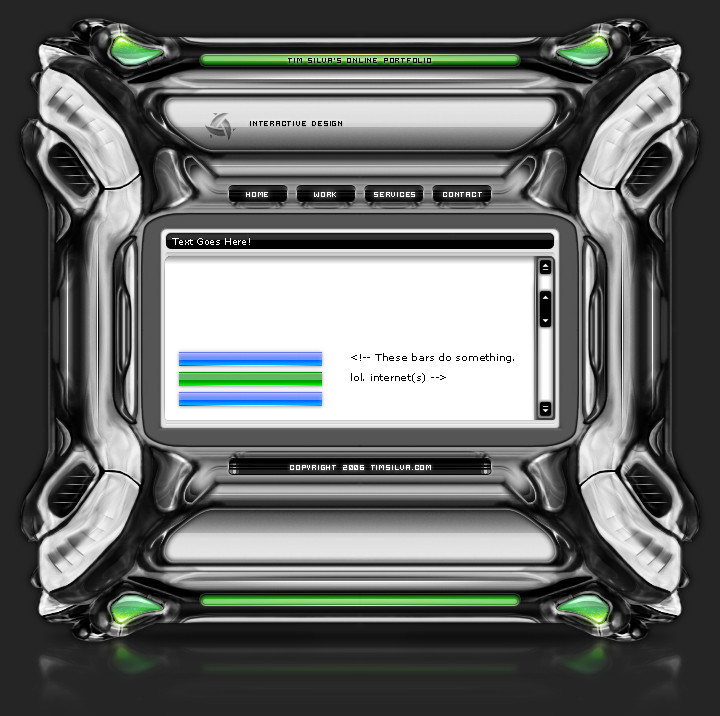
"your biz" logo on brick with dropshadow, icons top right we all know that classic

👍: 0 ⏩: 1

krazytim In reply to karsten [2008-02-09 22:54:10 +0000 UTC]

lol yup, I love the style

👍: 0 ⏩: 0

xfragg3r [2008-02-04 12:35:42 +0000 UTC]

realy nice tim, love the colors

👍: 0 ⏩: 1

krazytim In reply to xfragg3r [2008-02-09 22:53:53 +0000 UTC]

I'm late, but thanks

👍: 0 ⏩: 0

Superiorgamer [2008-01-20 05:34:12 +0000 UTC]

Very nice and clean template. Wow, great work

👍: 0 ⏩: 1

krazytim In reply to Superiorgamer [2008-02-09 22:53:45 +0000 UTC]

Thanks

👍: 0 ⏩: 0

tehacesequence [2007-12-25 04:53:35 +0000 UTC]

I agree with you that this is a cool shape, and I also admire the "about your biz" button, good work even as it's not finished.

👍: 0 ⏩: 1

krazytim In reply to tehacesequence [2007-12-25 19:47:01 +0000 UTC]

Thanks

The "about your biz" button is finished What r u talkin about?

👍: 0 ⏩: 1

tehacesequence In reply to krazytim [2007-12-26 13:32:30 +0000 UTC]

I started this a while ago and it was just sitting in a folder until I had time to finish it.

;]

👍: 0 ⏩: 1

krazytim In reply to tehacesequence [2007-12-26 21:09:21 +0000 UTC]

I was talking about the whole design, not the button. The button is finished, why does it not look done to you?

👍: 0 ⏩: 1

tehacesequence In reply to krazytim [2007-12-27 02:15:34 +0000 UTC]

I know it seems that I write something wrong as I was also reffering to the design when I wrote that it's unfinised ;]

👍: 0 ⏩: 2

tehacesequence In reply to tehacesequence [2007-12-27 08:41:49 +0000 UTC]

lol many misunderstoods here... ;] I'll try to do better next time I'll comment your stuff. Sorry for the confusion. Have a nice day.

👍: 0 ⏩: 0

krazytim In reply to tehacesequence [2007-12-27 03:50:14 +0000 UTC]

Oh, you misunderstood this "I started this a while ago and it was just sitting in a folder until I had time to finish it."

I meant that it was unfinished, but I just had some time to finish it up, so I did, and then I uploaded it. I see why you misunderstood that

👍: 0 ⏩: 0

MaLH92 [2007-12-23 09:16:05 +0000 UTC]

whoop whoop ... exactly my style ... I love it ... ... + fav !!!

👍: 0 ⏩: 1

krazytim In reply to MaLH92 [2007-12-23 09:40:46 +0000 UTC]

Thanks for the +fav buddy

👍: 0 ⏩: 0

Mikekuul [2007-12-22 22:24:30 +0000 UTC]

This is not too bad. The content section is completely out of place though. It looks like a flash embed in the middle of what should be a HTML/CSS page. The content area is ridiculously small, the blur effect makes things worse and the scroll bar isn't interesting (or required for that matter).

Ditch the scrollbar, bump the content buttons ("about your biz", etc) to the right of the content and let the content just flow down and around the buttons.

👍: 0 ⏩: 1

krazytim In reply to Mikekuul [2007-12-22 23:52:05 +0000 UTC]

lol, well its not like i'm coding it or anything, this was just an experiment with colors more than anything If I were to code it, I would make it taller and the content would stretch down, but when I designed it in ps, I only made it 800px tall, so I just put something simple in the content area. I wouldn't use the scrollbar if it were coded (or flash for that matter).

👍: 0 ⏩: 0

lorency [2007-12-22 21:46:42 +0000 UTC]

Great work! I love the colors!

👍: 0 ⏩: 1

krazytim In reply to lorency [2007-12-22 23:46:24 +0000 UTC]

Thanks

👍: 0 ⏩: 0

rd-signs [2007-12-22 19:06:15 +0000 UTC]

nice but the menu looks out of place imo

👍: 0 ⏩: 1

krazytim In reply to rd-signs [2007-12-22 19:32:38 +0000 UTC]

What do you mean? The colors, or the position?

👍: 0 ⏩: 1

rd-signs In reply to krazytim [2007-12-22 21:43:38 +0000 UTC]

hm.. the structure... they should be all the max width.. and can't understand that.. blank part at the bottom of the menu.. it makes it.. weird. maybe add another button

👍: 0 ⏩: 1


| Next =>