HOME | DD
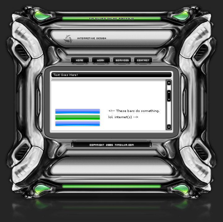
 krazytim — YourBiz Layout

Published: 2007-12-21 19:13:40 +0000 UTC; Views: 26988; Favourites: 138; Downloads: 1087
Redirect to original
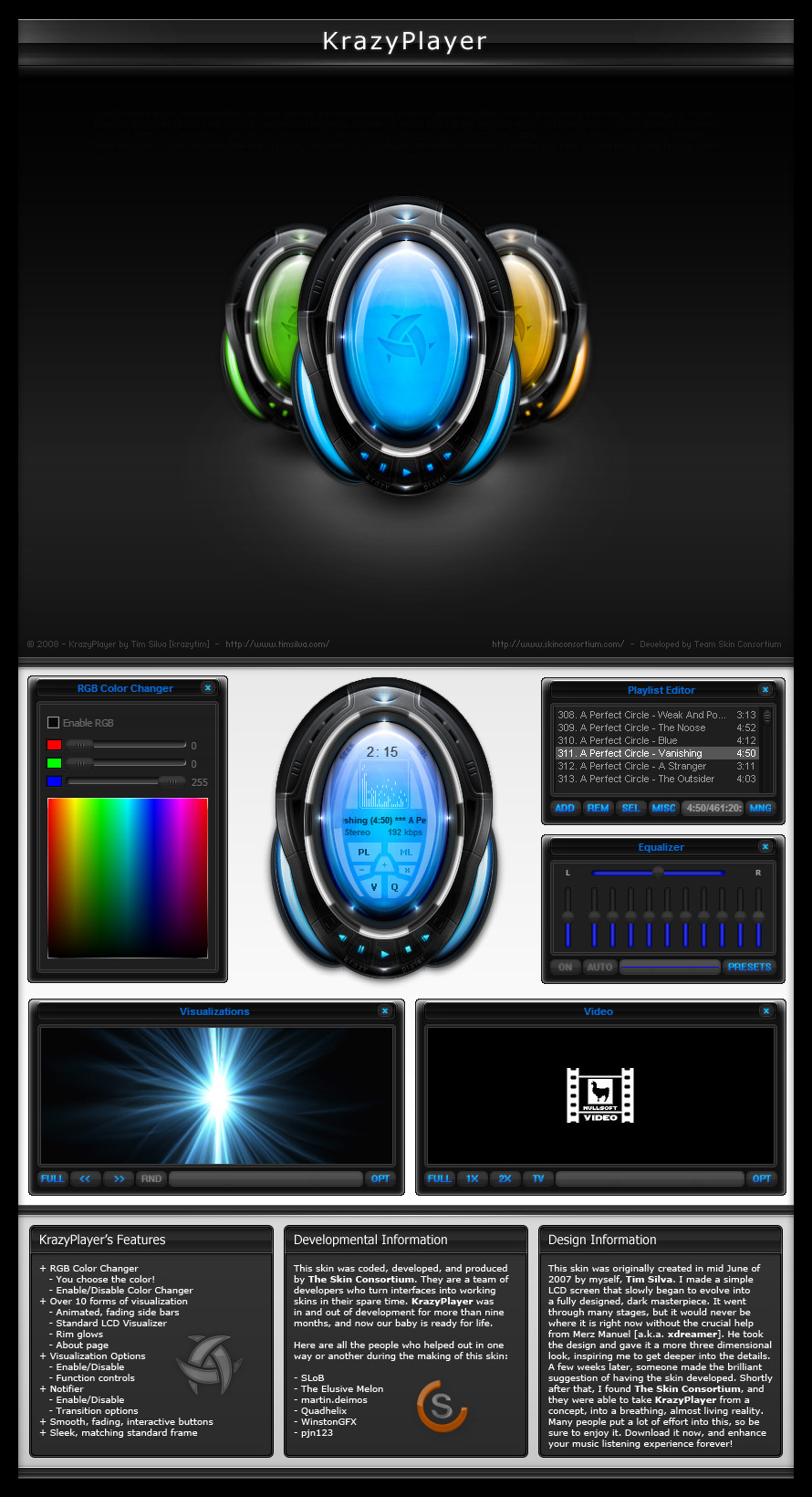
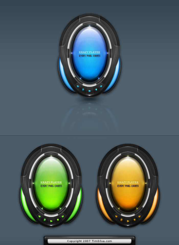
Description
Read Me: This is a deviation submitted under my old account (krazytim). My new account (timsilva) is here: [link] - Please watch my new account.Do not make comments or add this deviation to your favorites. Instead, go to the mirrored version of this deviation here: [link]
----------
I wanted to make something orange.
 (Smile)") Just for fun, I was experimenting with a certain style that I have always been fond of.
Just for fun, I was experimenting with a certain style that I have always been fond of.
Related content


Comments: 105

Oh, I know what you mean. Well it would be a centered layout, so it wouldn't fill up the entire screen if it were coded. But it is only for me anyways
👍: 0 ⏩: 0


great one tim, a lovely combination of function v's style , would like to see this flash coded, my fave colors too ya bish ")
")
👍: 0 ⏩: 1
Thanks
I actually like the header more than the footer  (Wink)")
👍: 0 ⏩: 1
yea i know, i am torn between wanting a clean design and a detailed design lol, part of me likes my site the other part wish's it was more corporate
👍: 0 ⏩: 1
imo, something more corporate, clean & professional gives you the freedom to focus the content on your portfolio. Plus it shows a level of confidence because you can made cool looking stuff, but you held back from that in order to focus your visitor's attention of your best works
👍: 0 ⏩: 1
hmm all good points we shall see ......
👍: 0 ⏩: 0


loool ! Once again it is really superb. I like your style !!
👍: 0 ⏩: 1
ty again boing
👍: 0 ⏩: 0

Thats what I was aiming for
👍: 0 ⏩: 0

Ahh nice one buddy
P.S. You must have a pretty large fan base. A fair few comments building up here!
Peace, Lance
")
👍: 0 ⏩: 1
Glad to here that you like it
Ya, I noticed that too. My last few posts have been getting some good attention.
btw, if you didn't read my last journal, you should check out these forums: [link] - You'd fit in there, people there would appreciate your style.
👍: 0 ⏩: 1
Nice one. I just checked out the forum. Looks pretty cool. I'll register once I've sent this
Peace, Lance
👍: 0 ⏩: 1
Cool
👍: 0 ⏩: 0

nice one. Good main photo. Orange pen really suits the heading.
👍: 0 ⏩: 1
Thanks
Whats funny about that is that I didn't even add the image to the layout until the end of designing it, and I thought the same thing.
👍: 0 ⏩: 0


I'm glad you think so ben
👍: 0 ⏩: 0


No kiding
👍: 0 ⏩: 1

awesome
👍: 0 ⏩: 0


looks cool. nice colors, would maybe do the hover with the white as a overlay^^

👍: 0 ⏩: 1
Thanks tobimo
👍: 0 ⏩: 1


| Next =>