HOME | DD
 Kyle-Dove — How BW should have been
Published: 2010-12-23 21:20:32 +0000 UTC; Views: 30699; Favourites: 1217; Downloads: 214
Redirect to original
Description
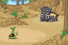
I just finished a new battle background for mountains.I wanted to test it out so I did this.
Personally, I think this is awesome, it's such a shame Nintendo wont use proper battle backgrounds.
Hope you like! Turtwig and Bastiodon rule btw.
I did NOT make the pokemon sprites/animations. Nintendo did. Credits to Jefelin for the rips.
Related content


Comments: 472


wow that's awesome, I really wish the game was like this. ;3;
👍: 0 ⏩: 0


One of the things that fangames do better than Game Freak D< and something tells me this would take less space in the rom then their FULLY HARDCORE 3D RENDERED OVALS >_>
👍: 0 ⏩: 1

FULLY.
HARDCORE.
3D RENDERED.
OVALS!!
👍: 0 ⏩: 1

i hate the game in general.
most of the new designs are terrible and there is literally after how many years and games no change in gameplay.
my problem is mainly with the designs though.
👍: 0 ⏩: 1

:U well, personally i thinks it BETTER that they don't change the gameplay, but DO change the design. it means the games feel...new, but maintain the reason we played in the first place.
almost the same reason the zelda games are still good, but sonic games...not so much.
the overall aesthetic of BW is fresh, i cant wait to try it~
i would really like true backgrounds too....but, i dunno...
👍: 0 ⏩: 1
meh i just don't like it.
never really played zela
yeah sonic hasn't been doin so hot this past decade. ... well this is SEGA is were talking about.
👍: 0 ⏩: 1
ahhh well, thats okay~ to each their own, i just wanted to state that changing designs is not....in itself bad. :3
yeah yeah :U i LIKE the new "feel" of the sonic's and the new characters,(shadow and his ilk.) but...i just wish the gameplay/camera was less shaky.
👍: 0 ⏩: 1
yeah
but i liked sonic unleashed.
i liked its gameplay style it gave a sense of speed as sonic games should. and i think the gameplay was pretty good too.*the day stages* but of course they had to screw it up with the whole where hog thing.
witch is why i am buying sonic colors.i hear from okay to good reviews on it.
👍: 0 ⏩: 1
oh yeah? :U i read some SCATHING reviews, so i never tried unleashed. mayhaps i should. what about the um....wavyness of control though? sonic heroes was pretty shaky.
oh yeah! i heard good things about colors too. but i dont wanna get it until i have more regular access to a wii. the DS version...well...maybe if i can find it used.
tell me if its actually good, okay? ^__^
👍: 0 ⏩: 1
if you have had your old school callings filled with sonic 4 then go for the wii version.
the 360 and ps3 version of unleashed are the good ones.
unleash depends though really.
there are mixed thoughts on the game.
the only problem i have heard about colors is that the drift is awful but aint to much of a problem.
👍: 0 ⏩: 0

I completely agree with you! I've been waiting for fullscreen background battle images for years instead of those stupid little floating circles. The games would be much better off with images like these! I think you've done a fantastic job on this, it definitely looks awesome!

👍: 0 ⏩: 0

That's fucking awesome.
You never cease to amaze me, Kymotonian.
👍: 0 ⏩: 0


This is amazing! I don't get what other people are saying that it wouldn't work because of the pokemon's sprites being all different shapes and sizes.. That doesn't really make a lick of sense to me. I could see this "forest path" being used in many different locations, so it's not like they'd have to make a new background for every single tile either... nevermind that they could and still have room for everything else and more in the little game cartridge (people underestimate the capabilities of those little things so much, it drives me and Boyfriend crazy.)
Nintendo should hire you to design some of the battle system.
 (Wink)")
👍: 0 ⏩: 1
yeah I don't get what some people are saying either. You could also do a simple background setting where different parts are randomized on the background to create a slightly different background each time if it bothered people so much that they might see it often.
Personally I wouldn't get tired of seeing this background 100 times, it's definately a lot less tiring than the ones they have now...
I only wish they'd hire me..
👍: 0 ⏩: 0

This is awesome! and I totally agree, the full battle scene should have been introduced long ago. Hopefully they'll do it next console.
👍: 0 ⏩: 0

you should sell your idea to the company
👍: 0 ⏩: 1
you should send the company ideas
immsure theyd love to hear it ^-^
👍: 0 ⏩: 0

They should make proper backgrounds. I think they're just lazy, though.
👍: 0 ⏩: 0

I like the way nintendo does their much more, and I believe it makes more sense also. Given that there are so many pokemon that can be in a particular area, it mean a lot of pokemon won't fit in with a particular setting. So by doing it with pads like they are currently, it shows this is the general type of terrain, but its different throughout.
Secondly, the focus is, and always was, and hopefully always will be on pokemon. Their current way keeps the focus on them, while being able to show the ecosystem.
And thirdly, simply originality. Pokemon certainly wouldn't be where it is today if they copied everything other people did, and I think I would never imagine pokemon if someone showed me this image. And as cool as it is the first time you see it, how cool will it be after the 50th battle you've done there?
Regardless, great spriting as always, although I can't quite get a grasp on its actual area its based off of without reading your description of it. Just because it looks like a rocky desert, but yet has dying trees in the background, signifying that vegetation used to grow there. I know, minor complaint, but just seemed a bit off to me.
👍: 0 ⏩: 1
That's fair enough you're entitled to your opinion. I get the sense from most of the replies that most people would agree with me that they'd much prefer battles like this. Personally a lot of pokemon would fit in different settings, you only need 10 different ones or so. You can imagine ground, rock, grass, flying, normal types in a setting such as this.
I tried to keep the background quite simple and didnt use any blacks so hopefully the pokemon still stand out quite a lot on this.
Originality...surely they're being unoriginal by not doing this? Keeping to the same boring style of battle setting as from the original game is hardly original I believe. They wouldn't be copying, its just the next logical step.
The setting is just a fictional mountain trail. I actually based it on a photo so it's not as strange as you'd think. Especially being the pokemon world where there can be electric caves and such.
👍: 0 ⏩: 1
Well, yes, you only need ten for all pokekmon to live in, but not all pokemon will FIT into each one of those categories.
As far as the next logical step goes, well, its not like they are same backgrounds. They are sprited up to date just as much as yours are, there is simply less of it. I guess I just find a large static backround you see 50 times to be more boring than something that is just there to get the idea across.
And I wouldn't worry about the color choice, there's no doubt you did well on it and the pokemon stand out. However, no matter what colors you choose, there is no doubt going to be focus taken away from the pokemon when it covers the whole screen. Add to that, you have attack animations of all sorts of colors, and styles(2-d or 3-d) to keep in mind as well.
Honestly I'm not trying to start an arguement or go off on a tangent, I was just a tad peeved at your title of "How BW should of been". And yes, before you say it, I do realize its YOUR opinion on the matter.
👍: 0 ⏩: 1
Ah right, sorry if I came across as argumentative. Judging from the reaction I think most people agree this is how they think BW should have been.
Also I don't know if you've seen the battle screenshots for BW but the battle scenes are now 3D, so theyre not sprited up to date like mine. This means the pixels are really stretched and come off quite ugly. Take a screenshot like [link] for example...Just looking at the floor..need I say more?
👍: 0 ⏩: 1
Well, I think there is no doubt in my mind most people on first glance would say its better, I myself would. Its after you do so many battles there it gets old. I'd be fine with it if they put in as much work as they did with the little pictures for each area in hg/ss(i.e. slowpoke well, ice cave, etc), and perhaps animated them also. But as of right now, I, as well as anyone else see the way they currently do things and instantly say, thats pokemon.
But no, I haven't played nor seen black and white, other than that first footage of entei vs zoroark disguised as raikou. but I actually like the ground, looks kind of like brushstrokes, and gets across the murky kind of feel the design that the legendaries give me. Although, I can't really argue much on that point until I play the game.
👍: 0 ⏩: 0

Would be very interested to see how Dig and Earthquake would turn out on a scenery like that.
👍: 0 ⏩: 1
ooh that's a good point, that would be interesting!
👍: 0 ⏩: 1
yep! And the sky turning dark when using Thunder too O:
👍: 0 ⏩: 0

This is amazing, the animations are a nice touch (even if they were Nintendo's), but the background feels like it's finally that last step of immersion Pokemon needs (on hand-helds at least). I second (or nth) the awesomeness of this!
👍: 0 ⏩: 1
Yeah, I mean they're still using the same background style as the first pokemon games ever..you'd think they would have moved on from then!
👍: 0 ⏩: 0

I agree with you, Nintendo should have done the newer games like this...makes it more realistic. They are already going with the 3-D point of view and moving sprites in battles. Why not change up the scenery as well? They should have some kind of poll or fan suggestions on this kind of thing. But I really like this idea, very creative!
👍: 0 ⏩: 0

that does look awesome  (Smile)")
👍: 0 ⏩: 0

The title should be changed to "How Nintendo should have hired me".
👍: 0 ⏩: 2
Haha damn right. They should have hired you too!
👍: 0 ⏩: 0


")

This is really awesome, though i'd be interested to see how it looked with the pokemons stats, wouldnt want them getting in the way of the fantastic background.
👍: 0 ⏩: 1
If I was in charge, I'd put all the stats and everything on the bottom screen. There's so much wasted space there that they could keep the entire top screen beautiful.
👍: 0 ⏩: 2
That's a pretty good idea too =O I wish Nintendo paid attention to this...
👍: 0 ⏩: 0
I thought you might say that, and why not, its a damn fine idea.
👍: 0 ⏩: 0

I love it! I definitely agree that Gamefreak needs to step up their battle backgrounds. Beautiful work here.
👍: 0 ⏩: 0

These are both my favorite pokemon too
The background does seem fitting for how pokegames should be.
👍: 0 ⏩: 1
I'm always happy to see more GenIV fans!
👍: 0 ⏩: 0

I think they haven't done this (yet) is because of the placements. I mean, it would be weird if you were on a icy sea-thingy with lots of ice around the place, but then in the battlescreen there would be none and just water and an island in the background everywhere you fight. It would be too much work if they had to make a battlescreen for every tile and placement, so I can kinda see why they just do a basic battlescreen with light and shadow effects :b
👍: 0 ⏩: 1
Not really. They did it for HG in the location screenshots. Those were all many and very different.
Plus have a look at the sprout tower - what battle background appears there? A CAVE BACKGROUND. That is the most nonsensical thing I have ever seen so I doubt they're worried about it not looking exactly like that place you're in...
👍: 0 ⏩: 1
<= Prev | | Next =>