HOME | DD
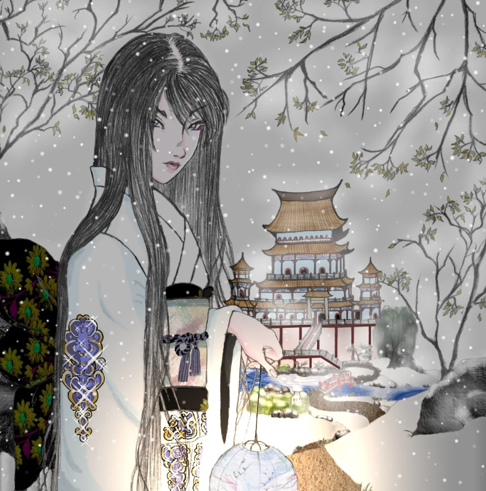
 LadyEntropy — Welcome Home - colour version
Published: 2003-12-18 15:44:14 +0000 UTC; Views: 1865; Favourites: 26; Downloads: 288
Redirect to original
Description
YES! Finally, I've finished it!!! After endless time, I DID IT! I coloured the " Welcome Home" piece - the one I'm dedicating to the gentlemen who were my opponents in my first L5R tournament. And they are....:Bayushi Tashibana - for being my favourite Scorpion, and the only one I'll hug (well, of course I'll have a chainmain shirt on, just in case....
 (Wink)") )
)Mirumoto Shiryu - for always being there -- and acting as a guide for a northerner girl lost in the hell of a big city.
Bayushi brothers - for playing even against all odds - showing that even a Scorpion can be honourable (actually, they are always honourable, except only to themselves).
[T]iamat - for being the only person who I knew in #dnd.
Yoritomo Noin - for being my favourite Kolat!
Doji Hukugaisha - for being my favourite Crane cousin (Go us!)!!!
Kakita Carreira - for the warning he got for aiding me in a rules doubt I had.
A big Domo Arigato, for you, brave samurai!!
Ah, and I'm asking for Santa to give me a tablet and Photoshop this X-mas -- it's a pain to colour something using a photograph retouch program and a rat... err.... mouse. ARGH, I went insane using it!
Related content


Comments: 29


The colours came out very good especially the "shine" of the lantern
👍: 0 ⏩: 1

Thank you ^__^... it was quite the pain to color this, because a) it was my first colouring attempt; b) I used a mouse the whole time and c) I used a photo manipulation program, not Paintshop Pro.. So I'm happy people actually LIKE the results.
👍: 0 ⏩: 0

Ah, experimenta submeter sem o efeito luminoso! Acho que o cinzento atrás retira a vivacidade toda ao desenho!
Sem isso acho que ficava lindo!
👍: 0 ⏩: 1
Eu sei, mas infelizmente preciso do fundo cinzento para dar a ideia que se está no meio de uma tempestade de neve. O efeito de luz bem, são saiu como queria --mas trabalhar com um retocador de fotos é uma seca.
👍: 0 ⏩: 2
Pois sim, senhor inginheiro. Tens razão tenho que tentar outra versão. Mas olha que fazer efeitos realistas usando o rato e um programa de foto-retoque é dificil pra chuchu.
👍: 0 ⏩: 0
o cinzento está muito homogeneo! Se estiveres a utilizar o photoshop o semelhante tenta criar mesmo uma sensação de diversidade no fumo e faz uma mascara a volta da rapariga para que ela se destaque mais.
Assim ficavas na mesma com a ideia de tempestade de neve e o desenho ganhava mais vivacidade!
👍: 0 ⏩: 0

que desenho lindo!!! muito bonito o seu estilo... adorei!!! meus parabéns!!!!!!
👍: 0 ⏩: 1
Estou a ficar sem coisas bonitas para dizer, ehehehe. Eu confesso que deixei o estilo Manga durante algum tempo, para tentar ser mais realista, que é bem mais dificil. Mas aqui estou a tentar voltar - ainda que não seja 100% manga.
👍: 0 ⏩: 1
lol! Mas o seu estilo é muito interessante! é uma mistura de Manga com o tradicional japones... é muito legal! continue assim
👍: 0 ⏩: 0

I agree with ~PlatypusGreen! It does have the look of traditional Japanese artwork! I love it! 
👍: 0 ⏩: 1
*bows* Thank you so much, I will now take the liberty of perusing your library .... :wink:
👍: 0 ⏩: 0


Muito obrigada. Sinto-me muito lisonjeada por isso, visto que és muito mais hábil que eu no manejo de CGI, como mostra a tua arte.....
👍: 0 ⏩: 0

Tá tão lindo!
A sensação de profundidade tá perfeita, aqueles enfeites no fato tão de+ e o flare da lâmpada tá espetacular
Já a outra versão tava fabulosa quanto mais esta
Não me queres vender isto?

")
👍: 0 ⏩: 1
Bigado, és um kido!!!!!! 
Vender é dificil porque o original está em papel a preto e branco. O original colorido é este, só que um pouco maior. Posso é dar-te autorização para o imprimires, se quiseres. Podes fazê-lo na Copipronto no CC Cidade do Porto. Como pagamento.... imprimes uma cópia para mim?
👍: 0 ⏩: 1

Ficou lindo ,sensei!!!!
=^^=
+fav!!!
*******************
👍: 0 ⏩: 1

👍: 0 ⏩: 0


ta lindissimo!
magnifico mesmo
qualquer coisa que eu possa fizert fica muito aquem do k deveria ser dito
parabens^^
ah e muito bom Natal ^^
👍: 0 ⏩: 1
As tuas palavras doces são o suficiente -- compensam todo o trabalho.... 
👍: 0 ⏩: 0

The lighting is perfect. And the sparklies on her sleeve add the nicest touch. ^^ Well done. :3
👍: 0 ⏩: 1
Thank you... but they were a pain to make. Originally I wanted to make a flare "Star" effect... but since I was using a mere photo retouch program, I had to simulate it with a star-shaped stamp. It took a while, because a little too much pressure, and it would be a fully white star, and a little too less and you could see through it.
👍: 0 ⏩: 0

what i like about this is the essence of traditional japanese artwork.
👍: 0 ⏩: 1
I did try not to overdo the drawing -- by adding a few tree branches with a little amount of leaves. Japanese art is slightly minimalistic, and I think I managed to pull this one rather acceptably. You are indeed very perceptive, congratulations. I assume you enjoy japanese arte, then?
👍: 0 ⏩: 0

*bows* Thank you, you are most kind. Funny enough, the original pencil picture was sitting in a shelf for nearly 6 months before I added the tree branches and the background, and then scanned it. Not to mention it took me a month or two before I coloured the first version (which is somewhere in my gallery).
👍: 0 ⏩: 0

Oh wow..the colors are so perfect, and the background is flawless! The girl makes it so majestic too!
👍: 0 ⏩: 1
Thanks so much for the compliments... taking into account this is my first attempt at CCGing, that means a lot to me....
👍: 0 ⏩: 0