HOME | DD

LaFatalite — SAI Paint Tool - Tutorial 2

Published: 2009-02-08 12:37:18 +0000 UTC; Views: 122888; Favourites: 654; Downloads: 3111
Redirect to original
Description *******[link]
please visit that link if you would like to DL the tools I use

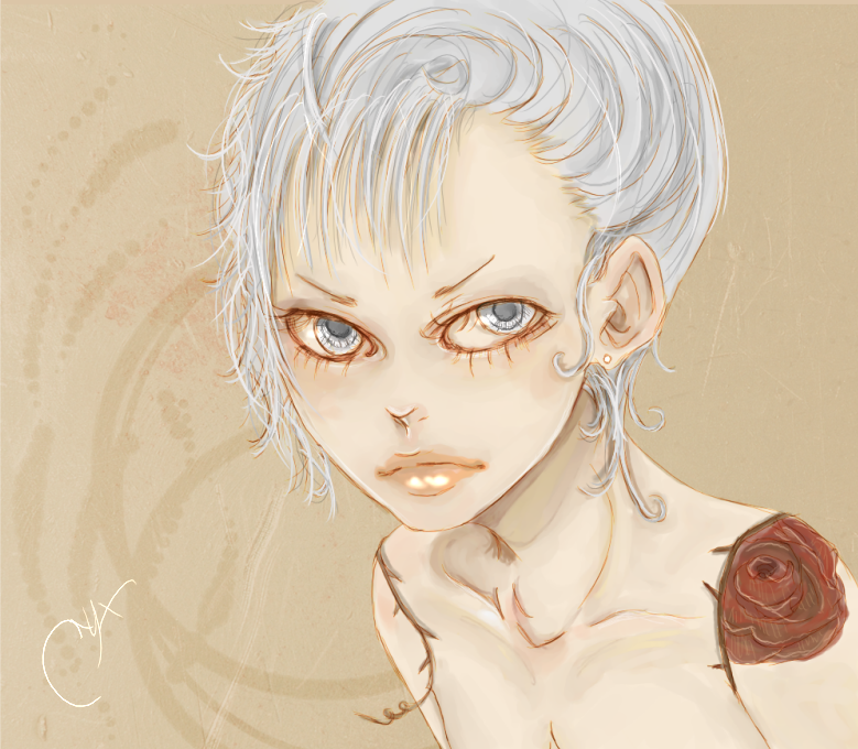
Tutorial for this: [link] image
First SAI Paint Tool Tutorial - [link]


----

Ok, let's start this off.

When you first begin [making a new image] honestly don't worry about the size.
Why?
Because you can change the size later on.
The only thing you should ponder is the resolution.
300 px is great unless you've got more memory to use, then put it higher. Any lower I'd say about 275 px.
But that's just me - ((When making your resolution higher, make sure you don't have a shit load of programs open like an idiot))

TOOL SETTINGS
NOTE: The names of my tools are different from the ones that came with SAI. Two reasons.
One - because I organized them by how I use them (color, blending, erasing -)
Two - I have extra tools made by others who use the original version


  • Airbrush: to me this is excellent for the "persistent" colors that don't want to show up during blending, and also if you don't want to put a lot of pressure down with your tablets pen.

    • Size: 2 px - 6 px

    • Min Size: 63%

    • Density: 100

  • Brush Color: I used this for my linework. Works well.

    • Size: 0.5 px

    • Min Size: 100%

    • Density: 100


  • Draw Acry. Color: I do all of my coloring with this tool. I find it better than all of the other tools for coloring.

    • Size: this all depends on WHAT you're coloring. For
      hair I do the main with 5 px, and for the strands I go from 2px - 3 px

    • Min Size: 100%

    • Density: 100

    • Blending: 50

    • Dilution: 0

    • Persistence: 74


  • Eraser: Uhn... I'm not even going to put the
    settings. That should be already known to you digital workers!! *pffftauauahahah*


  • Color "HELPERS"
  • Swatches: I think it's good to add in swatches of colors your use often, or ones that you feel will be used later. Even completely random colors that you like! IT's great for fast use-coloring. I have organized my swatches by the main place I use them in when coloring. i.e. skin, clothing, backgrounds, hair, detail, eyes - even better about swatches in general is that you can use the colors for areas you didn't organize them for.


  • Scratch.pad: If you want to test out colors and see what they'll look like when blended, then this is the tool you should use often. Or use your eyedropper and put colors on there for later on. Either way, you can make use of this if you get the hang of it ((which is hilarious because it's not difficult at all!!!!))


  • Full Screen: I think it's best to work full screen
    so you don't have to keep scrolling back and forth. But this is something people(s) should already know yeah??? PRESS F11 to turn it on and off.


  • Highlighting
  • Layer Settings: I always, always, ALWAYs use the "Luminosity and Shade" mode in a separate layer ABOVE the color work. The opacity stays at 100% because you can just adjust the brush opacity that you're using.


  • Tools for Highlighting: I use the Airbrush, Brush Color, and Draw Acry. Color


  • other: Highlighting is pure joy. It always brings something fun to the picture, so it isn't dull. Go for the hair/strands, lips, body parts, inner eyes, nose tip, anything! Even the background, just blend it in. You'll get the hang of it really, and once you do I bet you'll enjoy it.


  • OTHER
  • Linework: Believe it or not, this is a really important part of the drawing. For myself, it's better to work in some shade of brown. In the beginning I always used BLACK which isn't great at all. So later on I moved to brown shades, except they were DARKER shades of brown. About a medium and not too light is good. It blends wells, honestly with many, if not all, colors.


  • End Product: Well, really just what you get when you're finished - Don't forget that SAI Paint Tool has options for "Hue and Saturation" as well as "Brightness and Contrast". I think if you didn't get the feel you wanted while coloring, try messing with those settings before starting over.
    Go for a warm (reddish), cool (blueish), or natural (a bit
    yellowish). Brightness and Contrast can be your friend, because H&S isn't always good as the first step to after editing. If that doesn't work out, try doing an overlay with a
    texture.


  • BAH - well, hnn, if you have any questions comment here, or NOTE me.
    ----
    Should I make a download for the brushes I use??
    or any other things???
    Related content
    Comments: 186

    Loviyou In reply to ??? [2009-02-08 12:56:29 +0000 UTC]

    Great Tutorial ! ^_^

    👍: 0 ⏩: 1

    LaFatalite In reply to Loviyou [2009-02-09 01:48:07 +0000 UTC]

    Thank you!

    👍: 0 ⏩: 0


    <= Prev |