HOME | DD
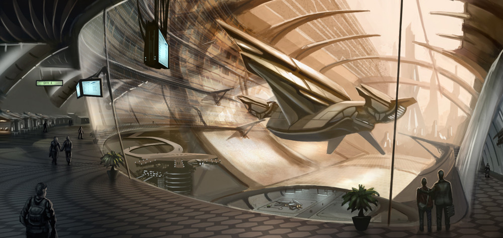
 larkin2 — Departure Gate
Published: 2007-03-21 10:41:16 +0000 UTC; Views: 8250; Favourites: 231; Downloads: 276
Redirect to original
Description
Futuristic airport scene inspired by Mark Goerner and James Clyne.Mark Goerner [link]
James Clyne [link]
Related content


Comments: 71

I love this! Fantastic in both senses of the word!
👍: 0 ⏩: 0

 (Smile)")

A futuristic Airport? 
Even though I'm scared to death of flyin', just seein' one of those will be worth it...
👍: 0 ⏩: 1

This is awsome! I think I'd like to model it in 3d if you don't mind, looks fun.
👍: 0 ⏩: 1

Please do. I'd love to see the results
👍: 0 ⏩: 0


this one is really cool!
Your perspective work is great.
Especially the curved lines, which can be a pain in the ass in 2 point perspective
The shading really catches ones attention.
It draws you to the warm colors of the ship ( which is the main object here ) and then reaveals the colder parts of the spaceport itself with the people watching.
The screens in the upper right and the lower hall give this one a direct red/blue color contrast,
which makes it even more exciting.
great job!
 (Wink)")
👍: 0 ⏩: 0

Looks awesome wish I could draw like that or at all. Best I can do is close to stick figures. -.-
👍: 0 ⏩: 0

ok ..i just drooled all over me...
i think i am slowly figuring out why i like your work so much
👍: 0 ⏩: 0

I once had a dream of a place that looked close to identical to your fictional creation here.
👍: 0 ⏩: 0

=O...really nice place...great colors...great composition...great work...
👍: 0 ⏩: 0


This looks AWSOME!!!
i wished i lived in a place like this
cool design for the spaceships
")
👍: 0 ⏩: 1
Thanks Francis. It will be featured in one of the next issues of IFX. I think the work you're doing with that magazine is fantastic. After reading your Sketchup workshop I gave it a go, and Im using it for an upcoming piece. Thanks again.
👍: 0 ⏩: 1

Cool - I have been using Sketchup quite a lot lately. So useful.
👍: 0 ⏩: 0

You have some really nice images in your gallery. I particularly like this one, because of its strong perspective, which seems to pull in the viewer. It works so well that even the pretty centered horizon line is not really an issue.
the design of the ship is really neat, too, it fits into the whole image and is quite streamlined, and still looks big enough to contain a small crew.
what I think could need some more work is the area on the very left. the supporters of the ceiling seem to kind of float in grey nothingness, I think some structures that explain those parts and a few small point lights might be cool. a few small blue lights could be scattered over the rest of the painting too, like little spots of colour. but that's really all there is to critique, otherwise this looks good, the work you put into it shows
Daniel
👍: 0 ⏩: 1
Thanks. That's a good point, I had forgotten about that area of the picture completely. You mentioned the horizon line too. Is it a general rule to avoid putting it in the centre?
👍: 0 ⏩: 1
haha, at least that's what I read in every article and book about perspective ")

👍: 0 ⏩: 1

the 3:13 to Jupiter is now boarding, please make your way to......
👍: 0 ⏩: 0

It looks awesome! I wish I had your talent....
👍: 0 ⏩: 0


this drawing is awesome!! Realy.. def a fav.. and put u on a wacht to!
👍: 0 ⏩: 0

")
")
👍: 0 ⏩: 1


It is completely beyond my grasp to figure out just how the helll you manage to do art on this level of fantasticness and detail, in 15 hours..... wow
👍: 0 ⏩: 1
Thanks. Hopefully the next ones won't take so long. I spent far too long detailing this...
👍: 0 ⏩: 0


Oh man... that is amazing! The ship design is Awesome! I love the soft ambient shadows in the interior..
+Fav!
👍: 0 ⏩: 1
no problemo dude! Just make some more awesome, dramatic sci-fi scenes!
👍: 0 ⏩: 0


Didn't think of it when I made the first comment, but the piece could do with a contrast boost. Also... the platform on the lower left, it seems kind of small, and the people on it, extremely small compared to the way the rest of the piece works in perspective. Other than that, though, no complaints
👍: 0 ⏩: 1
I might try that, but I want to keep the contrast low on the background elements. Thanks, and thanks for 
👍: 0 ⏩: 1
| Next =>