HOME | DD
 Lc4Hunter — Which texture do you prefer?

Published: 2014-05-05 14:34:24 +0000 UTC; Views: 1017; Favourites: 8; Downloads: 0
Redirect to original
Description
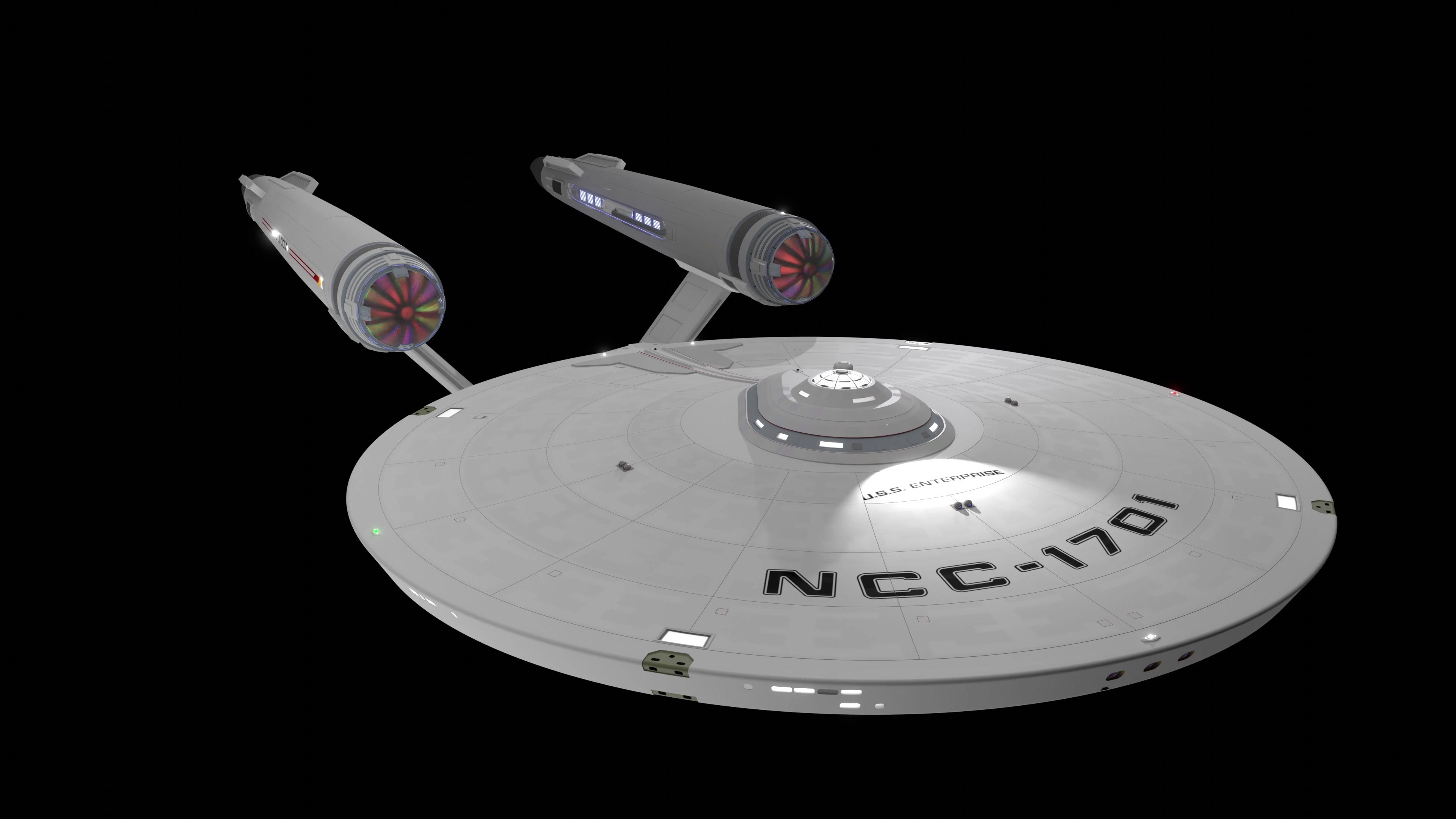
Hy together.I´ve made a few versions of the EA-plates and here you can see my favs.
Which do you think fits best?
In my opinion version 2 and 3 are better than the first one because the ship has enought details to show, there is no need anymore to have such a "strong" texture that simulates more details.
What do you think?
Please let me know
 (Smile)")
Best regards,
Lc4Hunter
Related content


Comments: 11

Von den 3 Dargestellten gefällt mir Nr.: 1 am Besten.
Nr.: 2 gefällt mir gar nicht zu gleichmäßig und viel zu Hell.
Nr.: 3 sieht mir doch sehr stark nach Nova-X aus.
👍: 0 ⏩: 1

Ich denke eine Mischung aus 1 und 3 wäre sinnvoll.
Von der Helligkeit her mag ich Nummer 3 am meisten, aber gerade die kleinen "greebles" sehen dadurch langweilig aus.
Bei Nummer 1 sehen dagegen die Greebles am besten aus.
Oder ich nehm einfach beides, das gleichmäßigere für die großen Teile und das kontrastreichere für Greebles etc.
 (Wink)")
👍: 0 ⏩: 1

Looking good, I like 2 and 3 though I think 3 would fit better for the Omega/Nova.
👍: 0 ⏩: 1
Well, i´m not sure. Number 1 and 3 are both good.
Number 1 has a good contrast, but some details get lost because of the contrast.
Number 3 looks good on all bigger parts like the sides of the front or the rotating section, but greebles (sides and front) are boring.
Maybe i should use both textures. 3 for the main hull and 1 for greebles to let them look more complex.
👍: 0 ⏩: 1
I agree 3 for the main hull and 1 for the finer details would work best I think.
")
👍: 0 ⏩: 0

Definitely the third. The darker one looks more canon.
👍: 0 ⏩: 1
I'd agree with that choice myself.
👍: 0 ⏩: 1
From the thumbnail view the third choice looks somehow even more canon if I can somehow explain it.
")
👍: 0 ⏩: 1
The third option does seem to get the darkness right, it's not too dark but not too light either. Seems to be spot on going by those renders.
👍: 0 ⏩: 1