HOME | DD
 lee25 — D+G Vector and Drawing

Published: 2006-10-16 22:37:36 +0000 UTC; Views: 137376; Favourites: 2075; Downloads: 3603
Redirect to original
Description
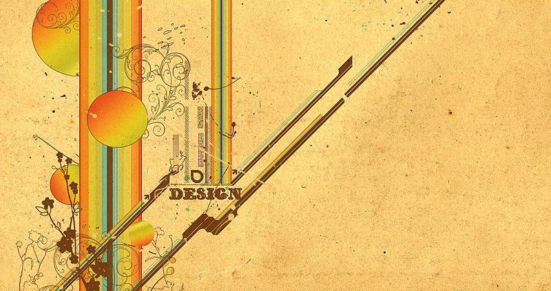
Combined the vector paths with the sketch for comparisson.[One of the 4 sketches I did for a collab between me and Aeiko/ Wirestyle for Dolce & Gabanna to be printed in a book.
To see the final image: [link]
The idea and inspiration for the typeface treament came from the baroque and rococco period, this was becasue this style of decoration emobodied the kind of decadence thats often asscociated with the fashion industry.]
Related content


Comments: 342

Slap that on a t-shirt! sell it for £40 a pop. hehe, i created a cover for a cd project using that style!
👍: 0 ⏩: 0

 (Smile)")

Awesome work, man. You are a true master, at least for me. There's something that I would like to ask you. The name of my girl is Laura, and I'm looking for someone who could make a good disign with her name, because i'll probably get it into a tattoo, and I think you have the talent. Just as this design of yours, I would like something very similar. If there is any possible way you could help me, it would be amazing if you could contact me: ookami.no.ankoku@gmail.com
Thanks in advance, and keep up the great work.
👍: 0 ⏩: 0


This is speechless...i always love a vector and the scrap together...the result is always perfect, with more life...excelent work

👍: 0 ⏩: 0


")


")

ne chance you will ever develop a tutorial on how to do this kind of stuff
if not ne pointers u can give
👍: 0 ⏩: 0


diesel is using now something similar
but I think this is better
👍: 0 ⏩: 0


free your mind, free your soul
👍: 0 ⏩: 0


That's just great
I'm fav'ing this one..
👍: 0 ⏩: 0


Absolutely stunning! I adore this type of typographic treatment...how do you manage to make such intricate strokes? Is it all freehand?
👍: 0 ⏩: 0

Love it. The theme fits really well and I like how you showed the sketches.
👍: 0 ⏩: 0


...not sure which is vector and whics is pencil but looks great from here.

👍: 0 ⏩: 0

Wow...nice and effective...You deserve a fav
👍: 0 ⏩: 0
Wow...nice and effective...You deserve a fav
👍: 0 ⏩: 0


just out of curiositly what was the origonal typeface?
👍: 0 ⏩: 0

I love it...it looks elegant with an alternative twist..
👍: 0 ⏩: 0
<= Prev | | Next =>