HOME | DD
 lee25 — D+G Vector and Drawing

Published: 2006-10-16 22:37:36 +0000 UTC; Views: 137380; Favourites: 2075; Downloads: 3603
Redirect to original
Description
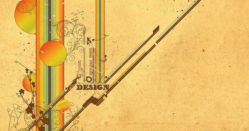
Combined the vector paths with the sketch for comparisson.[One of the 4 sketches I did for a collab between me and Aeiko/ Wirestyle for Dolce & Gabanna to be printed in a book.
To see the final image: [link]
The idea and inspiration for the typeface treament came from the baroque and rococco period, this was becasue this style of decoration emobodied the kind of decadence thats often asscociated with the fashion industry.]
Related content


Comments: 342

 (Smile)")


I like it.
The gradient really adds depth to the overall text.
And the sketched version with it gives it a messy or, lively feel, as if it was just drawn onto your screen really quickly.
Great work.
👍: 0 ⏩: 0

It seems quite heavily inspired by the work of Si Scott, too.
👍: 0 ⏩: 0

Claping my hands!
CONGRATZ!!!
beautiful work!
See ya
👍: 0 ⏩: 0


The quality of image is ver very high and fine!!!
Greatings from Mexico
👍: 0 ⏩: 0

simply beautiful...could you explain your technique in more detail?
👍: 0 ⏩: 0


Amazing Type Treatment..... New to D.A. still but one of the best pieces I have seen!
👍: 0 ⏩: 0

lmfao... this type was the only thing in that final pic I liked. No wonder Pete wouldn't answer my question on whether it was a modified font or completely original 
Anyway, fantastic job. It looks gorgeous.
 (Wink)")
👍: 0 ⏩: 0

Uhh...dude thats awesome!!! Im not into fashion or nething but this stuff kicks ass man. Gonna 
👍: 0 ⏩: 0


i prefer this version than the final it look terrefic
great work !!!
👍: 0 ⏩: 0


amazing.. how do you mix the letters so well with the brushes?? im trying to figure out more text art..
👍: 0 ⏩: 0

Holy mother of hand writings WOW dude. This is truly something amazing, wish I could do what you can do ")
👍: 0 ⏩: 0


i like this one instead the final collab....
this one has more sensation (feeling) than the final one.
cheers.
👍: 0 ⏩: 0


It's Amazing but in the final work i dont like the results (excuseme for bad english ^^)
👍: 0 ⏩: 0

Simply amazing... Always trying to create stuff with this style it's just impossible to make it all flow together without overdoing it, you've got it perfect! well done
(secretly i hate you) haha
👍: 0 ⏩: 0


<= Prev | | Next =>