HOME | DD
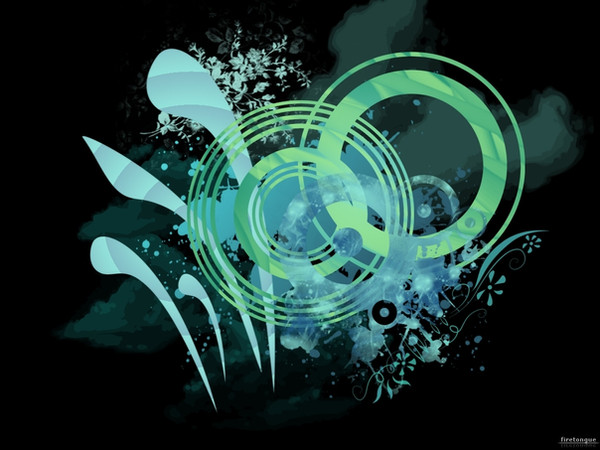
 lee25 — Ecosystem

Published: 2006-06-08 14:55:53 +0000 UTC; Views: 12004; Favourites: 166; Downloads: 1157
Redirect to original
Description
This image all started off as a drawing where I printed out the alphabet in the Georgia typeface, I then picked letters that I liked and drew around them. You can see the orginal here: [link] The drawing was tehn vectored in illustrator, and finnished off in Photoshop.This was just going to be black and white, but I started playing around with some colour ad I quite liked it.
The style of drawing around/over typefaces is inspired by an designer called 'si scott', i'd link his site if I could find it. I was also inpisred to do this kind of drawing after seeing one of digitalshock's works. [link]
Related content


Comments: 60

 (Smile)")

")


I still dig the b/w one more. This stuff you've been doing recently is really inspirational to me. Thank you.
👍: 0 ⏩: 0

")


indeed very reminiscent of the cuy doing the casio adverts ect while its very nice it strikes me a very "one trick pony" style. But as usual a great sense of compostion and style though i think i prefer the B&W version
👍: 0 ⏩: 1

I have the same thoughts about his style too, so right now im trying to think of ways I could move it forward in a different direction. Thanks for the comment
👍: 0 ⏩: 0

oh my word! i love how you explained how you accomplished this art piece. i rreally really love it, looks like you took time on it...
👍: 0 ⏩: 1
thanks
Its took me a few days to refine the sketch before spending 2 days on the vector.
👍: 0 ⏩: 0

Really nice work. The use of the two or three colours work well too.
👍: 0 ⏩: 0

I love it! WOnderful. You put a lot of work in to it and it looks wonderful!

👍: 0 ⏩: 0


"by an designer called"
anyway, great work, i prefer the white one more. laura LOVES it too

👍: 0 ⏩: 1
urgh, I've got to be more carefull with my spelling.
I was actually thinking that she'd probably like it.
👍: 0 ⏩: 0

this totally made my day. A truly stunning piece of graphic design!!!

👍: 0 ⏩: 0


 (Wink)")

Nice i really like it, love a bit of unusal typeorgaphy
👍: 0 ⏩: 0


Not bad. I think different colors may have suited this better. Either way, its nice.
👍: 0 ⏩: 0


wowza, thats truely amazing, i love it, you can really see the effort here, great work!
really original, nice choice of colours, they really make the piece
👍: 0 ⏩: 0

thats real sweet man, i really like the original drawing any chance you could post it in your scraps or something
👍: 0 ⏩: 0

Nice one, im not a fan of the colours, but its very nice ^^
👍: 0 ⏩: 0

oh woooow! i so want a logo similar to that, omg i want!
wish i could draw
hey, it's good to see you submit again
and how's your photography doing?

👍: 0 ⏩: 0

nice typography man, got an air of mystery to this piece, im liking
👍: 0 ⏩: 0

that';s REALLY nice....very clean...and love the idea...
👍: 0 ⏩: 0


insane stuff. love the depth of field fx. good as always

👍: 0 ⏩: 0

I can't get enough homo-erotica in my diet these-days...
👍: 0 ⏩: 1
Im Heading Away today, for a birth-weekend. We're going camping, you know us queers, can get enough of our "camp".
xxcq
👍: 0 ⏩: 1

I think it looks better in black mate, very nice anyway!
👍: 0 ⏩: 0

He lives!
Sick work; very lively and energetic, yet so... dark. That gaussian blur tops it off though.
I'm digging this. A lot.
👍: 0 ⏩: 0

much prefer the b+w and sketched versions to be honest.
👍: 0 ⏩: 0

ya i loved the drawings from flickr, looks just as dope on the screen. nice work man.
👍: 0 ⏩: 0
| Next =>