HOME | DD
 Lena-Hyena — John Uskglass

Published: 2006-09-10 20:36:28 +0000 UTC; Views: 7403; Favourites: 19; Downloads: 291
Redirect to original
Description
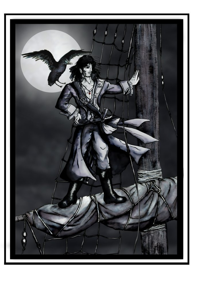
John Uskglass, the Raven King, the King in the North...From Susanna Clarke's Jonathan Strange & Mr Norrell.
Again, yes.
A completely different vision.
(The first one is here:[link] )
I seem to be obsessed.
Or perhaps haunted.
Font by ~Holyrose
Related content


Comments: 39


This picis cool! Exacly the way I imagined Usglass, maybe more fierce at the moments, but yes, this is Uskglass. Congratulations for the picture!
I am very happy to meet fens of this book in DA. In my country it is not well-known, no matter that it is wonderfully translated.
👍: 0 ⏩: 1

Thank you!
It is a wonderful book, and I hope there will be more illustrations here soon.
👍: 0 ⏩: 0

I linked to your deviation in my journal ([link] ). Hope you don't mind.
👍: 0 ⏩: 0


great illustration - the overall layout is nice too
👍: 0 ⏩: 1

Ah, I remember reading this book... though I never did quite finish it. 
👍: 0 ⏩: 1
Thank you.
I loved that book...
👍: 0 ⏩: 0

brilliant! like a page from and old book, reminds me of the work of Aubrey Beardsley
👍: 0 ⏩: 1
Beardsley? Nah, he was a genius. But thanks for a nice compliment.
👍: 0 ⏩: 1

Excuse my ignorance, but I don't know the character. Still, this is good work, the character is very well done and detailed and your washes give it an antique and solid look. I remember risking ink gradients once and not daring to go very far with it.  (Smile)")
I just think the dark cloud is perhaps too cartoony for the rest of the piece and the way you crop his legs could be better.
👍: 0 ⏩: 1
Well, the book is worth reading, if you have the time...
The clouds are my least favourite part - I didn't really know what to do with them...
👍: 0 ⏩: 0

This isn't how I imagined the Raven King but its really cool none-the-less... I like the detail on the waiscoat... You are right - it is patience. I'm currently in the middle of a fully shaded greyscale drawing of Lady Pole and the Gentleman with the Thistle Down Hair and I keep getting horribly bored by the patterns on his waiscoat and jacket! Also, your drawing reminds me of a depiction of Morpheus in Neil Gaiman's comics, which makes sense because the author of Strange & Norrell was influenced by Neil Gaiman... Nice
👍: 0 ⏩: 1
I don't have a definite image of the Raven King in my head, I'm just experimenting. And also, when I read the book, I had a feeling that his looks depended more on who saw him and where than on his actual features. I think it would be reasonable to believe that Uskglass can change his appearance.
Sadly, I haven't read Gaiman yet... but he's on my list
Good luck with your drawing, it will be interesting to see it.
👍: 0 ⏩: 1
Yeah I was thinking he probably changes with who sees him (again, a thing that Neil Gaiman's Morpheus does too) - do read him, its quite easy as the dream stuff is graphic novels but I do warn you: once you read one you'll be hooked!
👍: 0 ⏩: 0

The thin work on the tree is very delicate. Well done. As is the work on his jacket (I assume the raven king?) and shirt. His personal features are a bit lacking though. His hand is very flat anda bit awkward, and his head is tilted in an uncomfortable way. I think it's mostly because there's a lack of shading on his features which would bring out small things like knuckles, cheekbones, etc... The clouds are also a bit cheaply done. They could work if the rest of the piece followed the same iconic style, but because you went with a realistic tone on him and the background, the clouds should reflect that a little better with some more irregular shapes and highlights.
👍: 0 ⏩: 1
Ah, you've noticed the basic problem with the absence of a unified style. Very true.
The clouds are my least favourite part - to be quite honest, I had no idea what to do with them. I didn't want to go for realistic, but they're not stylized enough either...
As for the face, it is very lightly shaded. I didn't want more. Actually, now that I think about it, this pic should have been more flat, not less...
👍: 0 ⏩: 0


I like the handmade frame very much, and the details are fantastic!
Very nice work!
👍: 0 ⏩: 1

Has a nice mood to it which a lot comes from your style. Has a very classic look to it.
👍: 0 ⏩: 1


Wow, I'm proud you used my font there.
It's a beautiful piece, I like the empty and dark atmosphere.
And anyway I love B&W.
Thanks!
👍: 0 ⏩: 1
I'm glad you like it.
Thank you.
👍: 0 ⏩: 0

Beautifully done. I love the detail you've put into his clothes, you are very talented
👍: 0 ⏩: 1
Thanks.
It's not talent, really. Just patience
")
👍: 0 ⏩: 0

Svidja mi se kako si to uokvirila, tako izgleda bas kao ilustracija iz knjige. I odjeca mu je super prepuna detalja!
👍: 0 ⏩: 1
Hvala!
Probala sam malo stilizirat cijelu stvar - okvir, tekst itd. A odjeću sam probala prilagodit vremenu u kojem se događa radnja knjige, iako je JU sam po sebi srednjovjekovni lik i vilinski kralj - što ostavlja beskrajne mogućnosti za kostim...
Hej, jesi našla šta pametno u Algoritmu?
👍: 0 ⏩: 1
ma nisam uopce stigla do tamo, srela sam dobrog frenda s faksa, sjeli smo na kavu i brbljali cetiri sata, dok smo zavrsili vec je sve bilo zatvoreno, nisam obavila apsolutno nista...
👍: 0 ⏩: 1
Ah, to je super. Kvalitetno izgubljeno vrijeme
👍: 0 ⏩: 1
definitivno, prerijetko srecem stare prijatelje, stvarno je cudno kako si s nekim super vidjate se svaki dan, nalazite se i poslije obaveza, a onda se sve promjeni i svatko krene svojim putem i nitko vise nema vremena za nikoga.
👍: 0 ⏩: 0

This is really nicely executed. The contrast draws the eyes around the composition and I really like the delicate way it's framed. Well done on the detail as well.

👍: 0 ⏩: 1
Thank you!
I'm still not sure about the text, though...
👍: 0 ⏩: 1
I like the text...I thought it was a nice addition to the piece.
👍: 0 ⏩: 0