HOME | DD
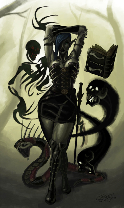
 Liamythesh — Servants of Lolth

Published: 2011-05-04 04:01:40 +0000 UTC; Views: 10460; Favourites: 110; Downloads: 643
Redirect to original
Description
I have wanted to draw a drow priestess for forever. I like my drow evil, also wanted to draw an amblypygid, and yochlol are fun too. Huzzah.Related content


Comments: 25

What are the monsters called? Especially that big one with a single eye.
👍: 0 ⏩: 1

That's a Yochlol. The other one is a Uropygus.
👍: 0 ⏩: 1

The demons are funny yes, but the drow priestress is awesome !
👍: 0 ⏩: 1

When I think "Servant of Lolth" I almost always had a posture of Female Drow Priest in my head. This one look like Valsharessa... very good job, but cloak could been little longer . Creatures... true... they are kinda funny lol
👍: 0 ⏩: 2

The Valsharess is actually a secular title in drowish i think.. 'Queen' or 'Monarch'
👍: 0 ⏩: 1
You're right! And it's visually awesome, always <3
👍: 0 ⏩: 1
I love the yochlol personally
👍: 0 ⏩: 1
I'm the same
Would You like to draw a funny pic with Illithids? I think they are the most hilarious creatures living in underdark after seeing this [link]
lol!
👍: 0 ⏩: 1
I love that interview. I have a commission I'm working on right now, and I am currently working on a commissions only basis, but if you'd be interested in feeding the starving artist, shoot some ideas at me, and we'll see what we can work out
 (Smile)")
👍: 0 ⏩: 1
I'm a custom scenario creator so it won't be any problem. Now I'm working on parody RPG climax mixes (unfortunetely in polish, but it will be translated in future). Idea Collabs are the best
👍: 0 ⏩: 1
Well, frankly I need the work, so anything you want to commission me for, I'd be glad to oblige. The going rate is $40 a piece. Note me when you decide on anything you want and I'll get right to work on it.
👍: 0 ⏩: 1
If I will need something, why not. But until August I need to accomplish some projects connected with hand made porcelain a little similar to non-metal series of NEMESIS NOW brand. I need to obtain my payment first
👍: 0 ⏩: 1
No problem. Look forward to hearing more back from you
👍: 0 ⏩: 0


What I'm noticing in this image is that it calls back some older problems I haven't seen in your work in some time. What stands out to me the most in this image is an overall inconsistency in the anatomy on the drow: her head size in relation to the rest of her body is large in a manner that makes her look adolescent at best and pre-adolescent at worst, while her upper legs are too short given the length of her torso (the knees come too soon). It gives off an effect like you reached the end of your paper, but really wanted to include the feet, so you drew them anyway; I've done this often, so that's the impression it gave me.
Her right arm, additionally, is too long for both her torso and in comparison to her left arm, and the right hand is much too large; fisted, the hand is almost large enough to cover her entire face, and now compare it, were it open, to the left hand's size (and the way that it's wrapped around the snake/whip looks flat; ever try holding on to something like that with your fingers flat? It's tough to make that happen, so I suggest making use of her knuckles for a more convincing grip). The lack of detailing on the left hand and left foot in general is a little out of place given the detail given elsewhere on her.
As a whole, the drow's subtle posturing indicates rigidity and unnatural tension, particularly evident in her shoulders and in the way her leg has no bend to it, as though she's posing for a photoshoot rather than stepping forward menacingly. It's not just in her frame, either. Remember our gripe with Anne Stokes' portrayal of hair as a stiff, singular unit? Her hair really doesn't give much impression of flow or movement, which saddened me because you usually make such pretty/believable hair.
I'm not trying to come down hard on this piece; I know you're happy with it, but I know what you can do and what you have done, and setting this up next to your past ambitious projects, this one just doesn't have the level of motion or detailing that I'm used to seeing from you. I hope you can do something with the crits, though... I think this could look badass with the right corrections. :hugs:
👍: 0 ⏩: 1
omg, you're right *facepalm*
I can't believe I went all the way through with the piece without noticing ANY of that. I'm not sure how well I can fix that in the existing piece. Frankly there's a lot I'm noticing now that I'm not happy with. I think I may start over with a different take on the idea... and give in and use some references. I just feel like a bit of a sham whenever I do that
")
👍: 0 ⏩: 0

I'll try to give a good critique since you asked in your journal.
I'm not qualified to call anyone novice or advanced or whatever, but you could use improvement for sure. BUT everyone can!
And you practice and draw all the time, I'm sure, so you improve all the time.
This piece is very nice, lots of movement, a very busy composition.
I think what you are fighting is the medium. I say that because I fight it a lot. I'm still working hard to get better at it, and I don't know about you, but it's definitely hard to tame.
There is a level of refinement that seems to be lacking in this image. It looks like the base is set down on several parts and still needs to be completed. Like perhaps this was a speedpainting, lacking the refinement of a finished piece.
Certain parts, like the pillar with the bright pink seem out of place and too crisp in comparison to the rest of the very soft lines. Or you could give the softness of the rest of the image more crisp, bold linework.
I think if you were just to take this and spend another night or two on it, just trying to find ways to refine areas, sharpen edges, etc-- you would find it looked even more complete. The background can stay a little soft but if you do that I would make it darker and less noticeable. Make the foreground pop. The tentacle creature is extremely blurred in comparison to the Drow and the other crab-thing-creature.
[link] This seems more refined in comparison, if that helps. Everything seems to match fairly well with crispness, and soft areas like the water and the less defined boulders work well because they aren't a focal point and don't need to be important.
I hope this helps you and makes sense. By all means, I don't know as much as others, and I am DEFINITELY NOT the best digital artist... but I pointed out what I could to help you. 

👍: 0 ⏩: 1
That does all make sense. Wish I could say it was a speedpainting, but frankly, it took a little over a week, working every time I had the chance (which was usually about 4-8 hours a day) Something about the medium never really has lent itself to me, so I probably am fighting with it, I just am sick of doing everything with colored pencils, feeling like the medium lacks the ability to give me what I want in many pieces. I think I did forget a lot that the background was a background. I was too concerned that it have detail so it wouldn't feel like I crapped out. In the end, I think I put too detail in it, and lost my depth of field, and a lot of quality with it. I'm not sure I see what you're talking about with the yochlol being blurry or not, but I like her that way, she's essentially made of ooze,and should be a bit out of focus from being farther slightly farther back from the focal point so it works for me. I think the problem is in that I failed to carry that depth of field through in the rest of the piece. I'm really still getting used to drawing scenes, and I did this one in pieces which is likely another weakness. In the end, I'm likely to accept the piece for what it is, or make only minor adjustments, but helping me see the flaws in this gives me a good starting point for the next time I try it. Thanks so much!
👍: 0 ⏩: 1
Glad to help!
Sometimes backgrounds need to be detailed, if it is important to the piece. But you can tone them down with a dark "wash" over them, cover them in shadows so it is still visible but not jumping forward.
The yochlol? I guess.. tentacle creature XD Anyway, to make that the way you want to, perhaps if you made the edges of it a little more transparent along with certain areas if it is supposed to be oozy... it might help convey what you were going for. Possibly.
Also, doing things in pieces isn't a bad thing unless you change the style you are working in. Sometimes that isn't a conscious thing... Often I find myself working in a different style when I go back to something and it messes it up. I either put the art down that night or rework the whole thing in the same style so it doesn't look bad. Sometimes you don't catch it and you have to go back and rework parts into whichever style you prefer for it.
Because sometimes you don't have time to just sit down and work on one piece until it is done, and that is understandable.
Anyway, I think you did a great job on it... there is always room for improvement, as I said before, and as I am sure you know. I am glad I could help, and I tried to be as constructive and descriptive as possible. Trying new things like this will just take time to get used to it and believe me, I UNDERSTAND how hard the fight with a digital medium is. ")
Good luck on the next piece! You can do it!
👍: 0 ⏩: 0