HOME | DD
 Librarian-bot — A week-long constitutional
#constitution #enterprise #redesign #startrek #constitutionclassstarship #startrekstarship
Published: 2019-02-11 08:33:31 +0000 UTC; Views: 2529; Favourites: 42; Downloads: 26
Redirect to original
Description
So, Star Trek: Discovery is back on our streaming services and my mind has turned Trek-wards again. Well, I mean, that last thing I uploaded was some more of the Endeavour, so it was already there, but watching season 2's first few episodes has pushed me further in that direction. Not that that's Disco's fault, per se, given that the plot is still only approaching competence in short bursts and the character beats still come across as stifled or forced (though it is at least approaching my favoured 'mystery in space' mode of Star Trek and we've had zero war crimes so far), but one thing that has jumped out from the experience has been the show's weird lack of conviction in its own aesthetic. When the Enterprise inevitably shows up, it's a grunged-up, semi-ST:Enterprise-ish remake of the original prop that looks hilariously out of place next to the dark and sleek Discovery. The TOS uniforms show up, bright and cheery anachronisms with no attempt made to merge them with the rest of the setting. And the pressing concern that needs to get a call-out in the script is that the Enterprise (and by extension the creative budget of a 60s television show) is allergic to the fancy holographic communications. I'd have thought that maybe doing something about the Federation's genocidal tendencies or actually trying to grapple with the rise of the far right within one's own culture rather than treating it as an evil, foreign horde might have been the more pressing issues left unresolved from season 1, but apparently it's more urgent to backtrack on the cosmetics.
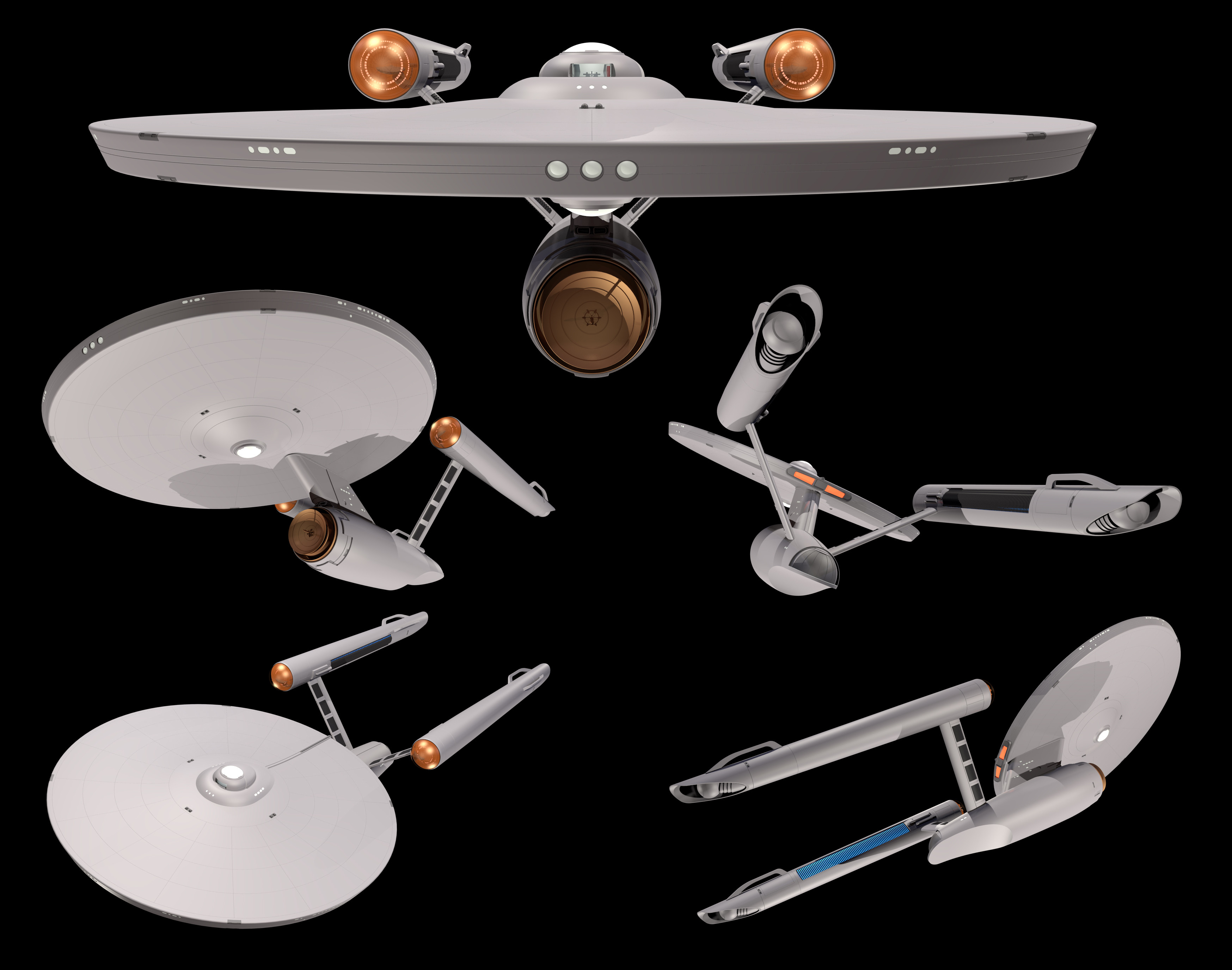
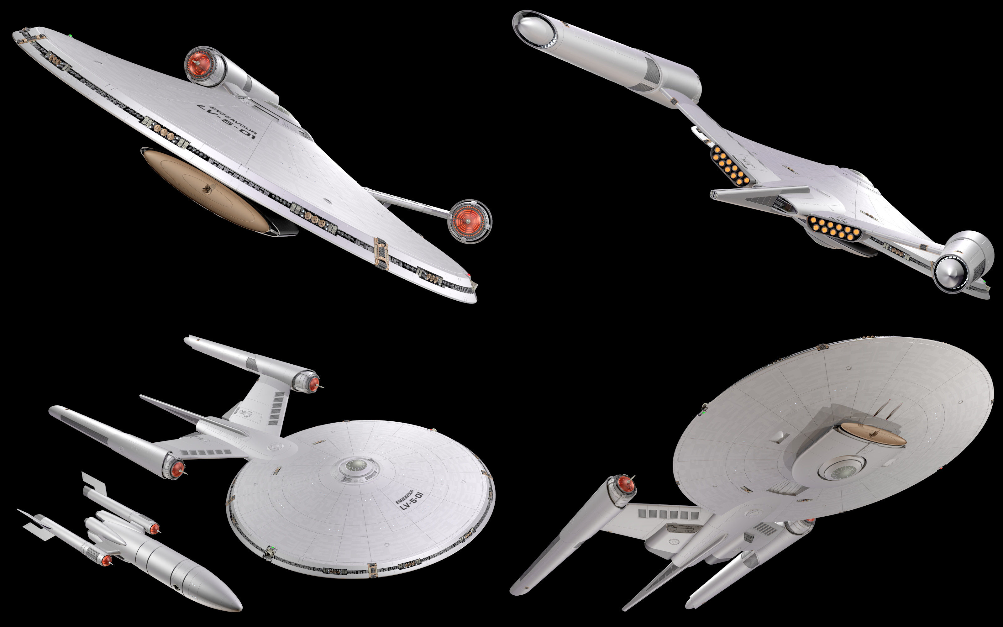
Where was I before I started ranting? Oh yes! That Enterprise design prompted me to do what every sci-fi modeller eventually tries to do, which is build their own original USS Enterprise, NCC-1701, no bloody As, Bs, Cs or Ds. It's not really something that I've been overly invested in doing before, since the design itself has never been that close to my heart, but the exercise of trying to create a Lego version (photos to follow) got me more interested. That she somehow married the flying saucer and rocket aesthetics while still looking coherent is quite a feat and running through what I did and didn't like about the result eventually yielded the idea for the above rendering. I then set myself the target of seeing how far I could get with her in a week and . . . well, here we are. This is not really a response to the Disco!Enterprise since I rather like that design in and of itself, but instead, like that recent movies, it is an attempt to refine the original.
Notes:
* This is almost certainly NOT going to end up in Enterprise livery. The document is named USS Excalibur, because I've got a perverse streak that likes the idea of setting something on a ship haunted by the death of its crew in the events of The Ultimate Computer.
* My chief aim was sleekness. I wanted to reduce the engineering hull in proportion to the saucer (which is the main focus of the ship, after all) while extending out the nacelles ala Discovery's needle-tapered affair. As a result of also not wanting to lose much in the way of space in the secondary hull, she's slightly bigger than the original's dinky 289m, clocking in at a perfectly respectable 390m from tip to tip.
*I drew liberally on different versions for the greebles, but decided to keep a rough approximation of the original prop's outline, hence the straight nacelle struts and curved shuttle-bay doors.
* Yes, she has a window for a viewscreen. I adore that as a visual and any complaints should be addressed to the Enterprise prop from the Where No Man Has Gone Before, which clearly has a glowing rectangle on the outside of the bridge corresponding to the viewer inside.
* Lots of detail left to add, of course, which might take a while since I seem to have arrived at the world's most convoluted way of adding windows.
I don't own Star Trek. This is a reimagining of the original Enterprise design by Matt Jefferies, influences include the redesign by Andrew Probert and that by the team who worked on the Star Trek remakes from 2009 onwards.
Related content


Comments: 2

This is pretty cool. Mind, since I don't watch discovery, I'll have to leave the horror of the uniforms in my head.
I like it. Well done!
👍: 0 ⏩: 1

Cheers - and actually, the uniforms don't look bad on their own. They just don't cohere with anything else on screen!
👍: 0 ⏩: 0