HOME | DD
 LightBombMike — James Howlett
Published: 2010-04-25 15:58:15 +0000 UTC; Views: 3379; Favourites: 44; Downloads: 534
Redirect to original
Description
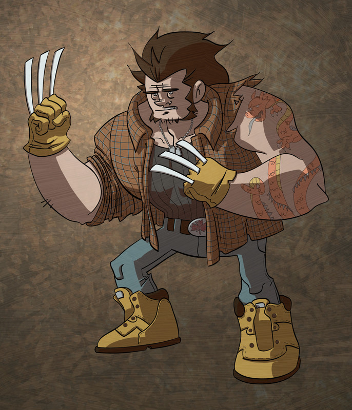
I've actually had some time to draw lately, and some X-men fan art sounded like fun.I liked the overall proportions of the Logan I drew 5 years ago but I wanted to show some of his history in his design. So, nothing says Canada like a flannel shirt, or Japan like a dragon tattoo. Amirite?
Related content


Comments: 17


Hey! When'd you start drawing again? Good to see you back doing this stuff, Mike.
Loving the pic. I especially love the way you've drawn Logan's head/face/hair (the tiny eyes set in this huge head are great) and the folds on that shirt are supremely well done (I jealous). You've also got some great little bits of detail going on, such as that tattoo and the design of those boots. Oh, and the tags. Colours are looking lovely too (love the boots and gloves).
However, I do have a few slight niggles. Nothing major but I thought I should point 'em out.
First off, those blades are a bit too stumpy looking at the moment. While the blades on his right hand are pretty sharp looking, the blades on his left hand look like flat pieces of cardboard. I can see the effect you were going for but it isn't quite working -- the blades on his left hand are especially problematic as the angle of the fist makes it look like Logan's hand has been replaced by a bear paw with extremely long nails! Also, is it just me, or is his right arm far thicker than the left?
Speaking of the arms, that left arm needs a bit more…'oomph.' The lines are just sort of…there and while the lines are perfectly functional they aren't all that interesting. I mean, the legs and head show a great sense of style and design whereas that one arm sticks out like a sore thumb.
Also, what's going on with his crotch? Dear me, no wonder the poor guy looks like he's a bit uncomfortable! I realize this is a cartoon so liberties can be taken but take such liberties within reason, unless it is an intentional part of the pic. Size that baby down, let the man breath!
Oh, and finally, I like that woody-ish texture you've got going on in the background, I just wish you didn't cover Logan in the same texture as this flattens the piece to hell. It's a shame, as your colours get across a great sense of volume and shape, only for a simple texture to dash that hard work to pieces.
Anyhoo, great piece overall, Mike. Oh, and welcome back to the Land of Drawing! Please stay
 (Smile)")
👍: 0 ⏩: 1

Thanks for the crit John! Being back in the land of drawing feels good!
I totally agree with the arm. Though the stumpy claws are something I love (makes him feel more like a scrapper I think) and the crotch was a conscious decision... even if it isn't the most functional of crotches. The texture over the whole pic was meant to be a sort of gesso'd look, though if it is just flattening out the whole thing then I'll have to rethink that.
👍: 0 ⏩: 0

Pretty badass man. Odd love, but I totally love his boots.
👍: 0 ⏩: 1
I knew I took the time to reference those boots for a reason. The most pure, and honest of reasons. Your love.
👍: 0 ⏩: 0

thank you sir, thats my favorite part too.
👍: 0 ⏩: 0

good stuff mike! nice to see some more drawings from you!
👍: 0 ⏩: 1
haha, yeah, its nice to have some time and energy to draw!
👍: 0 ⏩: 0

Thanks Mr.Shoemaker!
👍: 0 ⏩: 0

Flannel was the first Canadian Flag, before the maple leaf. Love this!
👍: 0 ⏩: 1
dude, you guys should bring it back! How many countries could make the same claim that their flag can double as such a warm bed spread?!
👍: 0 ⏩: 1
I'm gonna take it a step further and say the flag should double as an offical "Snuggie" product. Think of the merchandising rights alone! Cuddling with the Canadian flag and a hot coco, nothing says patriotism like that
👍: 0 ⏩: 1
Seriously. If you pitched that to the Snuggie Corporation I am sure they would go BANANAS!
👍: 0 ⏩: 0