HOME | DD
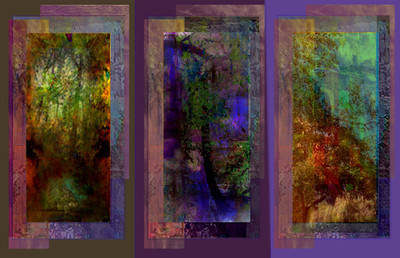
 LightSource — Another Imaginary Landscape

Published: 2006-05-12 05:33:06 +0000 UTC; Views: 355; Favourites: 4; Downloads: 16
Redirect to original
Description
Lanscape Imaginaire Avec Trop peu de FiguresSemi-abstract ...I would like more and different figures,
and some more color and activity, but there's a fair amount
of imagery now...
Related content


Comments: 20


beautiful! it was hard to tell whether it was digital or a traditional oil or acryllic. i like the vagueness, the fact that it forces the viewer to pull things from it through their own imagination. i think that if you want to work on it more, by all means do... just leave this as is and post the next as a variation!
 (Smile)")
👍: 0 ⏩: 1

Good suggestion. I often ruin good earlier versions
of things by overlaying stuff... This just grew like topsy
- as most....
many thanks for your comment....
👍: 0 ⏩: 0

I think that this is great just the way it is...you say more figures and activity........why? as you say this has a fair amount now......
it seems perfect like it is....don't add too much more......it would just be too busy......
I like the yellows and reds.....it looks like the start of a fire....in full view it doesn't but in small thumbnails ....
👍: 0 ⏩: 1
That's very nice thanks....
will at least keep early versions
per B's suggestion...
...yep I finally
got some yellows & reds the hue I wanted...
its much tougher with no training!
👍: 0 ⏩: 1
No training is sometimes better...
")
👍: 0 ⏩: 0

For some reason it made me think of the Great Wall in China. Perhaps as one would see it in an war dream landscape. I think perhaps it is the color scheme. The red Wall and a blighted parched yellow land beyond. Interesting as always my friend.
👍: 0 ⏩: 1
so many thanks Erin - I seem to be channeling some
Asian technique just now... images emerging really remind
me of my favs in Chinese and Japanese landscapes....
I got some of those Asian lines by osmosis... a very rough
westernized approximation of some delicate Asian landscape
possibly...
👍: 0 ⏩: 0

this is really beautiful... full of things to discover.. and the colours are gorgeous! well done...
👍: 0 ⏩: 1
...you are right on as always, Pat....
I am happy with the colors finally
I hope I can do more in this style...
I have some trouble with consistency...
regards
Sid
👍: 0 ⏩: 1
follow your mood and your instinct. let them decide on your style... 

👍: 0 ⏩: 1
....sounds very sensible...
you are full of common sense!
again, much ppreciate...
Sid
👍: 0 ⏩: 1

I guess its the repetition and the blur in the middle that get me the most.
👍: 0 ⏩: 0
imaginary landscape with too few figures... It's still pretty cool, and clearly a landscape. I can see some deliberate repetition on the left and it looks like there's a swamp toward the bottom with some lillies in it. Still more, there are some drops in the middle as though the lens were picking up on light sources... anyway, I think its a neat impressionistic landscape. Its dank and dingey and doesn't have any real subject, but at the same time, you think rain, plants, swamp, not much light - it combines a lot of the sense experience of a landscape without really depicting it literally. not bad.
👍: 0 ⏩: 1
You are very perceptive.... no subject...
and many subjects....
many thanks for the comments...
👍: 0 ⏩: 0

Have you seen Max Ernst's "decalcomania" landscapes this in some ways reminds me of those
👍: 0 ⏩: 1
Yes I have - interesting comparison, but I don't
see the simularity ... my image seems much more collage-y
than Herr Ernst's...no?
👍: 0 ⏩: 1
yea it is very different but thats just what immidiately poped in my head when I saw your's
👍: 0 ⏩: 0