HOME | DD
 longhornfusion — Poll: Large Taskbar Button

Published: 2010-12-01 09:04:15 +0000 UTC; Views: 1577; Favourites: 5; Downloads: 107
Redirect to original
Description
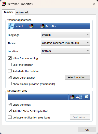
Top or Bottom(Small will be the same as the previous preview)
Reason I ask is because if the bottom is used there will be a gap between it and the taskband.
Related content
Comments: 24

My opinion is second: cause with small and short button, its more coherent to have also a short startbutton, its more nice!!
👍: 0 ⏩: 0

The bottom one.


👍: 0 ⏩: 0

Top is extremely beautiful, but I think that isn't a good option for multilanguage users, like me . In my case "start" = "Iniciar" (Brazilian Portuguese) , so , the text will be too long, and I'm not sure if thu button could support it, in terms of size.. well, anyone of the startbuttons are going to be awesome.
👍: 0 ⏩: 1

They are both very nice, but I would take the top one for a more Longhorn-like feelin'
👍: 0 ⏩: 0

I love top, have a gap if bottom ? 2 pix or 3pix ?
👍: 0 ⏩: 1

It'd have a gap of 26px on the right.
👍: 0 ⏩: 1

where? see here[link]
👍: 0 ⏩: 1

Invalid or Deleted File
👍: 0 ⏩: 1

Oh I thought you were talking about the bottom. The top will look like the one in your screen (in terms of size)
👍: 0 ⏩: 0


