HOME | DD
 Lukis24 — Apocalypse

Published: 2009-11-23 21:32:07 +0000 UTC; Views: 2888; Favourites: 38; Downloads: 31
Redirect to original
Description
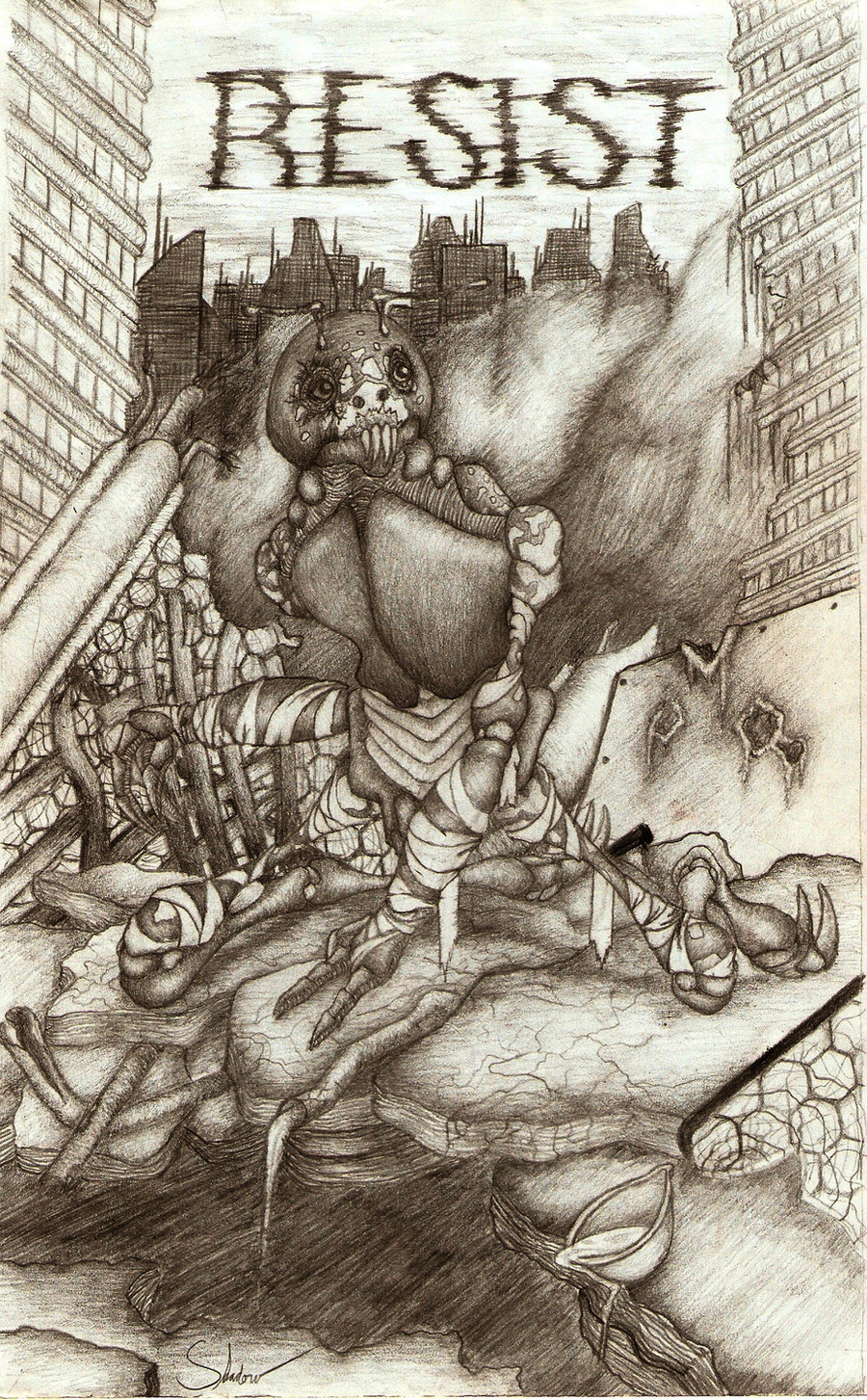
This is my submission for the Darksiders contest.I hardly doubt I'll win anything, but this was a really fun piece to make.
Hope you like.
")
Ref: [link]
How do the skulls look? Does the shading look alright? Anything else please feel free
Related content


Comments: 114

I really like the perspective on this. It also has a strong message
👍: 0 ⏩: 1

it's nice,the skulls look very good but you should've added a lot more detail to the background buildings and the..hill-thing
(also,I have to agree with :iconsijene:
👍: 0 ⏩: 1

This is awesome!!
The only this I would change is work a little more on light angle. like a little sheen on the skulls. A little detail would do it good
👍: 0 ⏩: 1


No offense, but I feel this should not be in the contest, since it's not your original idea/vision.
👍: 0 ⏩: 1

I don't think that, but that's your choice and decision.
👍: 0 ⏩: 0

I think adding some detail to the buildings would make this pick a whole lot better, try studying the structure of broken-down buildings (I'm sure you can find some pics online).
I LOVE the skulls! They're very stylized, and the crow adds to the overall feeling of the picture!
👍: 0 ⏩: 1

The skulls are cool, but if you were going for a very realistic image, then I think you should maybe use some real skulls to draw after - these skulls are a bit out of shape (not to offend though, I really like the way they look  (Smile)")
The buildings in the background are nice, but maybe it would be even better if they were a little darker.
I love the crow (I hope it is that
This was for #GimmeFeedback
👍: 0 ⏩: 1

the skulls look kind of cartoony(i mean that in a nice way!!!), and quite expressive, i thonk u should try charcoal, very dark nd very expressive, just make sure to roll up ur sleeves! there very messy!
👍: 0 ⏩: 1
Thanks, and I've experimented with Charcoal before, check out my dracula picture, [link]
👍: 0 ⏩: 1
ha i cant imagine my nana lookin for a dracula!!!
👍: 0 ⏩: 0

Honestly looking at the thumbnail I thought this was digital art, but now that I see it's hand drawn, I feel different about it, not bad either.
I think you did well your post-apocalyptic landscape and the point of view. The only thing I can differ from that is may you should start using a finer pencil, mechanical if nothing else. Finer lines would make it pop more.
👍: 0 ⏩: 1

Liking the perspective and the theme!
Details in the skulls near the front look good, but the details in the background could use work...
It looks like the background was just an afterthought, since the coloring is uneven, and the lack of detail.
This is the kind of picture that would look great with ink, instead of pencil shading, Crosshatching would also give this piece more of what it is lacking.
Overall, the piece seems unfinshed, but is a great start so far! Keep up the good work, and good luck in the contest.
👍: 0 ⏩: 1

OK, the skulls look very graphic too me, i dont know is it that what you want they look like, but is it not, i think you should add shading on thrm because they need volume ,so they will come out more realistic. Give some effort for thoses skull that are behind because when i look at the picture i though that there were fog, so its very important to precise that element i think . The sky?hm..u van add clouds or some little shading so the picture won't come out like unfinished.
So ya i hope it help , nice concept there ;D
👍: 0 ⏩: 1

Giving both the good and bad
As a tip, you could try to experiment with different types of shading by using the pencil differently; e.g. points, using cross-hairs or vary the direction of you pen strokes. The work takes longer to make, but to my experience, it will help you to add more light/shadow contrast, leading to extended feel of texture and shape - and so 'realism' to you work.
👍: 0 ⏩: 1

First of all, let me just say I very much like th concept behind this. It suits the contest's theme very much.
Secondly, I would like to comment on the strange marks on the skull. Were you trying to create blood/flesh, or gashes/holes? Either way, in my opinion, you colored them too darkly, creating an impression that those are tattoos on the skulls. There seems to be no depth in them. (again, this is my opinion, so let's not take it too hard)
Lastly, I would like to talk about proportions. The skulls seem to be oddly out of proportion. On the big skull, it seems to me, that the eye holes are of very distinctly different sizes. You could also use ref pics from the Intertubes to get a clearer idea on how to draw skulls. Also, the raven/crow/bird seems too big from this distance.
There. I doubt I've really said anything constructive (I'm new at this "criticism" thing, sorry). All in all, I would just like to say that you need to use more reference pictures and keep on practicing.
Uh...hope I helped.
👍: 0 ⏩: 1

I think this is a good image. I like how the skulls are slightly abstracted and I think you did a good job.
👍: 0 ⏩: 1

totally neat
i might not have centered the middle ground crow 
but, the overall feel of your work is excellent 
kind a creepy for this time of the year 
👍: 0 ⏩: 1

I like this concept. As far as the skulls go, they look good, but the one in front is a lot brighter than the others. I'm not sure if it is supposed to be like that or not, though.
I'm not an artist, but I think the shading looks fine. I really like the background, too.
👍: 0 ⏩: 1
Thanks, and yes the skull is supposed to be lighter than the others, because it's catching what ambient light there is.
👍: 0 ⏩: 0

Interesting job. In my opnion, Black and White are colors that contribute for the apocalyptic aspect.
👍: 0 ⏩: 1

really liking the detail on the skulls, especially the fact that the front skull is very bold and the background is a bit more fuzzy - a nice touch. perhaps make the vanishing point a little to the left? having it straight in the middle distracts somewhat from the skull.
👍: 0 ⏩: 1

I think the cracks on the skulls could have been a bit more shaded instead of solid black. Overall though it seems like you got a nice perspective/size going. Also, I really like the fact that not all your skulls eyes are shaped the same. That might seem silly, but I think it is a good detail point.
👍: 0 ⏩: 1
thanks, and yes the eyes were all kind of different. But it looks good, as it looks like it's been decaying for a long time
👍: 0 ⏩: 0

It's sort of a personal taste but I prefer the shading to be blurred out, dont get me wrong it looks good like this
Here's a really good mm ...not tutorial ")
Also try not to color some parts so dark, because they sort of distract from the rest of the drawing.
It looks great!
👍: 0 ⏩: 1
Thanks
👍: 0 ⏩: 0

I think the skulls look awesome, the perfect mix of cool and creepy. The shading is also really good, except for the in the buildings in the background--I think you should have a little more contrast in tones back there. The details (old beams and windows, etc), though, look pretty amazing. Good luck!
👍: 0 ⏩: 1

:gimmefeedback:
Its generally well done however Im not a fan of the shading but to help you in that area I think you need to work on the shape and perspective of the skulls this will help you learn yourself where to shade.
But still overall its got a good impact.
👍: 0 ⏩: 1

Hi, nice work.
However in my (amateur) opinion,the shading needs more detail and attention. The buildings to me need to be more defined, with ligter and darker shading adding depth. The same could be said with the mound (is it a mound of skulls?) that the raven sits on.
Anyway i like the look of the skulls, and the general feel of the picture. Creepy.
I have a feeling that you suffer the same mis-fortune as i do - impatience! Personally when i start a picture and i can see it is starting to look right I can't wait to see it finished so i tend to rush some of the later details, which in the end are what makes the difference between a good picture and an excellent piece of art work (something i have yet to do).
I hope this isn't too negative, I really do like this drawing and good luck with the contest!
:icongimeefeedback:
👍: 0 ⏩: 1
Yes, it is a mound of skulls.
Thanks.
And yes, I did rush some parts of it at the end 
Thank you!
(by the way, for the gimmefeedback icon, it's two m's not two e's.)
👍: 0 ⏩: 0
| Next =>