HOME | DD
 Lukis24 — Apocalypse

Published: 2009-11-23 21:32:07 +0000 UTC; Views: 2888; Favourites: 38; Downloads: 31
Redirect to original
Description
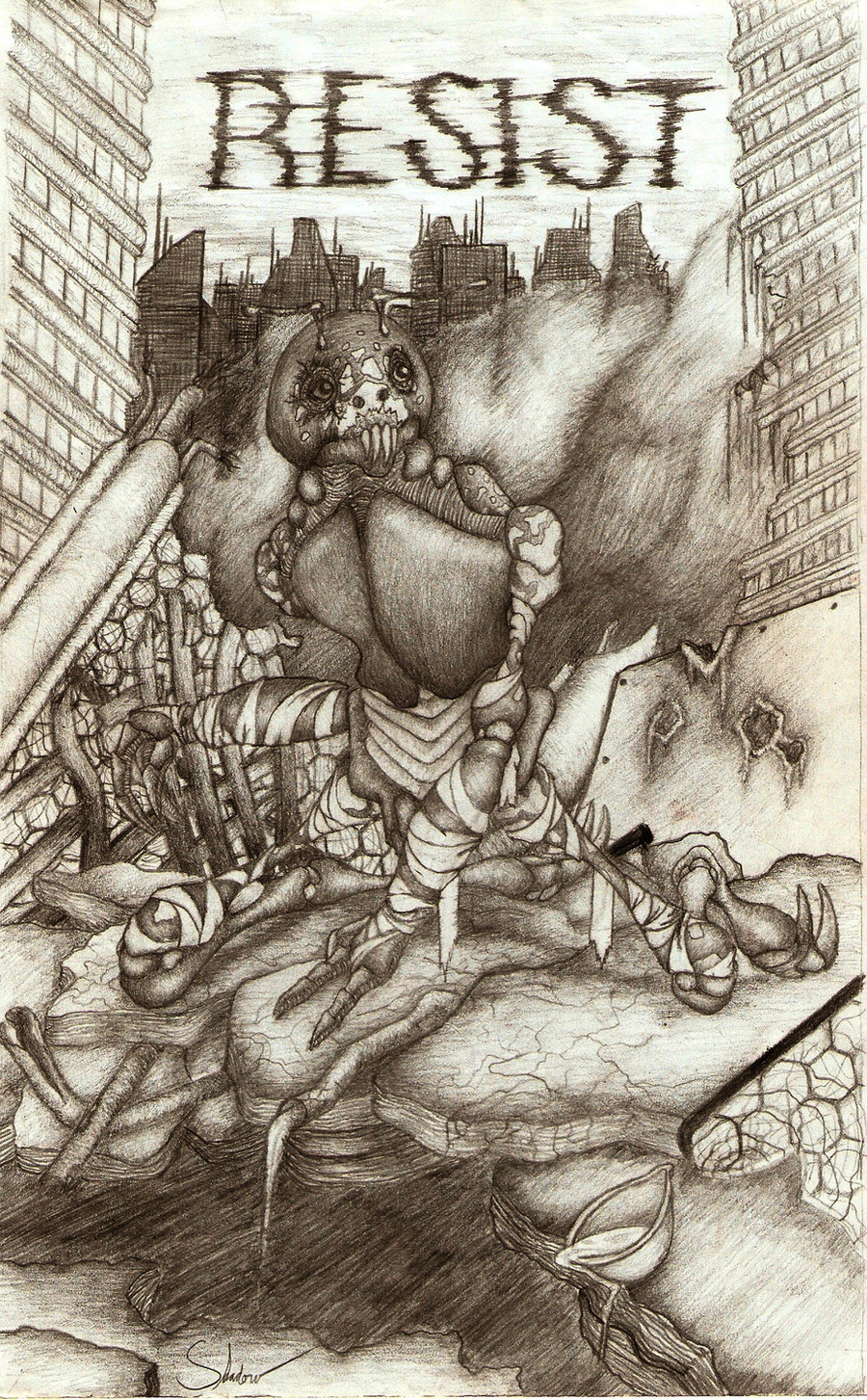
This is my submission for the Darksiders contest.I hardly doubt I'll win anything, but this was a really fun piece to make.
Hope you like.
")
Ref: [link]
How do the skulls look? Does the shading look alright? Anything else please feel free
Related content


Comments: 114

first of all this'll be my very amateur opinion ^^
this very nice and creepy drawing XD
for me the skull look a bit like cartoon.. and i see that =Bary91 already said much about it.. so i'll just give you some good ref (for me XD) [link]
and for shading~ you shouldn't forget that skulls are kinda round so there'll be some gradation in shading and for the crack.. it wouldn't be entirely black.. and remember that skull have thickness.. so there'll be a part that have lighter shading..
and.. another sugestion that you can use gradation for the bg a well so they doen't look flat.. for example.. you can make the building become darker when they far away or become lighter when they far away..
👍: 0 ⏩: 1

I'm enjoying this picture, I enjoy the pile of skulls and the destroyed buildings and raven, it's a really great idea and well put together :3
The only thing I recommend is the colouring and shading need slight improvement. It looks like you rushed a lot of the colouring due to the overlapping, but don't get me wrong- overlapping happens a lot and man, is it EVER a pain! but i figured out a new technique that puts the overlapping to a minimum. it may take awhile to do it, but it's totally worth it in the end- what it is is when using a pencil crayon, no matter if it's dull or sharp (better more dull, but not completely) and then colouring in circles slowly. I hope I explained that okay, but it works soooo much better then colouring in straight lines ^^ and for the shading the same thing goes, a really neat thing and easy (and I see you've done here) is start out dark and slowly go lighter, but where the raven is, it seems the dark goes to light too suddenly. But that's all ^^
Also, I think the skulls look fine :3 i really like the style of em!
Keep up the good work! ^ w ^
👍: 0 ⏩: 1

too bad it's not your idea ! don't just say thank you and take credit for the idea when it's not even yours.
👍: 0 ⏩: 0
 (Smile)")

Great job. I wish I could draw.
The skulls look awesome and I love the raven/crow in the background.
👍: 0 ⏩: 1

Wow, an interesting picture. I like it.
Perhaps you could have used smaller cracks and pieces missing from the skulls (like the one at the front has black on it, but you can see it's not a hole because it still has shape), but I think the shading looks good. Good luck with the contest nonetheless ^^
👍: 0 ⏩: 1

very nice in general, i like the dark concept and everything in the picture suits that.
I think the picture would look better overall if you made the pile of dirt (or whatever it is the crow is on) darker so it breaks up the picture and makes it easier to look at. Maybe try darkening the crow even more too so it stands out.
Its a good concept and the cracks in the skull at the front look very cool. Keep it up and just work on your shading a bit more and you will keep producing cool ass art.
👍: 0 ⏩: 1

Even if you just reference something and don't copy exactly, you should post credit in the description. It's only polite and will save you getting comments about plagarism and dishonesty.
As far as your actual picture goes, the things you need to work on mostly are: perspective (the buildings look a bit flat to me), anatomy of the skulls (particularly the ones closest to us), and shading. It's very easy to see the strokes you used to color this and it looks a bit amateurish... Just work on making your lines a bit more even, for example going the same direction, or come up with a unique way of shading. Similarly, look up a tutorial about perspective and I think you'll go far. You have the basics right (larger at front, small farther away), but to really get it to pop out in 3D, I'd suggest getting used to the ideas of vanishing points and the like. It'll be useful later down the line, too.
For being a highly referenced work, it isn't bad. Just work on developing some more ideas of your own. You're allowed to reference works, but just remember to credit where it's due
 (Wink)")
👍: 0 ⏩: 1

Thank you, and I will add that from now on
👍: 0 ⏩: 1
No problem! Good luck with your art
👍: 0 ⏩: 0

i like the theme and everything. i think the skull would look better if the top of it is more round. the shading is excellent. oh and i really like the bird on top of the skulls
👍: 0 ⏩: 1

Ooooh, creepy! The main skull seems a little off, so I'm not sure if it's human or not. It's interesting that the sky is clear like that. It makes me wonder if it is completely covered by smog, or if there is no pollution due to no people. I like the cracks in the skulls and the fact that you used charcoal (I think). It really brings those dark values into play.
👍: 0 ⏩: 1
Thanks, and actually, this is all black prismacolor
👍: 0 ⏩: 1


The overall composition is nice, but you could work more deeply in the components. Everything looks a bit shallow, a bit 2D, particullary the skulls in the front. I recently had to draw a couple of skulls and I picked my references for google (you can check the result here [link] ); you can try the same. Even if you want to make a particular style (cartoony I assume) you should always pick references to get the proportions and basic shapes right. Keep the good work.
👍: 0 ⏩: 1

i like the line art and the use of shadow because it looks naive and it goes well with the theme of the drawing and with the style
you know how to hatch but it's a little chaotic. I should maintain the direction or to make a game of directions.

👍: 0 ⏩: 1
Thanks for the feedback!
👍: 0 ⏩: 1

Shading isn't very smooth. I recommend using a a tissue to smooth it out.
Little hard to tell what's up with the skulls. Are those cracks?
👍: 0 ⏩: 1
thanks, and yes they are cracks
👍: 0 ⏩: 1
Hmm. Well, the thing about skulls is that they're actually kind of thick. I don't know if you'll be able to go back and add it in, cuz it looks really dark, so it might not work, but it does have dimension. It's easy to show it, too. The edge FURTHEST away from where the view is is the edge that will be seen. Simply follow along the line of the crack, and draw two. The second one needs to be 'inside' the crack. I hope that makes sense.
👍: 0 ⏩: 0

I think the shading on the skulls is just fine, especially for the Darksiders contest. That cartoony look of the skulls looks fine in my opinion.
However, I would make the background a bit darker so the skulls stand out even more.
👍: 0 ⏩: 1

well first of all i want say that the greyscale is an hard kind of work to do.
about the skull, im sorry to say that they look coming out from a cartoon, and in some of the the proposition is totally wrong.
in the big one the frontal bone is too much big (the front) also the nose, it isn't simply a triangle hole, it have a structure also inside and visible, for a little part.
Same for eyes.
also if the black colored part are hole, you drew some pieces by their own, i mean connected with nothing, and this is impossible, because the skull is empty inside and the pieces should fall on the floor, if the black is blood so then is ok :3
i advice you give a look on this [link] (founded on Google, here there aren't good human skull tutorial) or to see some anatomy book, or general biology/science one, they usually have a skull reference.
for the shading you did them quite good, just a little tips, if you've used a black colored pencil for, i advice you use the normal graphite, 2H for the sketch, HB for lineart and main details B-2B-3B and so on for shade (just be little careful the first time and practice)
hope had been helpful :3
👍: 0 ⏩: 1

just another little tip, if you want practice with skull, i advice you draw them as base for other works.
for me has been helpful ^^
👍: 0 ⏩: 0

i do love the skulls, though for me I think the background bulidings need work, making them the darkest object is one way (since they're furtheset away)
👍: 0 ⏩: 1

:icongimmefeedbackplz:
really creepy and it makes me shiver!
but it's good.
but,the buildings could use some more even shading. try smudging it a little.
The skulls look cool. I could never draw skulls like that.
👍: 0 ⏩: 1

As other people have said this is basically a complete copy of [link]
Whilst using other pieces of artwork for inspiration is alright, completely copying another's art is pretty irritating in my opinion.
In future maybe you should try to use ideas to warp into your own versions of things, rather than completely copying them?
👍: 0 ⏩: 1


the skulls look a little out of shape and the shadowing needs a little work
👍: 0 ⏩: 1

ever herd of a deviant art user called super sheep?
👍: 0 ⏩: 2
mabye u should look that user up and go through there gallery cause ur picture looks a lot liek super sheeps
👍: 0 ⏩: 1
I went to his gallery, he's got some cool stuff in there. I guess a lot of his works are dark and stuff like this one.
👍: 0 ⏩: 1
yer but one of his pictures looks alot liek urs
👍: 0 ⏩: 0
This is just a really bad version of this great piece of art : [link] ... try to stick to your own ideas !
👍: 0 ⏩: 1
| Next =>