HOME | DD
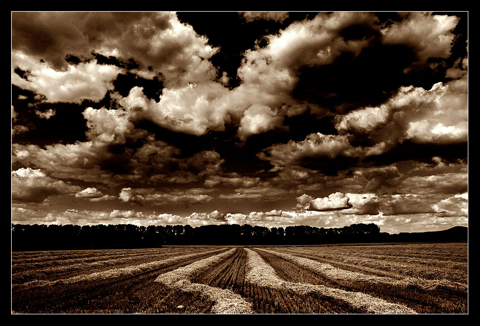
 LutherBash — Hellhound on my trail
Published: 2005-07-12 10:12:07 +0000 UTC; Views: 1056; Favourites: 32; Downloads: 171
Redirect to original
Description
---Related content


Comments: 37


I love the sepia color of the photo and how the sky looks as well awsome picture
 (Smile)")
👍: 0 ⏩: 1

Thank you very much for the 
👍: 0 ⏩: 1


Wow.. hoher Kontrast passt wieder prima.. your gallery absolutely strucks me down!!

👍: 0 ⏩: 1


blues falling down like hail
blues falling down like hail...
👍: 0 ⏩: 1
 (Wink)")

das is mir doch glatt einen fav wert, gut so!
schöner farbton, sehr stimmig
👍: 0 ⏩: 0


Herzlichen Glückwunsch!!! Das ist echt gut gelungen, toller Bildaufbau, Kontrast und Tönung

👍: 0 ⏩: 1


such an amazing photograph, i love the sepia tones and the composition.
👍: 0 ⏩: 1
Thanks for your kind words.
👍: 0 ⏩: 0


")
You don't have to, but thanks!
👍: 0 ⏩: 0

There is nothing more to say that phantastic work.
I like it so much because of the amount of details.
the good setup of the horizon, those tracks on the
field which are not just linear but have a curve in
the foreground. And besides thos the contrast is
great but even more the sepia toning. This is
something =Monocolour-photos would be very
glad to post in their gallery. Check it out and join
if you dont know it.
Wonderful work!
.:.
👍: 0 ⏩: 1
Thank you for the detailed comment and the
My first intention, was to do a normal b/w with it, with first time explicit use of DRI; i'm still not able to get satisfying b/w from my digishots. Then i made this toning with color balance and multiply mode. I discovered a toning that i was looking for for a long time, but it was too dark- perfect color only in multiply mode, but too dark; so i had to modify the toning and it's still too dark.
I'm currently trying to find out, how i could transfer the original toning, only availible in color balance which you can't save and multiply mode in a useful working tool like duotones or curves. Any ideas?
👍: 0 ⏩: 1
You could take the original colour version and apply a hue/saturation adjustment
layer. Here click colorize and select a tone you like and a saturation. This
adjustment layer could then be blended over with multiply or whatever. Ctrl+J
duplicates this layer when selected and you then set the blend mode of the copy
adjustmentlayer which should be on top to 'colour'. Thats really just a 5 penny thought
but could work. Try it out, i am not sure.
.:.
👍: 0 ⏩: 2
Warum nicht.
Danke für den Tip! Diese Art, mit zwei hue/ saturation layern, kannte ich bisher nur für s/w Umwandlung; funktioniert übrigends auch wunderbar mit selective color als obersten layer. Hab' inzwischen rausgefunden, wie ich ein toning mittels eyedropper, infobox und curves kopieren kann, leider nicht hundertprozentig; werde weiter forschen.
")
👍: 0 ⏩: 0
das nächste mal dann auch auf deutsch
.:.
👍: 0 ⏩: 0

well that is just breath taking....good lord
<3
👍: 0 ⏩: 0

holy crap. that's brilliant. the contrast is.. wow.
👍: 0 ⏩: 0