HOME | DD
 LuxDani — Clash

Published: 2008-03-23 15:45:54 +0000 UTC; Views: 1141; Favourites: 42; Downloads: 26
Redirect to original
Description
Whoops, I forgot about this piece. Had it sitting on my desktop for awhile. Just now I got around to finishing it.Recently I've seen something very similar to this (can't remember where I saw it) but I've had this piece sitting here for over a month now so I didn't steal the idea from there. The inspiration was actually from a tiny little icon somewhere on YouTube.(Once again, don't remember where)
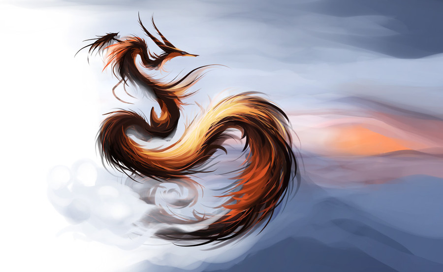
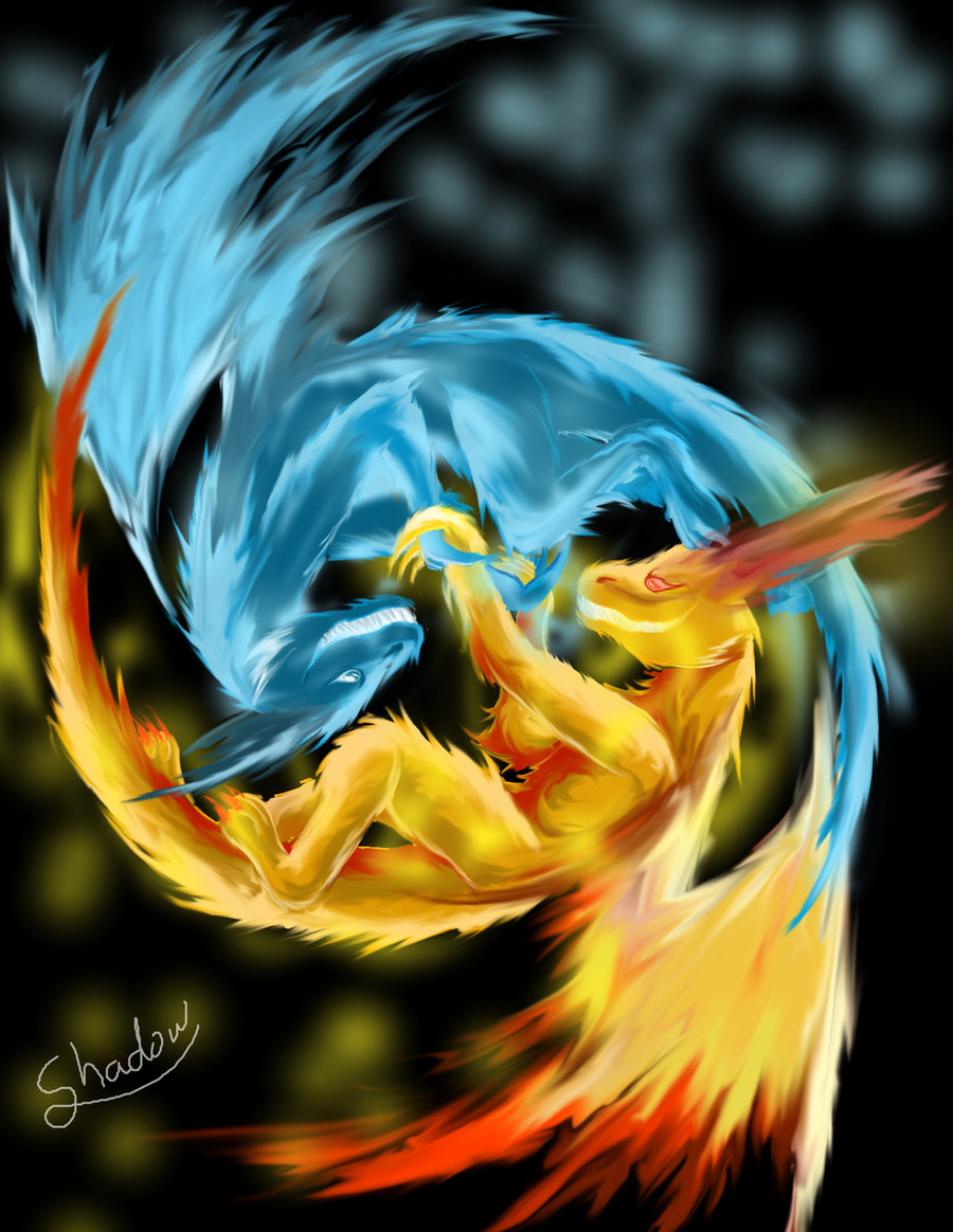
Fire and water. The usual clashing elements.
I tried to get the fire to look fiery, and the water to look watery. And yes, those are waves or something similar forming the furry water dude's aura.
WHOO
WEIRD HORNS FTW

My internet has been down for the past few days (stupid piece of crap), so I've had time to do some digital art.
If anyone wants to use this as a desktop background, feel free. Its the proper proportion anyway. But download it for the bigger size.
Related content


Comments: 14

cool! nice complimentary colours and beasties

👍: 0 ⏩: 0

The color choice on this picture is very well picked. I especially like how you manipulated the colors on the red creature.
Your texture skills on the claws, fur, and such are really well done. It looks a little too sketchy/light on the blue one, so I'd suggest you do the same thing you did with the red. Since the anatomy on the blue creature is like that, especially near the back legs, I can't crit it all too well. I think you have its shoulders a little too high and close to the neck. Just bring them down a bit and that should be fine.
The red creature look great, but the anatomy is a little disproportioned. When it comes to legs, all of them should be fairly equal and proportionate together. It looks like his right front leg is much larger than the other three. I would either shrink the size of that one or enlarge the others by somewhat.
His stomach is missing. Even if it were the angle, you should be able to see some more of his stomach because of the rib cage. But really, this creature is going in multiple angles. His head's facing at an upwards right angle, his chest is completely sideways, his right forearm is bent towards the front (especially the claws), his back right leg is a little more angled away from the front than the top right leg, and his tail is coming out of his leg in a side angle. Just get everything angled in the same general direction, in a comfortable position for the creature, and it should be fine. The base of the tail should be shown between the back legs if you want that angle look.
The back right leg is too pushed up to its body. It doesn't look like it has a lot of leg room and that it's giving a lot of pressure into his side. Just extend his waist or lake the leg larger and less scrunched up like the left leg.
Horns are magnificant. I wouldn't change a thing on them. You've got the texture, shading, and angles done well. Both are also very proportionate to the head. Another part I like is the black streaks you did in the red fur. It definitely gives it extra depth and makes him look very wild.
On the blue creature, I like the blue flame-like glow it has around its body. You've done an especially well job near the base of the tail.
Overall - great work. It just needs some work, but you're getting the right idea and you have amazing color skills.
👍: 0 ⏩: 0

Wow, nicely done.
I love the colours. Which colour do you like better?
👍: 0 ⏩: 1

I think the fire one turned out better.
Thankyou.
👍: 0 ⏩: 0

Water always wins x)
I like the opposing colors, and the horns are pretty shweet!
Sorry I haven't commented on yours too often :/
👍: 0 ⏩: 1
I'm partial to both.
I'm a pyro but also a water rat.
Thanks.

👍: 0 ⏩: 1

Haha!
Dude, many people would say it's a totally cliched theme, but the way you depicted it makes it stand out.
I really love how you did the fire dude. The orange highlighting plays perfectly with his fire theme. It's really smooth...when I looked at him, I though you did him traditionally with pastels, oh that rich smoothness. x3
And those horns.
I want your damn skills, Ko! D:<
-attemptstosteal
The only thing I don't like is how...contrasted in texture the water one is. From small view, it looks fine [but who's going to keep it that way? xD] but when you zoom in, you can see all the scribbliness and all. Water is a s'
...not much of a critique, but you could always blur his fur to make it more...eye pleasing. ;3
-faves-
👍: 0 ⏩: 1
You don't want my skills. They smell really bad when they are wet and they tend to give off a rather disgusting green aura when at work.
-cough-
Mm, I see what you mean about the water one. Maybe when I'm bored someday I'll try and fix it with a bit of blur and smudge.
👍: 0 ⏩: 0

eee ^^ the texture makes it look like it was done traditionally or something-- its quite cool xDD
awesome poses, the auras make the whole piccu very dynamic. Awesome!
👍: 0 ⏩: 0

Great job - I love their complimentary posings! ")
👍: 0 ⏩: 0
